Polish is a word that gets thrown out in conversations about craft, quality, and beauty. We talk about it at the end of the design process, before the work goes out the door: let’s polish this up. Let’s do a polish sprint. Could this use more polish?
A tweet (xeet?) on my timeline asked: “what does polish in an app mean? fancy animations? clear consistent design patterns? hierarchy and colour? all the above?” I thought about it for a moment and got a familiar itch in the back of my brain. It’s a feeling that I associate with a zen kōan that goes (paraphrased): "A monk asked a zen master, ‘Does a dog have Buddha-nature?’ The master answered ‘無’. 無 (pronounced ‘wú’ in Mandarin or ‘mu’ in Japanese) literally translates to ‘not,’ as in ‘i have not done my chores today.’ It’s a negation of something, and in the koan’s case, it’s the master’s way of saying — paradoxically — that there’s no point in answering the question.
In the case of the tweet, my 無-sense was tingling as I wrote a response: polish is something only the person who creates it will notice. It’s a paradox; polishing something makes it invisible. Which also means that pointing out examples of polish almost defeats the purpose. But in the spirit of learning, here’s a few things that come to mind when I think of polish:
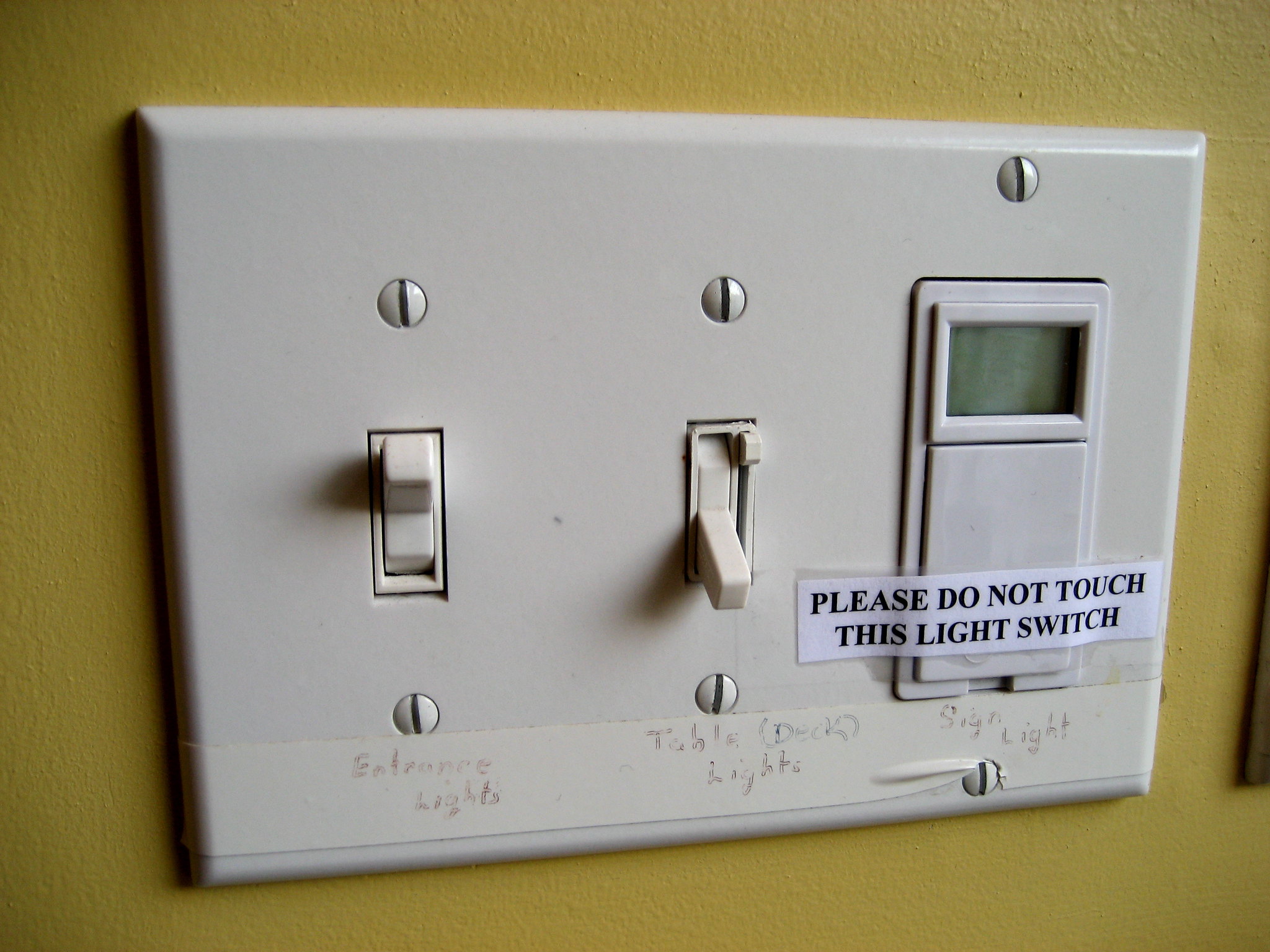
Next time you flip a wall switch or plug something into an outlet, take a second and look at the two screws holding the face plate down. Which direction are the slots in the screw facing? Professional electricians will (almost) always line the screw slots up vertically. This has no functional purpose, and isn’t determined by the hardware itself; the person who put the plate on had to make a conscious decision to do it.
Julian Baumgartner’s art restoration videos always include a note about his process for repairing or rebuilding the frame that the canvas is stretched over. When he puts the keys back into the frame to create extra tension, he attaches some fishing wire, wound around a tack, and threaded through each key; this, he says, “ensures the keys will never be lost.” How many of these details lie hidden in the backs of the paintings hung on the walls of the world’s most famous museums and galleries?
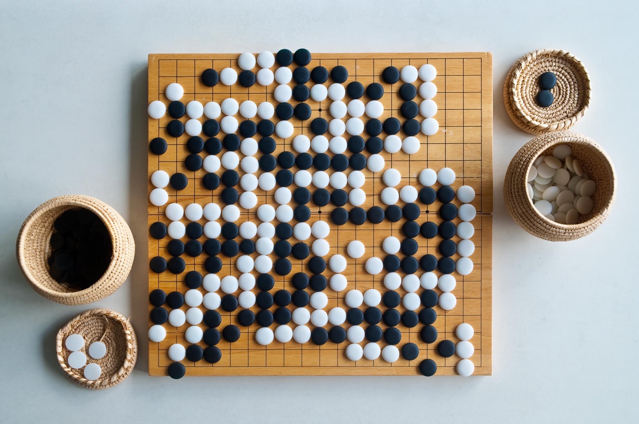
A traditional go board isn’t square. It’s very slightly longer than it is wide, with a 15:14 aspect ratio. This accounts for the optical foreshortening that happens when looking across the board. For similar reasons, traditionally, black go stones are slightly larger than white ones, as equal-sized stones would look unequal when seen next to each other on the board. The same subtle adjustments go into the shape of letters in a typeface: round letters like ‘e’ and ‘a’ are slightly taller than square letters like ‘x’ or ‘v’. The crossbars of the x don’t usually line up perfectly, either. The success of these demonstrations of polish is dictated by just how hard they are to see.
So how should polish manifest in product design?
One example is in UI animation. It is tempting to put transitions and animations on every component in the interface; when done right, an animated UI feels responsive and pleasant to use. But the polish required to reach that point of being “intuitive” or “natural” is immense:
- Animations should happen fast enough to be perceived as instantaneous. The threshold for this is commonly cited at 100ms; anything happening faster than this is indistinguishable from something happening right away.
- The speed of the animation has to be tuned to accelerate or decelerate at precise rates depending on how far the element is moving and what kind of transition is taking place. Changing a popover from the default linear animation to an ease-out curve will make it seem more natural.
- Often an animation should be faster or slower depending on whether it’s an “in” or “out” animation; a faster animation at the start of an interaction makes the interface feel snappy and responsive. A slower animation at the end of an interaction helps a user stay oriented to the result of their actions.
Another example is in anticipating the user’s intent. A reactive UI should be constantly responding to a user’s input, with no lag between clicks and hovers and visual, audible, or tactile feedback. But with some interaction patterns, responding too quickly can make the interface feel twitchy or delicate. For this reason, nested dropdown menus often have invisible bridges connecting your cursor and the menu associated with what you’ve selected. This allows you to smoothly move to the next item, without the sub-menu disappearing. These bridges are invisible, but drawing them accurately requires pixel precision nonetheless.
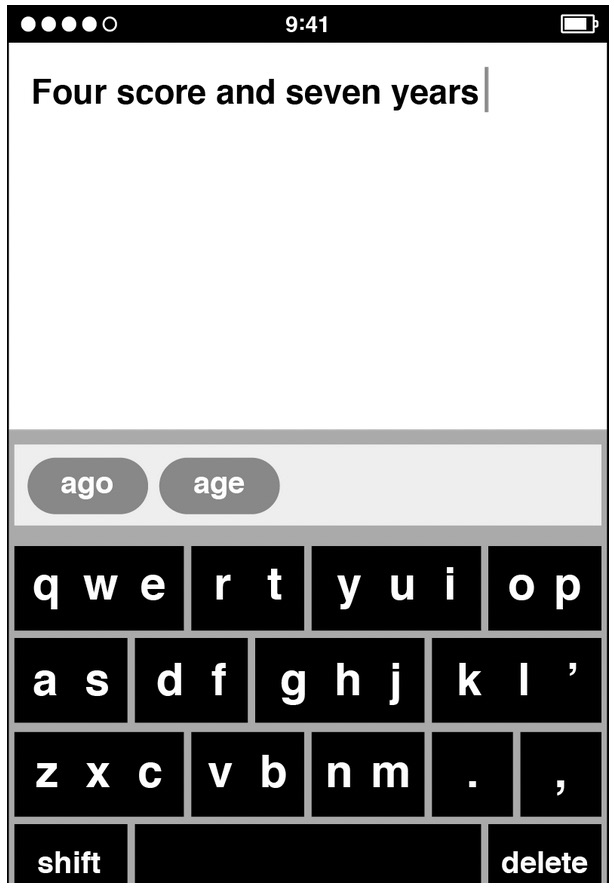
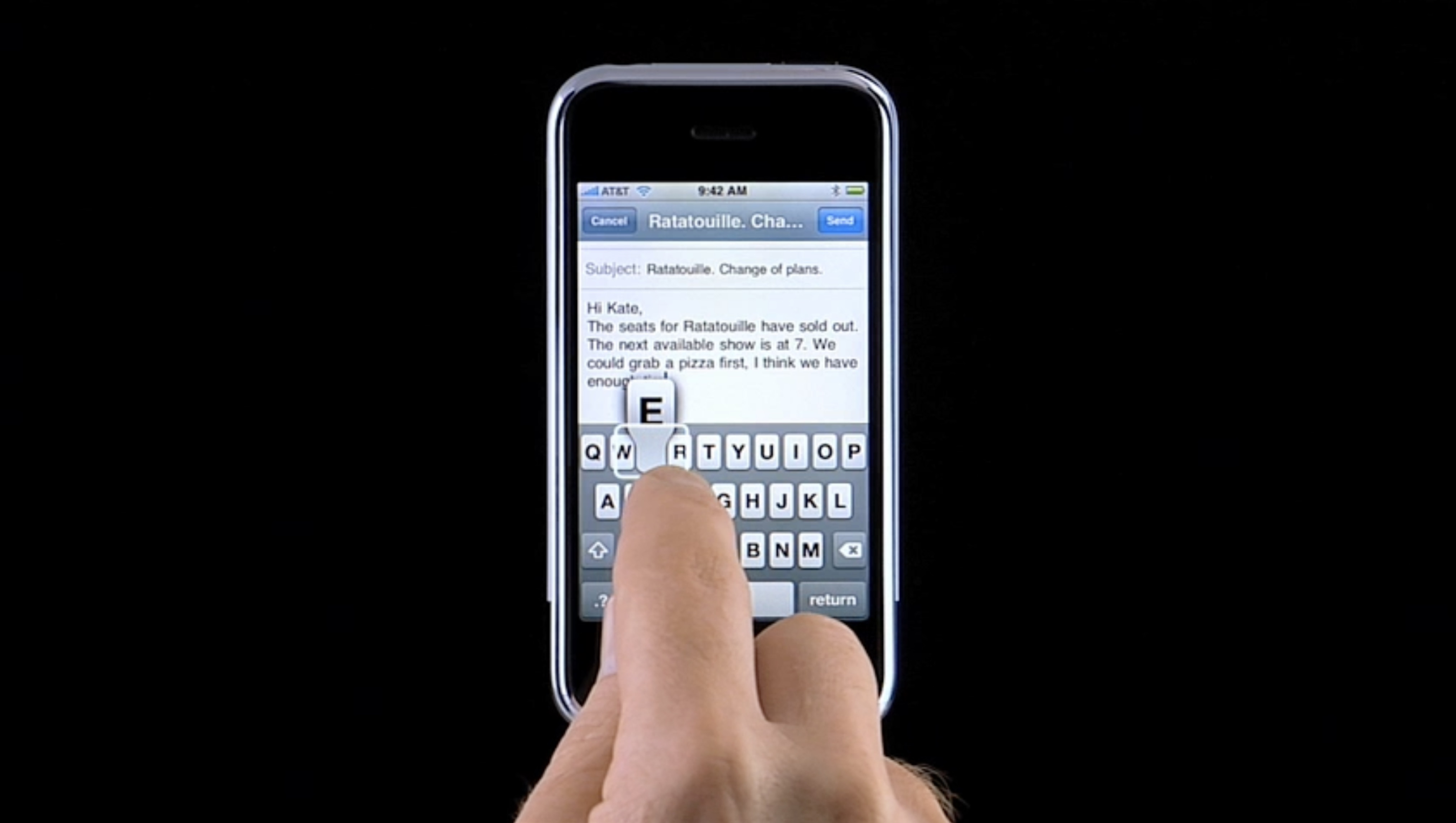
You benefit from this kind of anticipatory design every day. While designing the original iPhone’s keyboard, Ken Kocienda explored new form factors that took advantage of the unique properties of the phone’s touch screen. But breaking away from the familiarity of a QWERTY keyboard proved challenging; users had a hard time learning new formats. Instead, Kocienda had the keyboard’s touch targets invisibly adjust based on what is being typed, preventing users from making errors in the first place. The exact coordinates of the tap on the screen are adjusted, too, based on the fact that we can’t see what’s underneath our fingers when we’re using it.
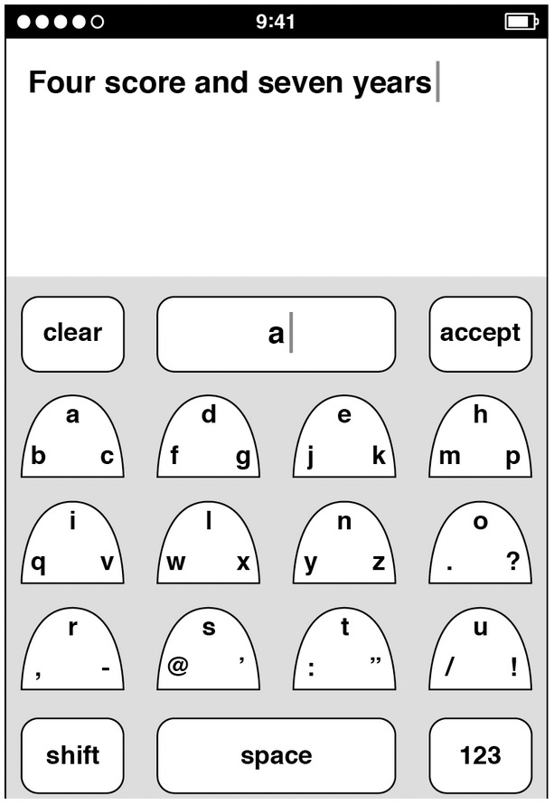
The iPhone’s keyboard was one of the most crucial components to the success of such a risky innovation. Polish wasn’t a nice-to-have; it was the linchpin.
The polish paradox is that the highest degrees of craft and quality are in the spaces we can’t see, the places we don’t necessarily look. Polish can’t be an afterthought. It must be an integral part of the process, a commitment to excellence from the beginning. The unseen effort to perfect every hidden aspect elevates products from good to great.