Paul Adams put it bluntly:
“Grid, font, colour, and aesthetic style are irrelevant if [outcomes] haven’t been resolved first … [but] sometimes it’s just more fun to draw nice pictures and bury oneself in pixels than deal with complicated business decisions and people with different opinions.”
— Paul Adams, The dribbblisation of design
This is called attribute substitution: when faced with a hard problem (complicated business decisions), we subconsciously substitute it with an easier problem (fonts and colors) and solve that problem instead.
Delight — creating an emotional impression through animation, copy, and illustration — is a common substitution for harder problems like accessibility and usability. More and more, designers and their stakeholders are focusing on delight as shorthand for success at the expense of basic utility.
To reverse this trend, we have to understand why delight is an easier problem than usability. With this knowledge, we can work to build better products by putting delight last.
Three hierarchies
All problems in digital product design can be organized into a hierarchy, with hard problems at the bottom and easy problems at the top. This mental model was explored by Abraham Maslow in 1943, and it is the key to understanding our bias.
Maslow’s Hierarchy
In A Theory of Human Motivation, Maslow described a hierarchy of needs that explain human behavior and motivation. Maslow’s hierarchy of needs comprised the following categories, from lowest to highest:
- Physiological needs: the most fundamental needs required for survival. Examples: food, water, sleep, and sex.
- Safety needs: needs associated with basic psychological well being. Examples: safety from physical harm, safety from emotional harm, and financial safety.
- Social Belonging: needs for community and emotional connection with others. These include friendships, intimate relationships, and family.
- Self-esteem: needs that provide personal fulfillment and a feeling of respect. Includes recognition, attention, and acceptance.
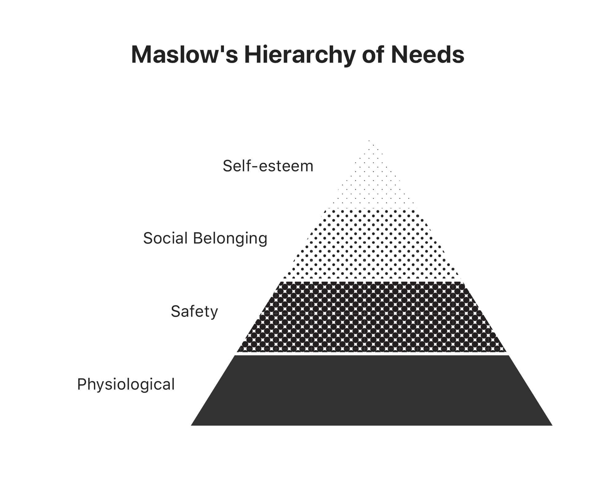
According to the theory, people are motivated by the needs one degree above their current level of fulfillment. People only seek higher-order needs — for community, for respect, for acceptance — if their lower-order needs are satisfied.
The theory has its critics, but it continues to resonate to this day.
“The continued resonance of Maslow’s theory in popular imagination, however unscientific it may seem, is possibly the single most telling evidence of its significance: it explains human nature as something that most humans immediately recognize in themselves and others.”
— Uriel Abulof, Why We Need Maslow in the Twenty-First Century
Walter’s Hierarchy
In 2011, Aaron Walter published Designing for Emotion. In the book, Walter adapted Maslow’s hierarchy of needs to describe the needs of the users of digital products. Walter’s hierarchy of needs was as follows:
- Functional: users should be able to complete tasks.
- Reliable: the product shouldn’t “drop out intermittently, or [be] otherwise unreliable.”
- Usable: users should be able to “learn to perform basic tasks quickly.”
- Pleasurable: using a product should “put a smile on your face.”
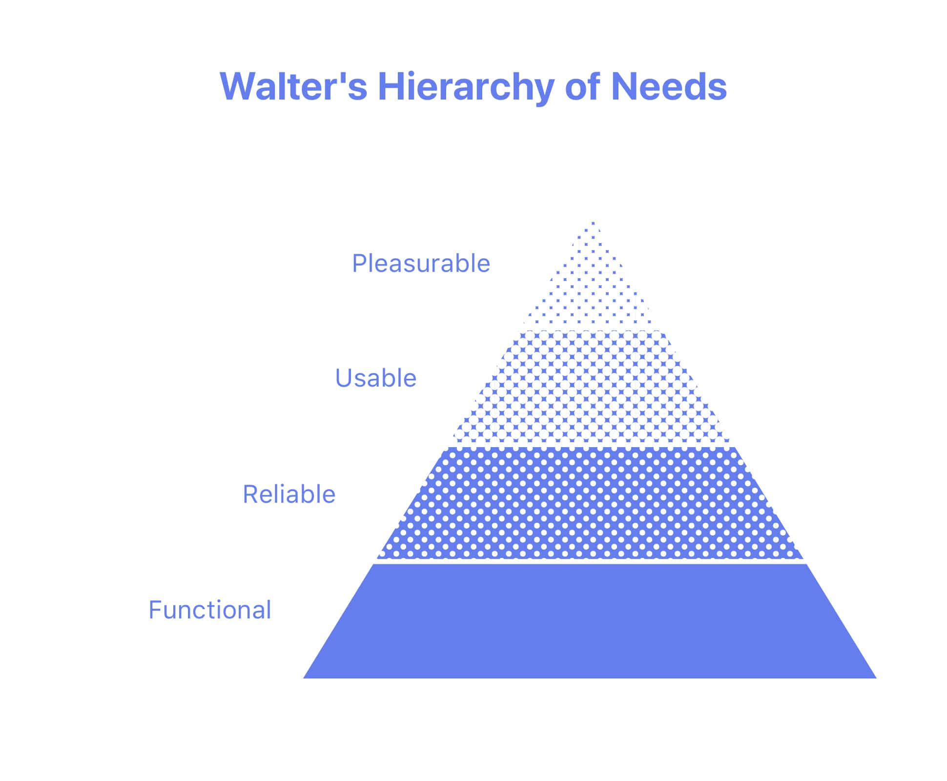
Walter argued that, in 2011, most products were content to be merely usable. More websites and applications should “transcend usability to create truly extraordinary experiences.”
Ström’s Hierarchy (that’s me)
In the 8 years since Walter published his hierarchy, the technology that powers websites and applications has matured considerably. Twitter retired the fail whale. Facebook introduced the Timeline. Google Docs works even if you’re not connected to the internet. Walter’s hierarchy needs a few updates:
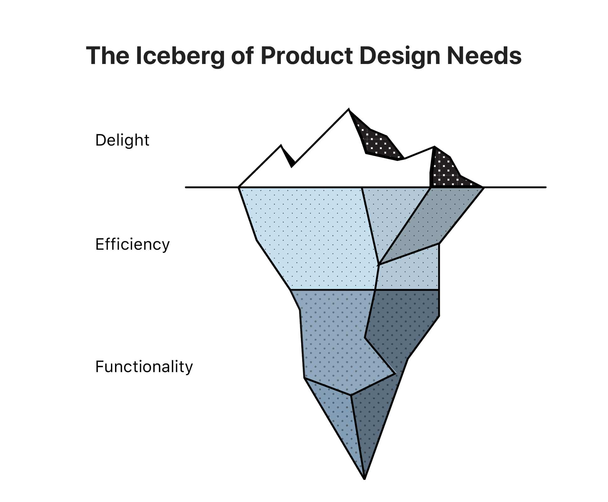
- Functionality: a user should be able to reliably complete tasks. This encompasses reliability and usability; these qualities are table stakes.
- Efficiency: a user should be more productive by using the product. A hammer is functional. A nail gun is efficient.
- Delight: a user should have a feeling of fulfillment, enjoyment, joy, or surprise while using the product.
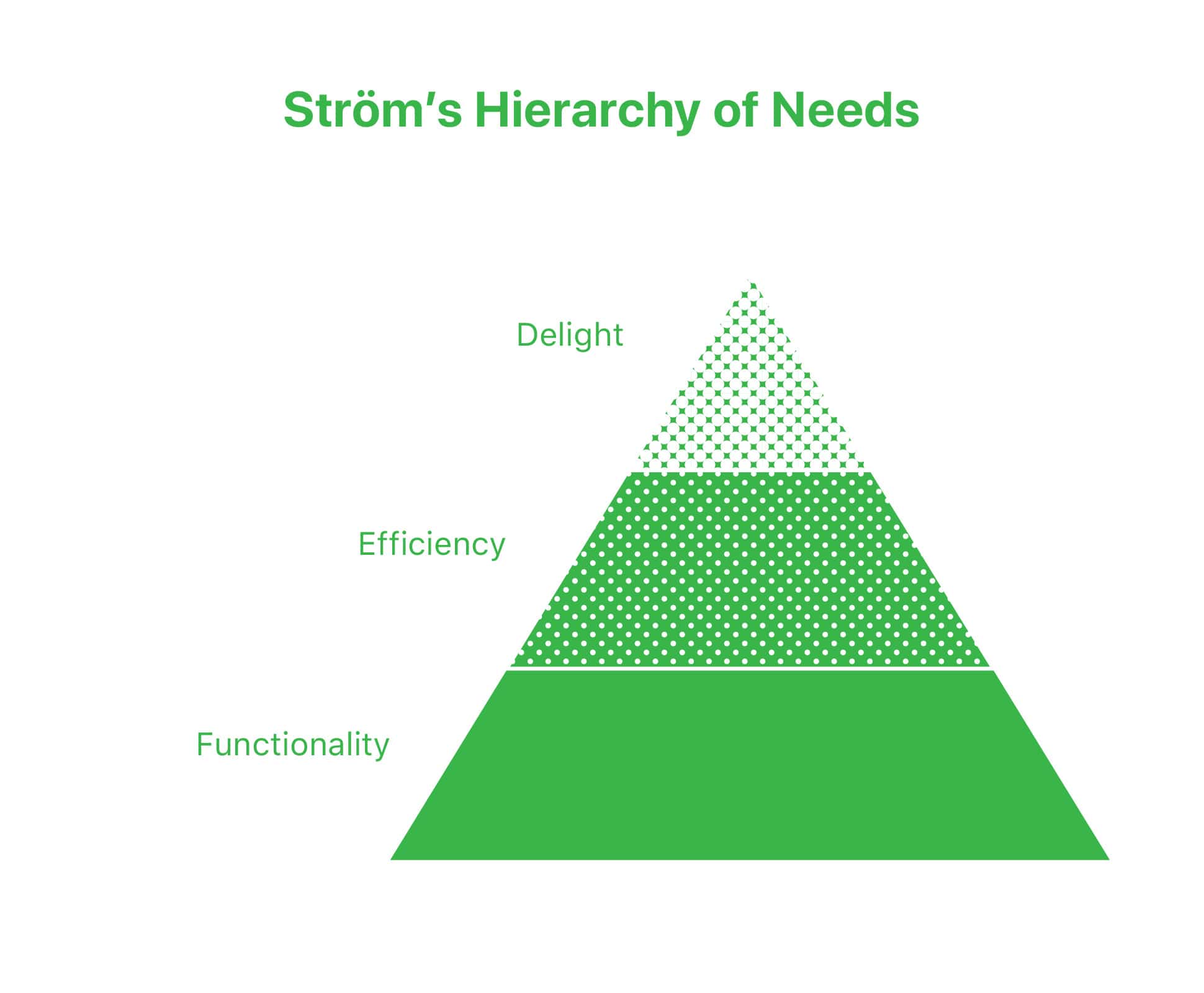
The key to the product needs hierarchy is one that Walter only mentions tangentially: your product has to satisfy the needs at each level before moving on to the next. A product can’t be efficient if it isn’t functional. A product can’t be delightful if it isn’t efficient and functional.
Usable = Edible
Walter draws an analogy between using software and eating food:
Think back to the best meal you’ve ever had. Not a good meal, I mean a mind-blowing, palate-challenging, fall-in-love-with-food-again, great meal … Did you once think about the meal’s nutritional value?
— Aaron Walter, Designing for Emotion
We shouldn’t settle for building software that is merely usable, just as chefs shouldn’t settle for cooking food that is merely edible.
But there is a dark side to the analogy. The most memorable aspects of a meal are those that cause an emotional reaction: the flavor, the texture, the visual presentation. The details of the ingredients and processes that produced your meal aren’t as memorable. In fact, the restaurant works hard to hide all those things back in the kitchen.
I’ve tasted great steak. I can easily remember how good it made me feel. So when I try to cook a steak, it’s obvious when the flavor and texture aren’t right. But it’s not obvious why it’s not right: I don’t have the same effortless recall of the temperature the steak is best cooked at, or the right questions to ask my butcher, or the right salt to season with.
Great products are not remembered for how usable and efficient they are. When a product satisfies our need for functionality and efficiency, we remember the emotional impression we get when using them. Then, as designers or stakeholders, we try to recreate that emotional resonance. But we don’t remember the more fundamental elements: familiar patterns, solid information architecture, reactive and responsive inputs.
Fight the bias
It’s hard to avoid the attribute substitution bias because it happens almost instantly. When editing, I often find myself correcting punctuation and grammar instead of actually reading what I wrote. When designing, I sometimes build components and styles before putting together user flows and journey maps. This looks like procrastination. But it’s an attempt to avoid the harder problems with more unknowns in favor of easier, more familiar challenges.
Designing for delight is the same.
To get to the harder problems1 of efficiency and usability, we have to go out and look for those qualities in the products we use every day. The easier it is to remember what makes Google so usable, the easier it will be to work on our own app’s search function.
Ultimately, fighting bias takes awareness and focus. Knowing, as G.I. Joe says, is half the battle.
Thanks to Josh Petersel, Logan Alexander, and Tim Casasola for help with earlier drafts of this essay. Also, special thanks to Lizzie May for reviewing the iceberg illustration.
Josh asked: “Is it always true that efficiency and usability are the hard problems, and delight the easy one? What about the products that are lightning fast and effective but nobody wants them? What do you make of Amazon discontinuing the Dash button, which let you re-order a household supply you’re running low on by just clicking a button – no need to visit a website, or even open an internet-navigating device?”
I guess there’s an even harder problem beneath functionality: market fit. ↩︎