This is a direct translation of a talk I gave at the NYC D3.js meetup in January of 2016. If you’d like to see a video of the talk, you can check it out on YouTube.
Have you seen this comprehensive list of Donald Trump’s insults? Or maybe this detailed rundown of the 2016 Primaries? Data is a big deal in the newsroom right now, and in 2016, we’ll likely see data take on an even bigger role in reporting feature stories.
The New York Times is just one example of an organization increasingly banking on data-driven reporting: in the Politics section of nytimes.com there is a blog called The Upshot that consistently uses analysis of detailed data sets to reveal surprising insights about news events on the front page. They typically include charts and diagrams to bolster their reporting: large, interactive explorations that are driving more and more traffic for the paper every day.
The Upshot, FiveThirtyEight and Buzzfeed, all of these publications are treating data visualization the same way that financial papers like the Wall Street Journal treat them: alongside the story, illustrating the story, but not integral to the story itself.
So what does data look like when it’s used as part of the story itself? How can we treat it as we treat verbs and nouns, integrated into, instead of apart from, the story?
Enter Sparklines
A sparkline is a small intense, simple, word-sized graphic with typographic resolution. Sparklines mean that graphics are no longer cartoonish special occasions with captions and boxes, but rather sparkline graphics can be everywhere a word or number can be: embedded in a sentence, table, headline, map, spreadsheet, graphic. Data graphics should have the resolution of typography. – Edward Tufte, Beautiful Evidence, 46–63
Edward Tufte describes sparklines in his book Beautiful Evidence as being word-sized graphics. “Typographic Resolution” is his key identifier of a sparkline, and he goes back to this distinction repeatedly without quite defining it. So what does “Typographic Resolution” mean?
Emojis are one example of word-sized graphics that we use every day: these pieces of design have typographic resolution, as they sit directly with the text to add meaning or change context. Emojis can turn “thanks 😀” into “thanks 😕”; a lot of meaning is imparted with a very small symbol.
Sparklines in practice
Let’s look at a data table that might benefit from sparklines.
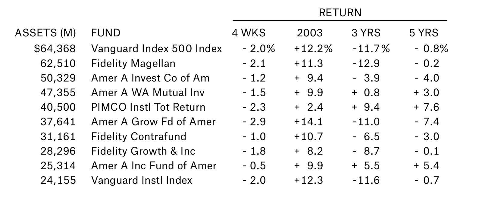
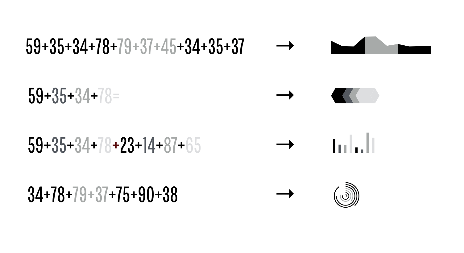
This is a typographic table: just numbers and letters, spelling out the top 10 index funds over the past 4 years. We can add a small chart to each line with the historic trends for that fund.
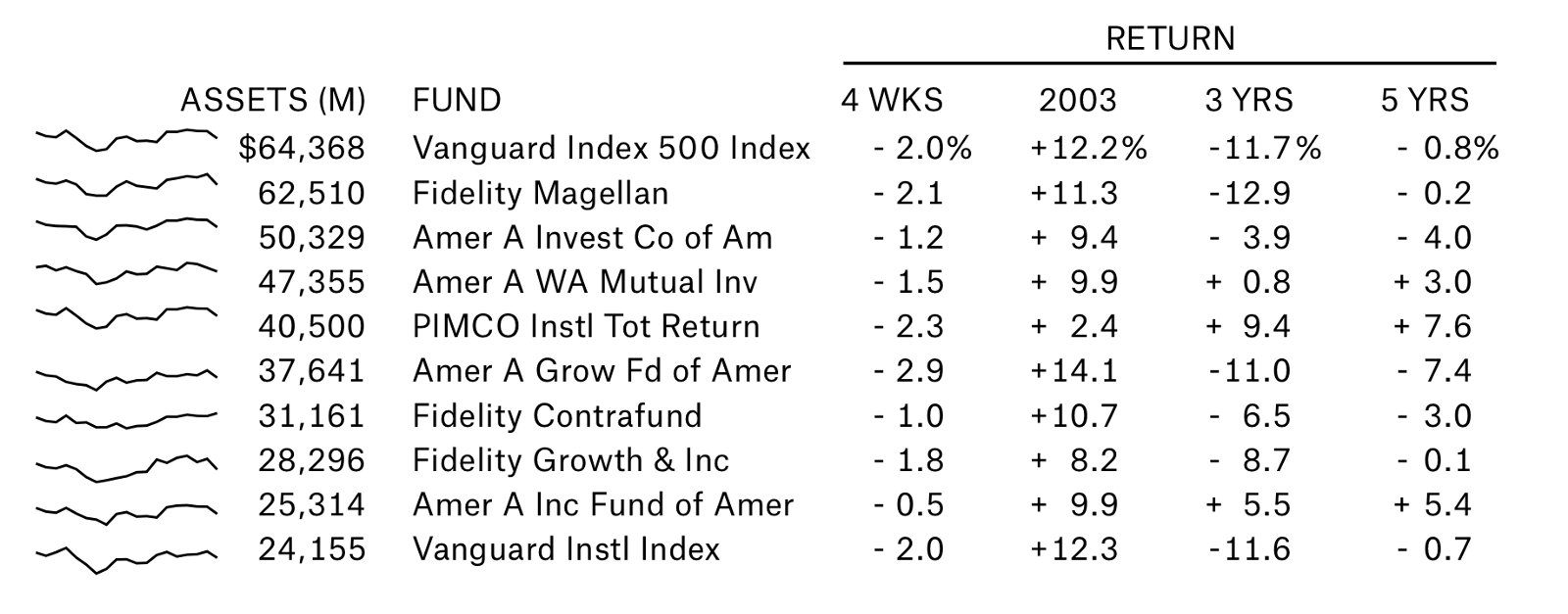
This adds 120 more data points to each line, demonstrating the volatility of each fund, as well as demonstrating the forces of market cohesion and highlighting market-wide events.
In fact, we can make this chart far more compact by eliminating the numbers on the right, replacing milestones with historic trends. Some audiences might not need to quantify the specific returns of the funds, and for them, we can add data and reduce complexity.
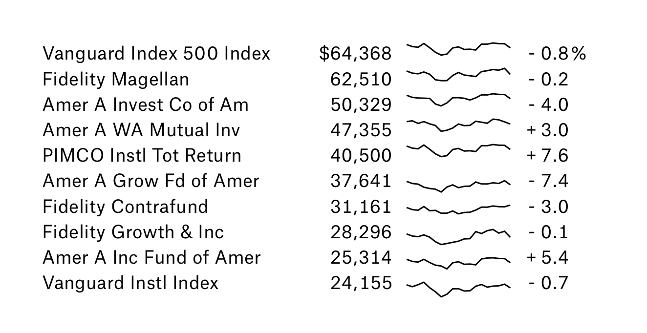
For the right audience, this compact display of data is just as easy to parse as the original. It might be argued that it’s easier, in fact: the lines resonate aesthetically with our natural instinct to find patterns, using multiple mental modes to add additional dimensions to the data.
Designing Charts to be Tiny
Simply taking normal-sized charts and sizing them down doesn’t accomplish the kind of efficiency of space we’re looking for with our new visualizations. In order to succeed, charts have to be designed with their size in mind.
That can look something like this:
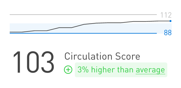
This is a proprietary platform that Planetary designed for The Daily Beast. It displays information about system-wide averages, local maximum and minimum, and current state into a small visualization that accompanies each report.
This approach also applies to paragraph-level charts. This is an example of how we might take a story about market performance and integrate charts into it:
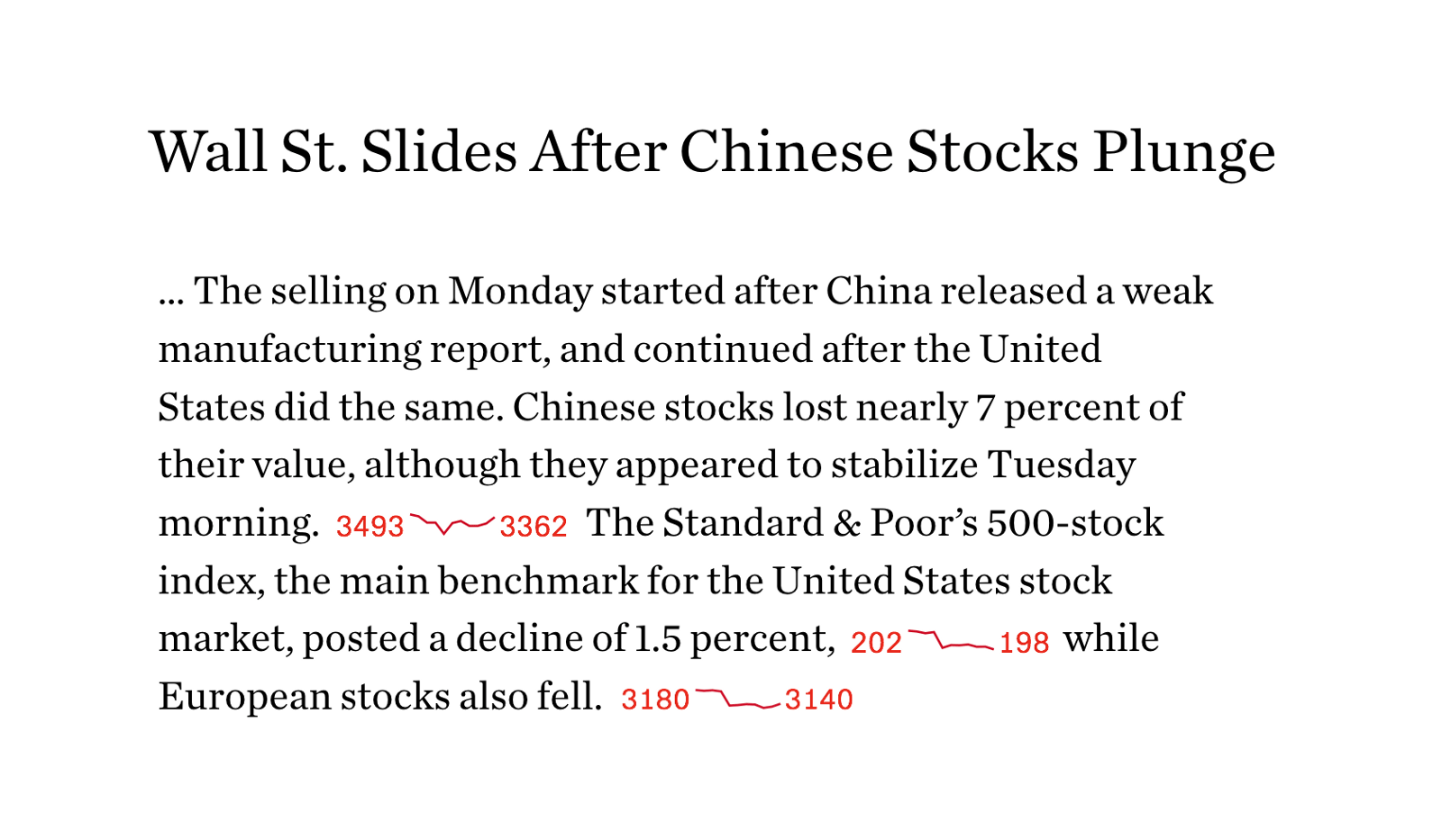
These charts are designed with tininess in mind. They don’t include text or axes. They use very few colors or patterns. They focus on one piece of information and don’t try to draw correlations or associations. This simplicity allows them to add value without adding noise.
Tools to make tiny charts
There are a number of tools available to designers and developers that make it easy to embed tiny charts into paragraphs of text:
1. D3.js
A developer named Tom Noda has written up a great tutorial for rendering small charts in D3. He deftly addresses some of the technical challenges, such as smoothing and asynchronous datafetching.
2. FF Chartwell
While we don’t normally think of fonts as software, they are actually complex pieces of code, capable of really interesting applications.
FF Chartwell, a font originally published by FontFont, can parse numbers into a variety of different visualizations. It uses the inherent qualities of the text — color, style, and size — to style the charts and graphs. And because it’s a font, it can be embedded into web pages and rendered alongside other text; this takes advantage of the optimizations done by browsers when rendering text. It’s nothing short of black magic.
In Conclusion
We see the value of data visualization more and more each day, as large and interactive charts are published alongside stories in major publications. Newsrooms that explore the realm of word-sized charts, making data a central and essential component to stories, will stand apart; the next frontier of data is integration with the text of our stories.