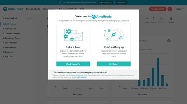
In-product education is a pattern that has emerged from the overlap between user experience design, marketing strategy, and product management. A brief definition: in-product education markets a product to someone who already uses that product. Think of the messages you get from a chatbot, the guided tours you see when you sign up for a new account, or the webinars you get invited to on becoming a pro user. That’s in-product education.

Recently, there’s been an explosion of products and services in the in-product education space. New tools promise to enhance your application’s user experience and drive business value. It’s true that in-product education can improve key metrics in the short term. But in the long run, investment in in-product education can limit user experience.
To see why, let’s compare applications to airports.
Airports and Applications
The user experience concerns of airports and applications are similar. Travelers pass through airports with a to-do list: locate their gate, eat lunch, use the restroom, retrieve their bags, go through customs, charge their phone. App users have a to-do list, too: they need to update their profile, read their email, create a new blog post, or file their taxes. But sometimes users can’t find the path to accomplishing their tasks. This is a problem for airports, too.

For an airport, lost passengers = lost revenue. If your passengers can’t find the food court, they won’t spend money. If they can’t find their gate, they’ll miss their flight. If they can’t find the trash bins, your janitorial fees are higher. Airports solve this problem by placing easy-to-read wayfinding signs in busy areas. For an airport, an investment in good wayfinding signs is a no-brainer.
This is the argument for in-product education: lost users = lost revenue. For example, gmail tells new users where to find their inbox, so they’ll know where to go to read their email. But we makers of software have an opportunity that airport makers don’t. We can move the food court.
Opportunity cost
Once the foundation is set, an airport’s developer can’t re-design the building. The cost of new signs is almost zero compared to the cost of moving terminals and amenities around. If travelers are getting lost, add more signs. It’s a no-brainer.
When an app’s users can’t find their way, the builders have more options. Incremental user experience changes are quick and cheap. But in-product education can also be cheap.
Products like AppCues and Intercom have changed the cost structure of in-product education. Developers don’t have to build in-app education themselves; they can install a library and hand control to the marketing team.

With plug-and-play libraries, in-product education is an attractive option. But there’s a hidden cost to using in-product education: the opportunity cost. And that’s where the slippery slope starts.
When teams use these tools to point their users in the right direction, they don’t learn why the users get lost in the first place. If the underlying problems are never resolved, the way-finding signs can become a permanent fixture in the landscape. This cycle causes the user experience to get more and more complex over time.
Norman Doors and EpiPens
Norman doors are an example of this complexity spiral. You might not have heard the term, but I’m sure that you have experienced a Norman door. This is a Norman door:

In an article and video, 99% Invisible describes Norman doors:
A so-called “Norman Door” has design elements that give you the wrong usability signals to the point that special signage is needed to clarify how they work. Without signs, a user is left guessing about whether to push or pull, creating needless frustration.
Norman doors don’t happen by accident. A designer has to realize that people are failing to use the door correctly, and add a sign. Despite the fact that good door designs are everywhere, Norman doors still persist. Don’t let your app be a Norman door.
A more alarming example is the EpiPen. Unlike most insulin pens and regular syringes, the original EpiPen’s cap and needle were on opposite ends. In an in-depth article, Joyce Lee describes the crisis that result from this design: “[Between 1994 and 2007,] There were over 15,000 unintentional injections with the EpiPen reported.”
To fix the problem with accidental injections, Mylan (the maker of the EpiPen) added text to the needle end of the pen.

According to one study, the updated pen had a success rate of just 67%. ProPublica writes:
That same study compared the EpiPen to another epinephrine auto-injector, the Auvi-Q … The Auvi-Q is designed with the cap and needle on the same end – and had a success rate of over 90 percent.1
Don’t let your app be an EpiPen.
Conclusion
If you are considering using in-product education to guide your users, try instead to solve the underlying problem. If you are introducing a new product or feature, let users explore at their own pace. Make functionality obvious. Use what you learn to avoid usability issues in the future. Build robust feedback loops, and let users tell you when they run into problems. Don’t trade the chance to develop a core competency for a short-term budget win. In the words of Don Norman, namesake of the Norman door:
“Any time you see signs or labels added to a device, it is an indication of bad design.”