Argos is a content marketing analytics platform, concieved by The Daily Beast, and designed, developed, and maintained by the Planetary team.
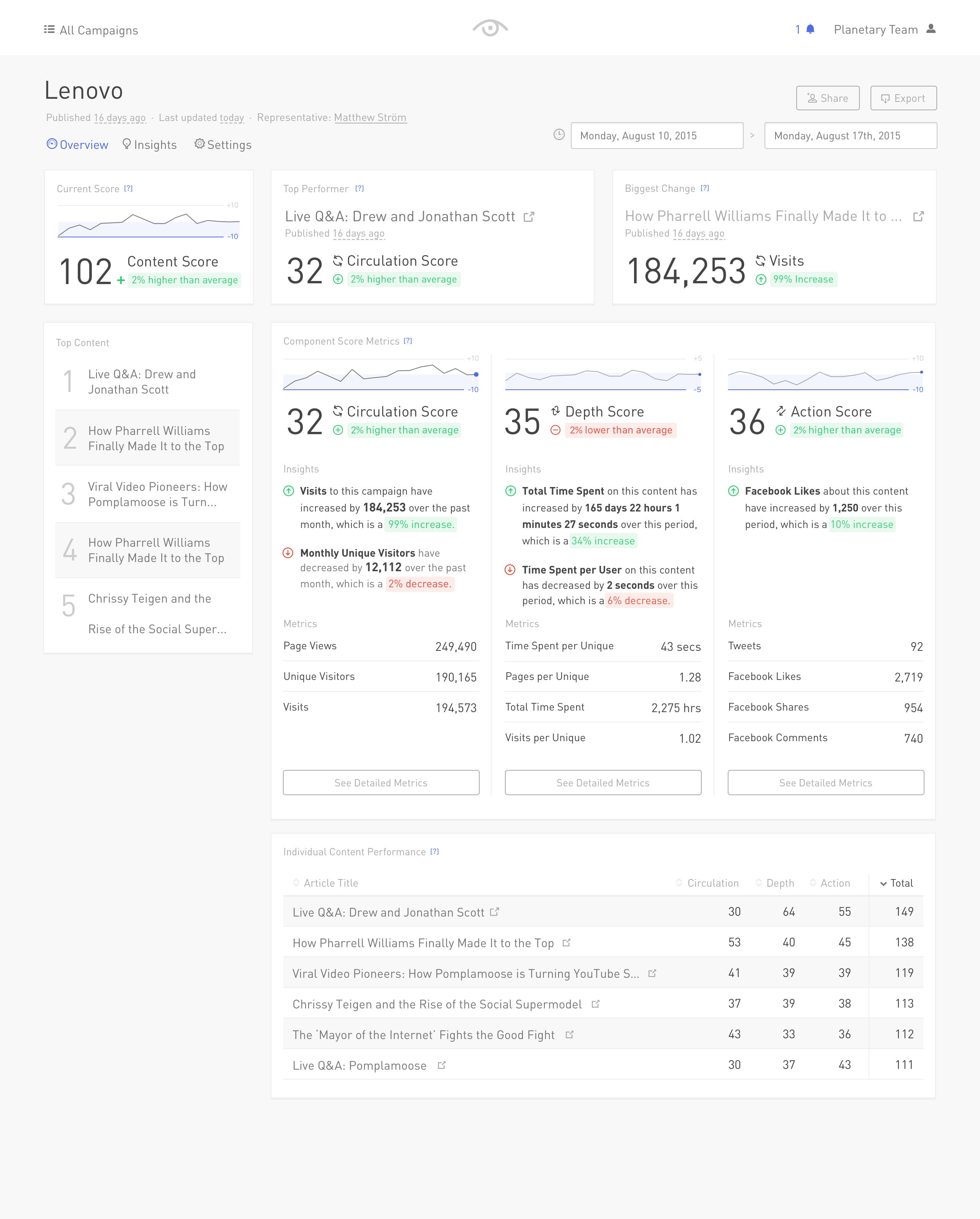
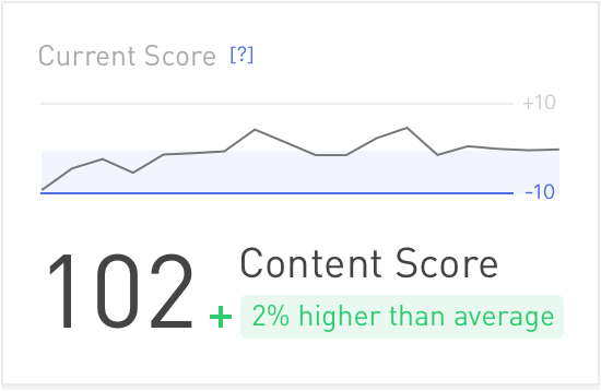
The advantage of Argos over other content metric platforms is the proprietary content score. Creating the scoring algroithm was challenging, but presenting it in a simple manner proved to be the best way to communicate its statistical underpinnings.
Designing Argos occured in a number of phases over the course of 2015.
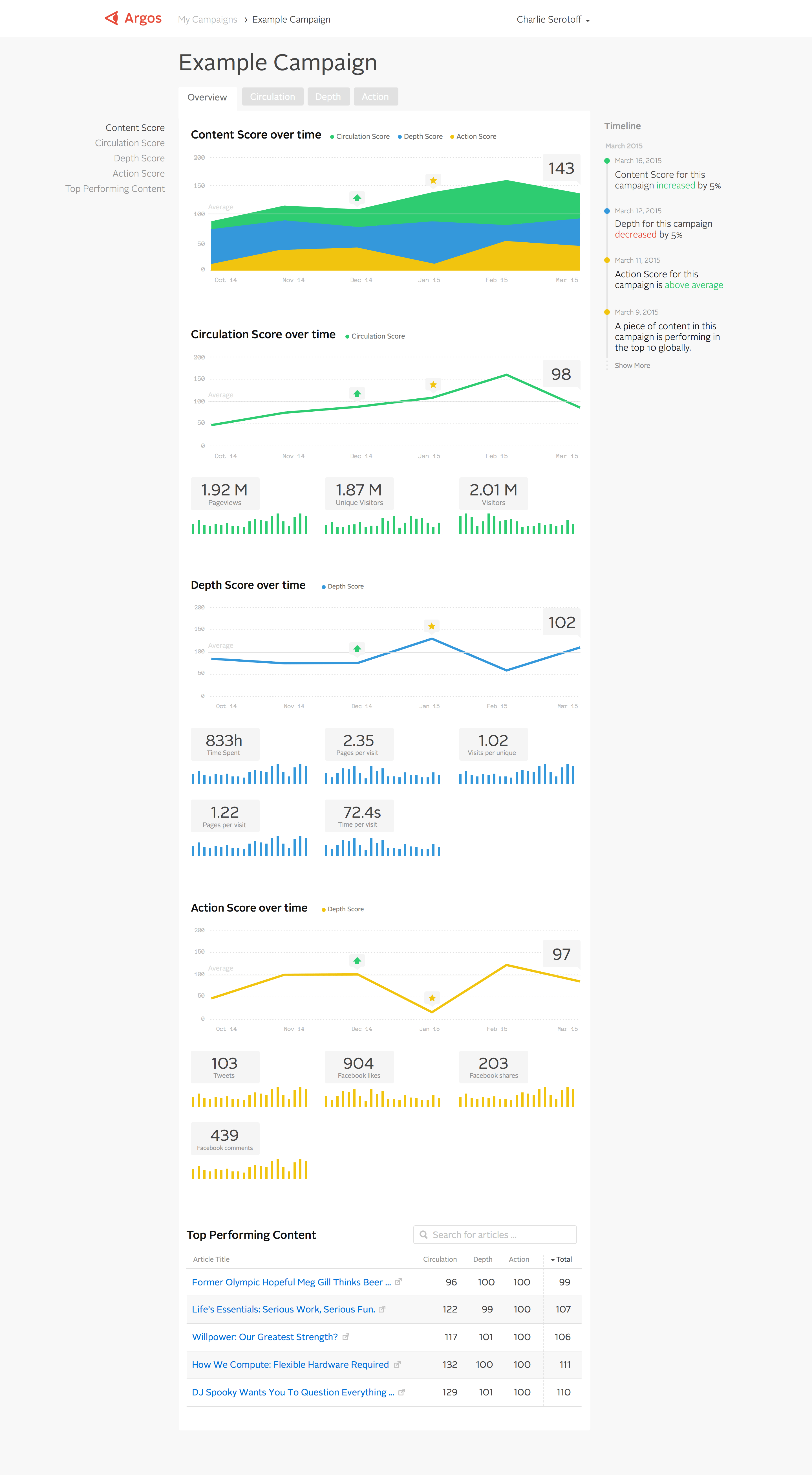
Initial layout concepts centered around a simple 1-column layout that could hold a number of components in a rigid hierarchy, maintaining a consistent time-scale on the horizontal axis. This would later become a core design concept for Spacetime.
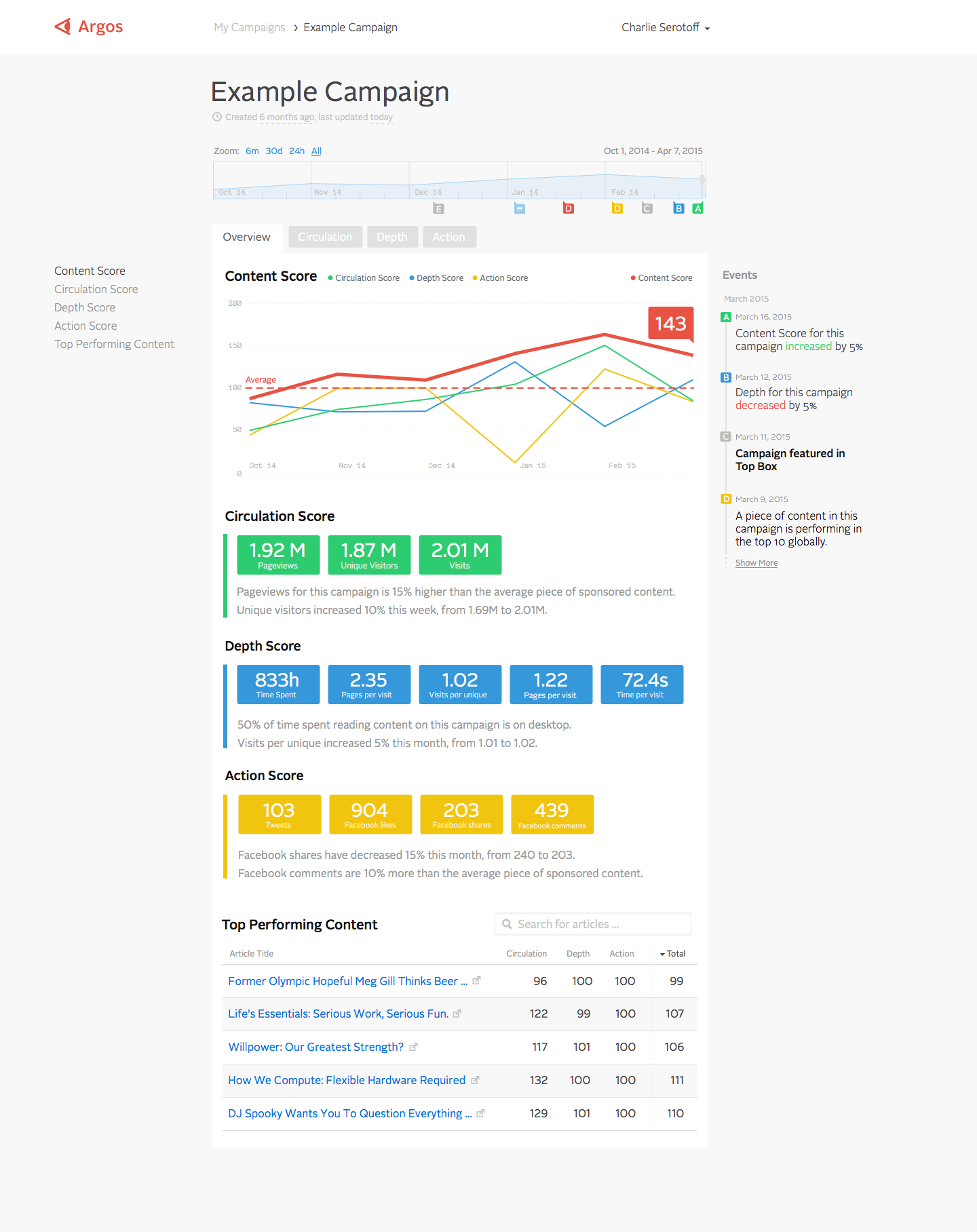
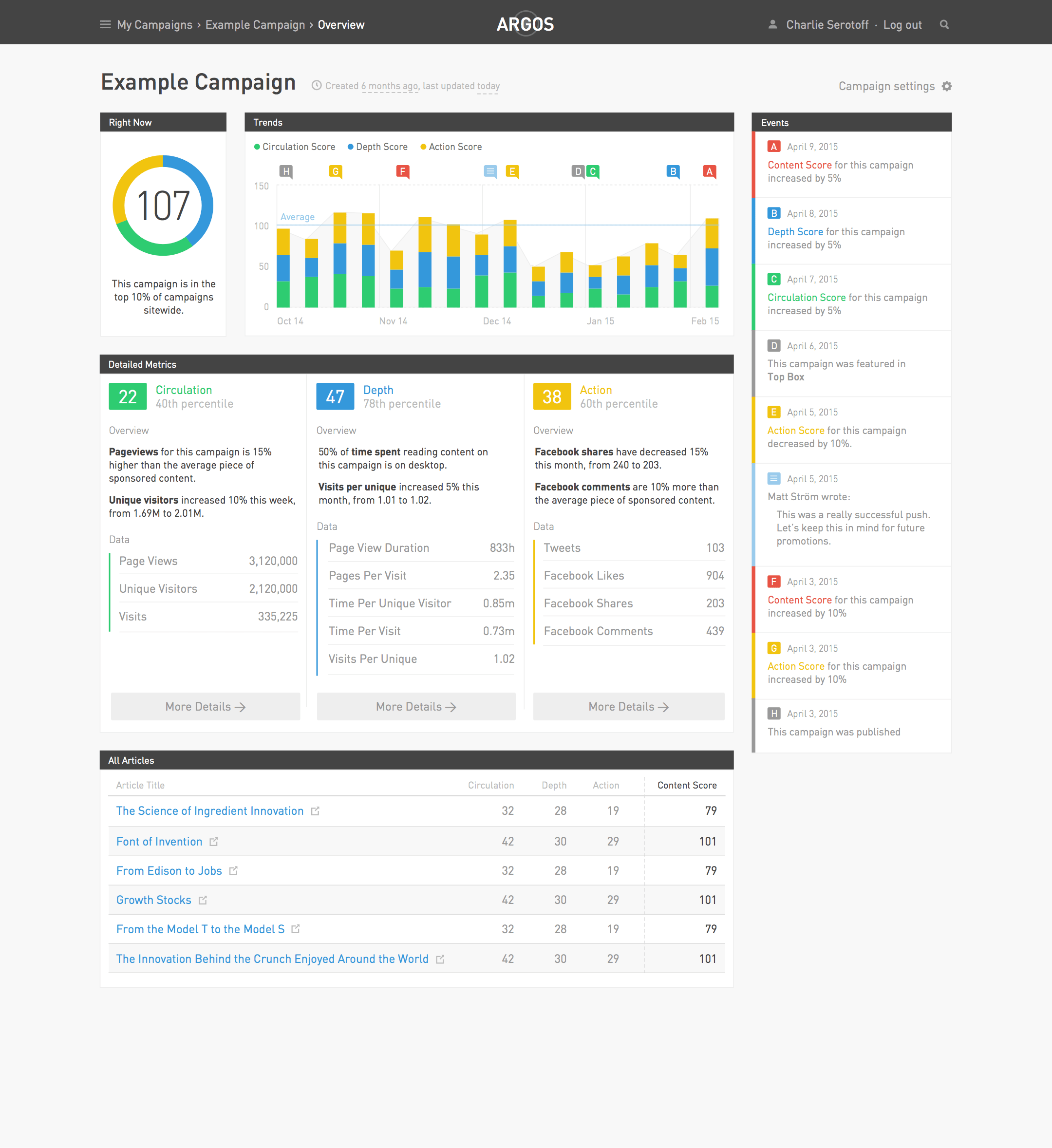
Later, the complexity of the components necessitated a more traditional dashboard layout, spanning multiple columns and allowing for more flexible hierarchy.
After 6 months of use, we had an opportunity to improve the design. We interviewed users and studied analytics data, and came to a few conclusions:
- The process of setting up a campaign was confusing and led to errors
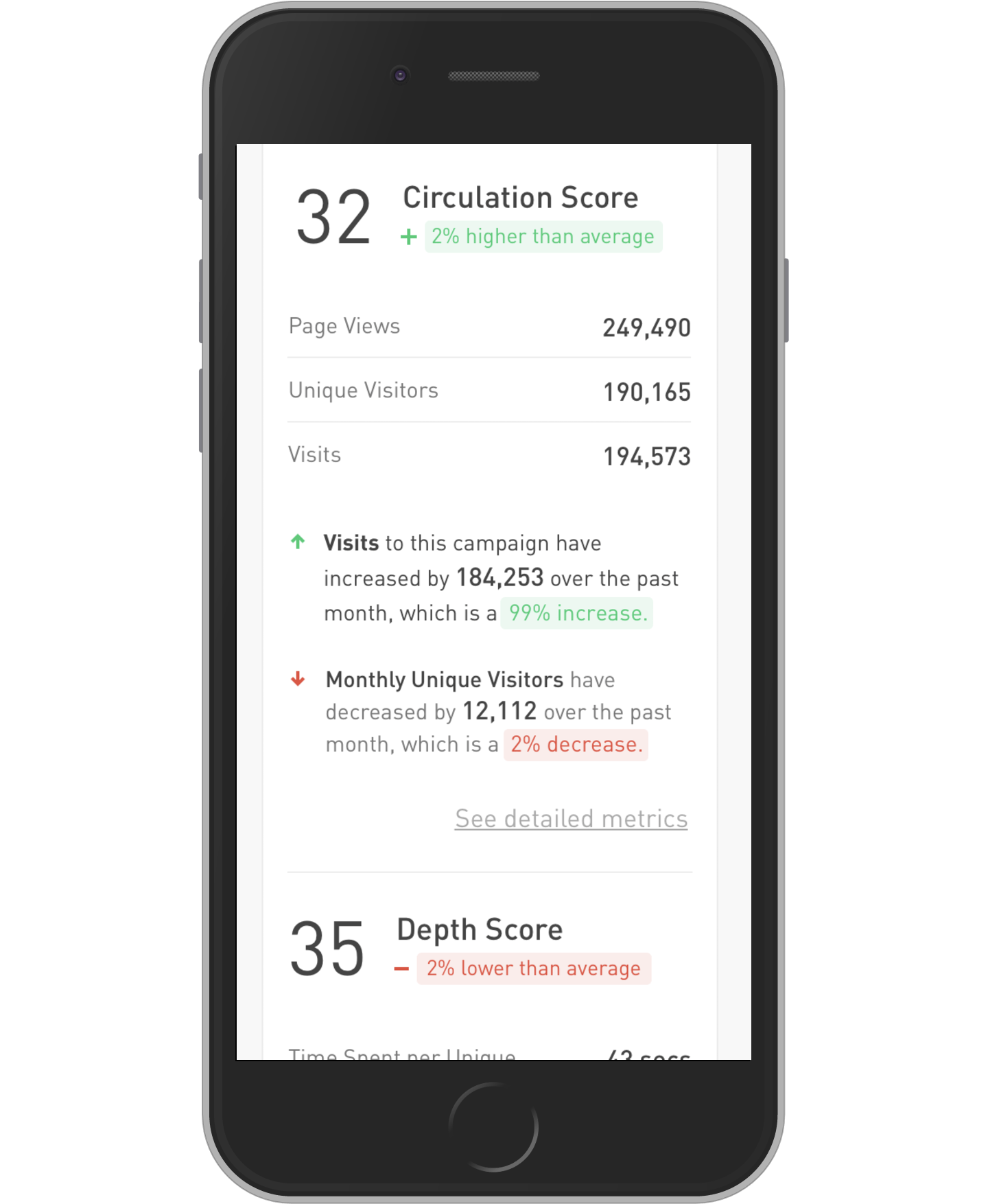
- Users found the raw numbers valuable, but wanted more context and insight. The question came up over and over again: “What does this mean?”
Seperately, I saw an opportunity to address a usability concern I had:
- Users with visual impairmnet would have trouble with the color-coded interface.
To tackle these three challenges, I led a refinement of the visual language.
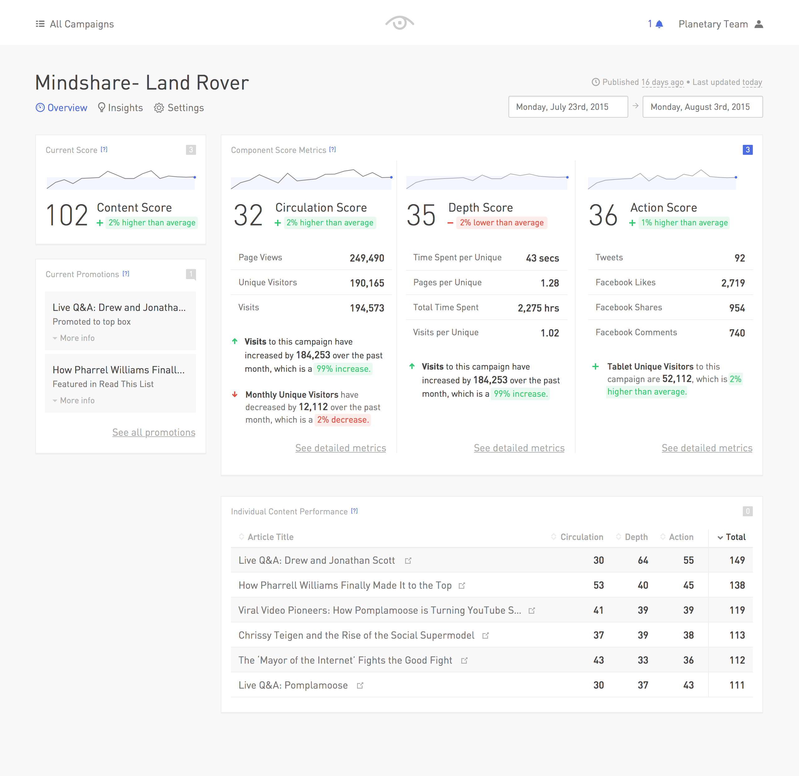
This redesign relied on one major guiding principal: When using color to encode meaning, always include a distinct secondary visual cue like an icon.