
I spend a lot of my day talking to myself. “Maybe this whole experience should just be a chat interface,” I think while brushing my teeth. “What if that component didn’t have borders?” I ask to nobody while cooking dinner. The office-less office doesn’t help; I’m nostalgic for folks walking by and seeing what’s on my screen, offering an unsolicited comment or saying later, “Ah, so that’s what you had zoomed in at 800% yesterday.” Besides, at the moment, Simple Health has a design team of one — me — so there aren’t any Slack threads for the latest font trends or design Twitter drama.
Even when I was on larger teams in real offices, design felt lonely. It took constant effort to create space for designers to share their work and safely give and receive critique. Creativity requires vulnerability, and designers spend most of their day exposed to scrutiny and interpretation. Collaboration between designers always yields great results, but it doesn’t come naturally, or easily.
And then there’s collaboration between designers and non-designers. To productively co-create with colleagues and customers requires steel-plated emotional armor. Even the best designers leave stakeholder workshops needing a hug. Once, when my boss asked me to lead a capital-D capital-S Design Sprint with a group of non-designers, I felt my life get shorter by a few months.
So over the years I’ve developed tools and techniques for opening up the design process to more folks in the safest way (emotionally and mentally) possible. I’ve run almost every one at Simple Health over the last six months. They’ve helped to bridge the gap between the isolation of the design process and the emotional intensity of collaboration.
I’d like to share one of these tools with you. Specifically, one that makes design research more collaborative. Broadening the community of research on your team not only improves the quality of the final design, but also builds empathy and trust with folks you might not otherwise have a relationship with.
Why design research?
Research isn’t the most common place for designers to collaborate. No, that distinction goes to critique (or review), that dreaded step of the design process where the designer has to offer her work up to folks for scrutiny and judgement. As a collaborative tool, critique has been sufficiently analyzed and how-to’d. I’ve written a few essays on the subject:
- A brief guide to design feedback
- How to get the best design feedback from your team
- Towards better creative feedback
And there’s a couple of books I’d recommend if you’re interested in going deeper on critique:
So this essay isn’t about critique. It’s about design research, the part at the beginning of the creative process, a phase where the stakes for collaboration are low and there isn’t any work to critique.
Where collaboration is concerned, focusing on the beginning of the process has a few advantages.
In the research phase, it’s easier to identify and discuss assumptions. Every participant in the design process — designer or not — brings some assumptions to the table. We all have some unvalidated notions of best practices, based on intuition or experience, not proven by research or data. At best, assumptions can be shortcuts to good design. At worst, they are blindspots that threaten to undermine our work.
As the design process rolls along, the line between unvalidated assumptions and validated ones gets blurred. When you’ve invested in a solution based on one of those unvalidated assumptions, it’s hard to take an honest look at its foundation for cracks.
Early collaborative research serves as a safe space to explore assumptions without the specter of sunk cost.
Generating questions and research topics is easier for non-design collaborators. I’ve spent a lot of time building up clout and rapport with my team. I want to be the expert, to have folks solicit my input, to be trusted to make the right decision. But when a project gets to the critique phase, it’s hard to square that role with the importance of incorporating feedback from all collaborators, experts or not.
That’s why the beginning of a project is ideal for collaboration: during the research phase, everyone is a beginner. Nobody is expected to have the answers, so we focus on generating questions instead. At this point, inexperience is a strength; asking the very most basic questions can lead to the best insights. It’s much easier to make space for non-design collaborators in early research than it is in later critiques.
It sets the tone for the rest of the project. There have been projects where, in the late stages of design, I realized we didn’t have enough collaborators. This sucks. Trying to bring in new stakeholders or designers for feedback can be painful when those collaborators haven’t been involved the whole time. Correcting course in the later stages of a project is a monumental task.
Promoting collaboration in the research phase ensures that your collaborators are along for the ride. It sets expectations that you’ll be including them every step of the way, and creates accountability — accountability is one of the biggest positive motivational drivers of collaboration.
Range Rover
I’ve always been on the hunt for a way to efficiently include an entire company in a design project. How can I give hundreds of people a megaphone for their ideas without the result being completely incomprehensible?
My current approach is a pretty good start. It’s a survey called Range Rover.
The goal of Range Rover is to have a large number of people evaluate a design or set of designs without needing to articulate precisely-worded ideas. There’s only one prompt on the survey: in the version I ran most recently, the prompt was “Please evaluate Simple Health’s current branding.”
The survey itself is a series of range inputs: range inputs consist of a slider that can move freely between two extremes. In the case of Range Rover, the two extremes are pairs of opposite adjectives: hot vs. cold, lighthearted vs. serious, soft vs. hard, and so on.
When I first ran this survey, I wrote all the adjectives myself. But I found that even the process of coming up with adjectives to test is a fun way to collaborate with stakeholders. Which goes to show: you can always start collaborating earlier.
Code the survey like this: the value of the adjective on the left is 0, on the right is 1. The slider starts at neutral, halfway between (0.5). The survey-taker shouldn’t see the exact value of the slider as they move it.1
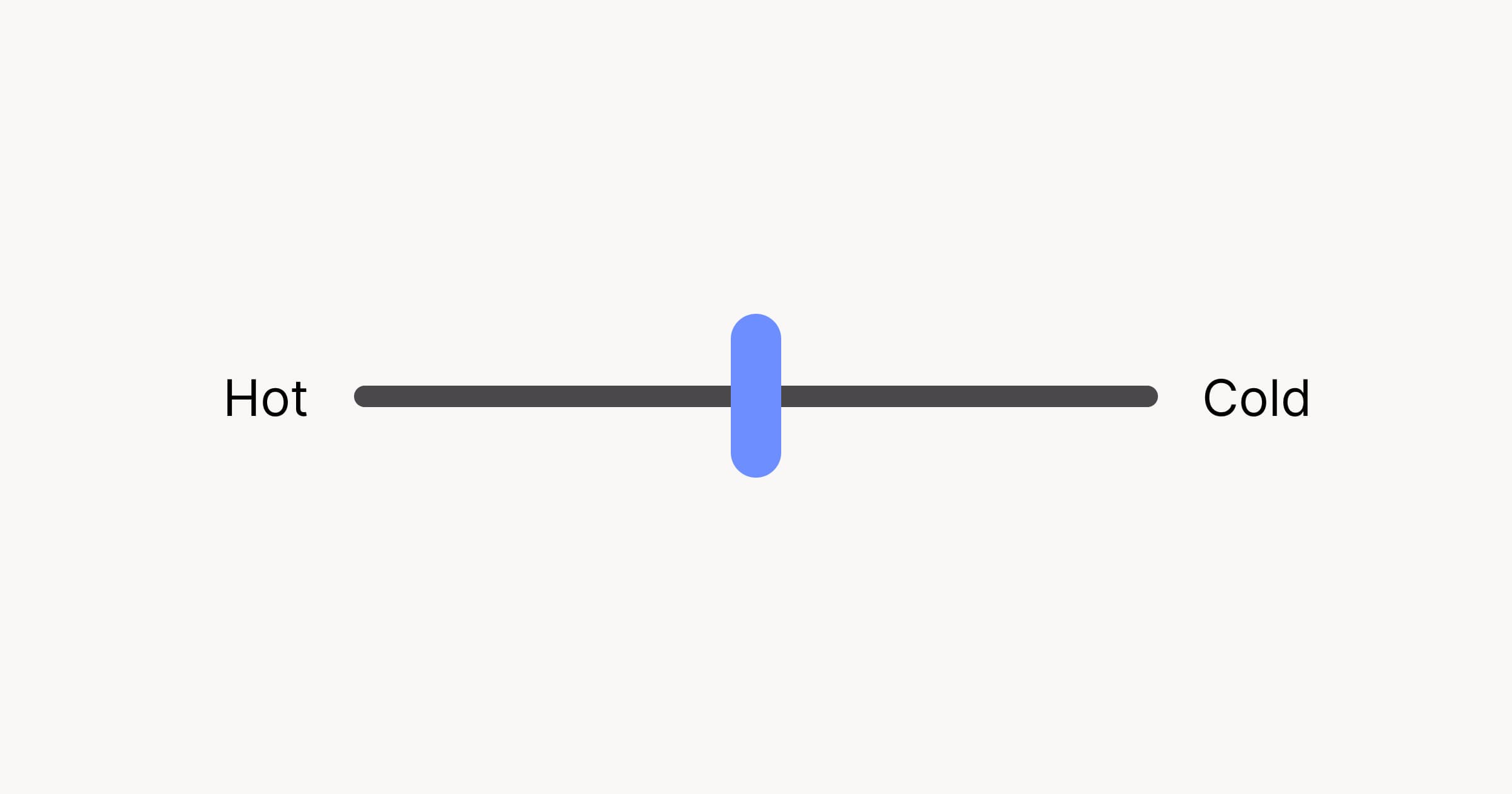
It’s quick to fill out: most folks will fill out a survey of 15 pairs of adjectives in less than two minutes. I put a gif of a dancing cat on the “Thank you page,” which is always a hit.
The lightweight nature of the survey means hundreds of collaborators (thousands? I’ve never tried) can contribute.
Once you get those hundreds of results, how do you use the data? Well, it’s important to try and tell a story with the data. To that end, there’s a few tools at your disposal.
Average value (aka mean)
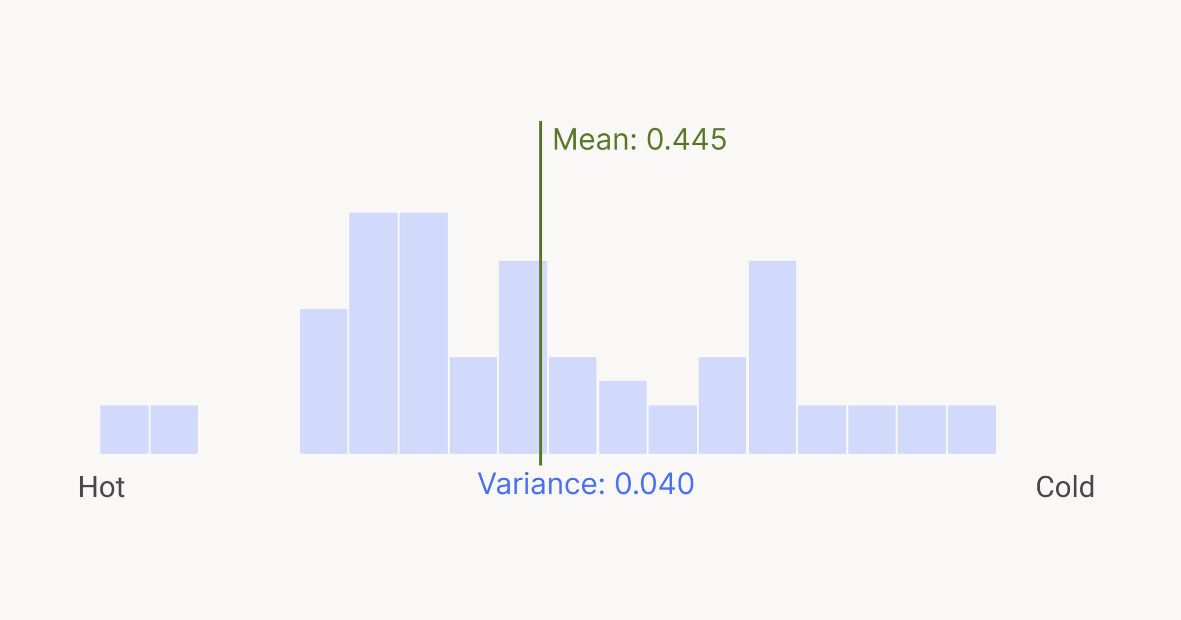
The easiest calculation to do is to simply average all the results for a given adjective pair. What you’ll get is a nice democratically-elected result. Say our slider has the word “quirky” on the left side and “serious” on the right. A slider pushed by most participants towards the left will yield an average (or, mean, as my high school math teacher would have us all know) like 0.15. You can say something like, “on average, participants think our brand is quirky.”
But averages aren’t the most informative kind of information. You’re rolling all of the data up into a single insight burrito; it’s a nice snack, but it’s hard to tell what all the individual ingredients are.
Spicier wisdom comes from deeper investigation.
Variance
Variance is, essentially, the level of disagreement between individual data points. For an adjective pair, low variance means that most people put the slider in the same place. High variance means there was a higher spread of values. The higher the variance is, the less confident you can be that the mean is a good representative of the group’s assessment.
Most spreadsheet software (Excel, Google Sheets, etc.) will calculate variance for you automatically.
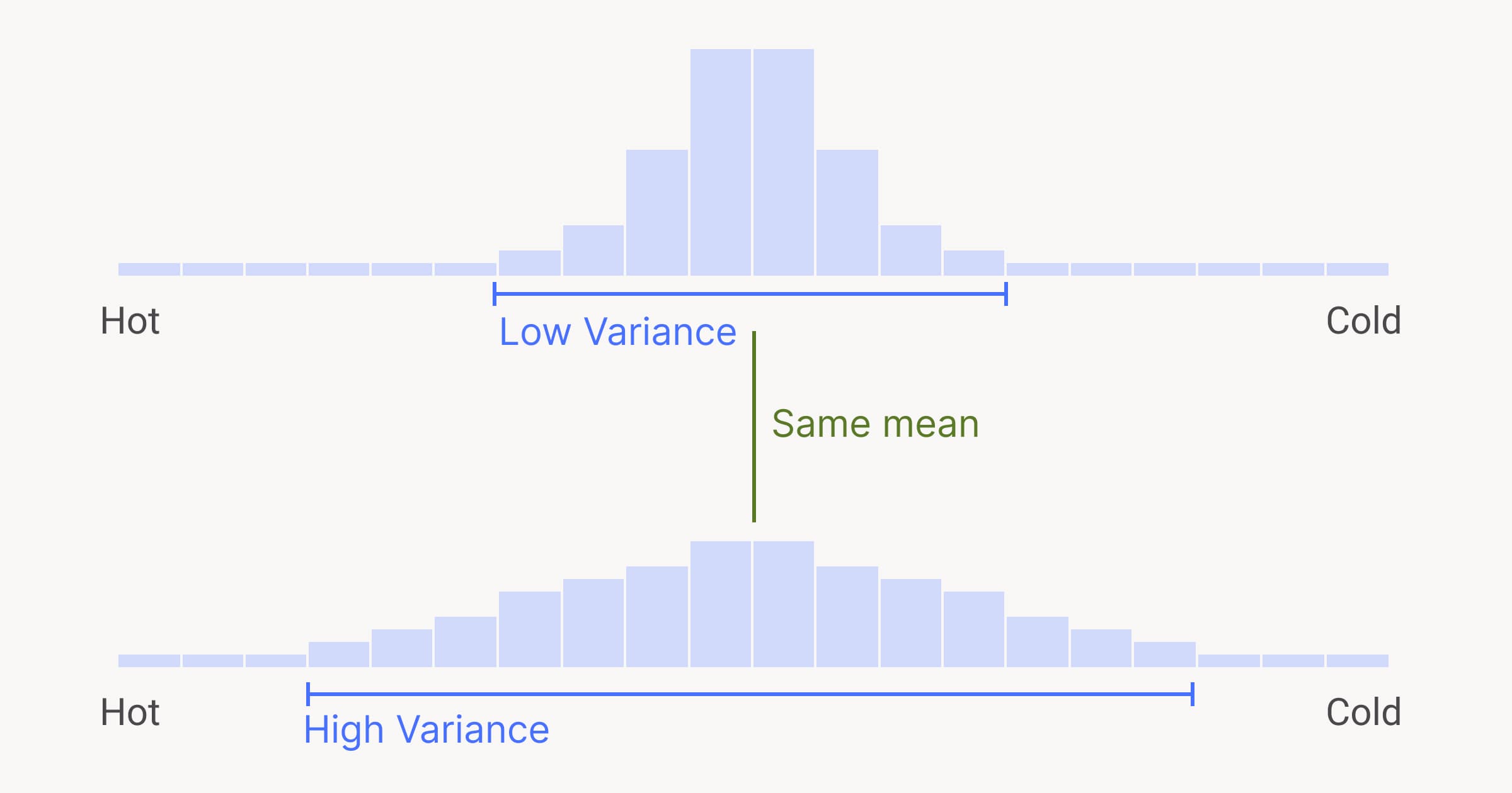
I think variance is fascinating: data with the same mean can have a different variance, which is just one example of how data can hide valuable insights. Variance tells a compelling story, one of agreement or (most likely) disagreement. If you limit your analysis to averages, you’ll lose the individual, human aspect of the data you’ve gathered.
Modality
Modality is a measure of how many “groups” there are in a data set. A bell curve is an example of unimodal, or one-group data. Data sets can have two groups, three, or more — because our survey isn’t multiple-choice, we need to look at modality to find any naturally-occurring groups.
Finding modality usually requires visualizing your data with a line or a bar chart.
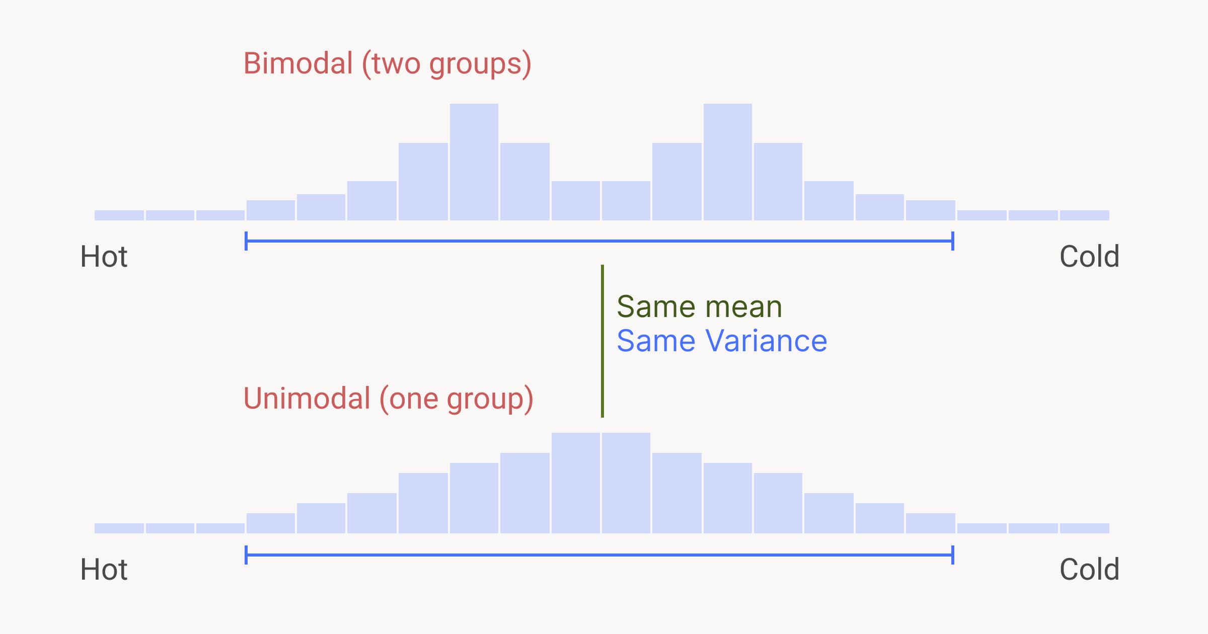
Here’s something wild: data with the same mean and same variance can have different modality. For instance, your data might have high variance — at first glance, you think that people don’t agree on the answer at all. But on further investigation, you might see that there are two tightly-grouped clusters. There’s actually low variance inside those clusters; there are two groups who agree with themselves but disagree with each other. This happens most often along organizational lines; for instance, the marketing team might see the brand in one light, whereas the engineering team has a different perspective.
The wisdom of the crowd
Including a broad range (get it?) of collaborators in gathering design research is just one step on the road to a more inclusive design process. But the step I look forward to the most is sharing the results of the research with the participants (and even non-participants). It’s great to reflect on how individual data points fit into a larger narrative.
Sharing your research can be a matter of simply summing everything up in an email or a Word/Google Doc. You can have a read-out meeting where you walk folks through the results. Or you could build a pretty website, like I tend to do when I have too much time on my hands.
Regardless of the form it takes, the aggregated output of your collaborative research is likely to be more insightful than any of its individual data points. This is a phenomenon called “the wisdom of the crowd,” in which the judgement of a group tends to be more accurate, reliable, or useful than the input of any of its individuals.2
The knowledge you share from your design research is a springboard for conversations about design. Encourage people who participated to share their reaction to the output: my favorite question is, “Did this surprise you?”
—
Collaborative design is tough. There’s all sorts of hurdles in the way of an inclusive and transparent environment for teamwork. At the very least, collaboration is a gauntlet for the ego; I usually come out of group design work with more than a few bruises. But in the safer waters of design research, I’ve found that my colleagues are kinder and more constructive. With care and intention, you can use the research phase as the pattern and foundation for powerful positive collaboration throughout the design process.
Results will be funky decimal values like 0.248983. That’s OK — the more open-ended the input, the more diverse (and useful) the results will be. ↩︎