It used to be easy to pick colors for design systems. Years ago, you could pick a handful of colors to match your brand’s ethos, or start with an off-the-shelf palette (remember flatuicolors.com?). Each hue and shade served a purpose, and usually had a quirky name like “idea yellow” or “innovation blue”. This hands-on approach allowed for control and creativity, resulting in color schemes that could convey any mood or style.
But as design systems have grown to keep up with ever-expanding software needs, the demands on color palette have grown exponentially too. Modern software needs accessibility, adaptability, and consistency across dozens of devices, themes, and contexts. Picking colors by hand is practically impossible.
This is a familiar problem to the Stripe design team. In “Designing accessible color systems,” Daryl Koopersmith and Wilson Miner presented Stripe’s approach: using perceptually uniform color spaces to create aesthetically pleasing and accessible systems. Their method offered a new approach to selection to enhance beauty and usability, grounded in scientific understanding of human vision.
In the four years since that post, Stripe has stretched those colors to the limit. The design system’s resilience through massive growth is a testament to the team’s original approach, but last year we started to see the need for a more flexible, scalable, and inclusive color system. This meant both an expansion of our color palette and a rethinking of how we generate and apply these colors to accommodate our still-growing products.
This essay will take you through my attempts to solve these problems. Through this process, I’ve created a tool for generating expressive, functional, and accessible color systems for any design system. I’ll share the full code of my solution at the end of the essay; it represents not just a technical solution but a philosophical shift in how we think about color in design systems, emphasizing the balance between creativity and inclusivity.
Why don’t the existing tools work?
In the past few years, I’ve come across dozens of tools that promise to generate color palettes for design systems. Some are simple, like Adobe Color, which generates color palettes based on a single input color, or even an image. Others are more complex, like Colorbox, which generates color scales based on a long list of parameters, easing curves, and input hues.
But I’ve found that each of these tools has critical limitations. Complex tools like Colorbox or color x color allow for a high degree of customization, but they require a lot of manual input and don’t provide guidelines for accessibility. Simple tools like Adobe’s Color and Leonardo provide more constraints and accessibility features, but they does so at the expense of flexibility and extensibility.
None of the tools I’ve found can integrate tightly with an existing design system; all are simply apps that generate an initial set of colors. None can respond to the unique constraints of your design system, or adapt as you add more themes, modes, or components.
That’s why I ended up going back to first principles, and decided to build up a framework that can be adapted to any codebase, design tool, or end user interface.
So what makes a good color palette?
To build palettes from first principles, we need a strong conceptual foundation. A great color palette is like a Swiss Army knife, built to address a wide array of needs. But that same flexibility can make the system unwieldy and clunky. Through years of working on design systems, two principles have emerged as a constant benchmark for quality color palettes: utility and consistency.
A color palette with high utility is vital for a robust design system, encompassing both adaptability and functionality. It should offer a wide array of shades and hues to cater to diverse use cases, such as status changes—reds for errors, greens for successes, and yellows for warnings—and interaction states like hovering, disabled, or active selections. It’s also essential for signifying actionable items like links and buttons. Beyond functionality, an adaptable palette enables smooth transitions between light, dark, and high contrast modes, supporting the evolution of your product and differing brand expressions. This ensures that your user interfaces remain consistent and recognizable across various platforms and usage contexts. Moreover, an adaptable palette underscores a commitment to accessibility—it should provide accessible contrast ratios across all components, accommodating users with visual impairments, and offer high-contrast modes that enhance visibility and functionality without sacrificing style.
Consistency is another crucial aspect of a well-designed color palette. Despite the diverse range of components and their variants, a consistent palette maintains a coherent visual language throughout the system. This coherence ensures that elements like badges retain a consistent visual weight, avoiding misleading emphasis, and the relative contrast of components remains balanced between dark and light modes. This consistency helps preserve clarity and hierarchy, further enhancing the user experience and the overall aesthetics of the design system.
As you’ll see, even simple questions about these goals reveals a deep rabbit hole of possible solutions.
Through the looking glass: perceptual uniformity
The principles of utility and consistency make selecting a color palette more complex. There’s a question at the heart of both constraints: what makes two colors look different? We have an intuitive sense that yellow and orange are more similar than green and blue, but can we prove it objectively? Scientists and artists have spent the last decade puzzling this out, and their answer is the concept of perceptual uniformity.
Perceptual uniformity is rooted in how our eyes work. Humans see colors because of the interaction between wavelengths of light and cells in our eyes. In 1850, before we could look at cells under a microscope, scientist Hermann von Helmholtz theorized that there were three color vision cells (now known as cones) for blue, green, and red light.
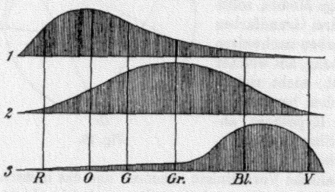
Most modern screens depend on this century-old theory, mixing red, green, and blue light to produce colors. Every combination of these colors produces a distinct one; 10% red, 50% green, and 25% blue light create the cartoon green of the Simpson’s yard. 75% red, 85% green, and 95% blue is the blindingly pale blue of the snow in Game of Thrones.
Von Helmholtz was amazingly close to the truth, but until 1983, we didn’t have a full understanding of the exact way that each cell in our eyes responds to light. While it’s true that we have three kinds of color vision cells, and that each responds strongly to either red, green, or blue light, the full mechanism of color vision is much more nuanced. So, while it’s technologically simple to mix red, green, and blue lights to reproduce color, the red, green, and blue coordinate system — the RGB color space — isn’t perceptually uniform.
Picking the right color space
Despite not being perceptually uniform, many design systems still use RGB color space (and its derivative, HSL space) for picking colors. But over the past century, scientists and artists have invented more useful ways to map the landscape of color. Whether it’s capturing skin tones accurately in photographs or creating smooth gradients for data visualization, these different color spaces give us perceptually uniform paths through a gamut.
Lab is an example of a perceptually uniform color space. Developed by the International Commission on Illumination, or CIE, the Lab color space is designed to be device-independent, encompassing all perceivable colors. Its three dimensions depict lightness (L), and color opponents (a and b) — the latter two varying between green-red and blue-yellow axes respectively. This makes it useful for measuring the differences between colors. However, it’s not very intuitive; for example, unless you’ve spent a lot of time working with the lab color space, it’s probably hard to imagine what a pair of (a, b) values like (70, -15), represents.1
LCh (Luminosity, Chroma, hue) is more ergonomic, but still perceptually uniform color space. It’s a cylindrical color space, which means that along the hue axis, colors change from red to blue to green, and then back to red — like traveling on a roundabout. Along the way, each color appears equally bright and colorful. Moving along the luminosity axis, a color appears brighter or dimmer but equally colorful, like adjusting a flashlight’s distance from a painted wall. Along the chroma axis, a color stays equally bright but looks more or less colorful, like it’s being mixed with different amounts of gray paint.
LCh trades off some of lab’s functionality for being more intuitive. But LCh can be clunky, too, because the C (chroma) axis starts at 0 and don’t have a strict upper limit. Chroma is meant to be a relative measure of a color’s “colorfulness”. Some colors are brighter and more colorful than others: is a light aqua blue as colorful as a neon lime green? How does a brick red compare to a grape soda purple? The chroma scale is meant to make these comparisons possible.
But try for a moment to imagine a sea green as rich and deep as an ultraviolet blue. Lab and LCh both let you specify these “impossible” colors that don’t have a real-world representation. In technical parlance, they’re called “out of gamut,” since they can’t be produced by screens, or seen by human eyes.
The existence of out-of-gamut colors makes it hard to reliably build a color system in LCh or lab color space. Finding colors with consistent properties is a manual process; when Stripe was building its previous color system using lab, the team made a specialized tool for visualizing the boundaries of possible colors, allowing designers to tweak each shade to maximize its saturation. This isn’t a tenable solution for most teams; what if there was a color space that combined the simplicity of RGB and HSL with the perceptual uniformity of lab and LCh?
Björn Ottosson, creator of the OKLab color space, did just that in his blog post “OKHsv and OKHsl — two new color spaces for color picking.” OKHsl is similar to Lch in that it has three components, one for hue, one for colorfulness, and one for lightness. Like LCh, the hue axis is a circle with 360 degrees. The lightness axis is similar to Lch’s luminosity, going from 0 to 1 for every hue. In place of Lch’s chroma channel, though, OKHsl uses an absolute saturation axis that goes from 0 to 1 for every hue, at every lightness. 0 represents the least saturated color (grays ranging from white to black), and 1 represents the most saturated color available in the sRGB gamut.
Practically, OKHsl allows for easier color selection and manipulation. It bypasses the issues found in LCh or lab, creating an intuitive, straightforward, and user-friendly system that can produce the desired colors without worrying about out-of-gamut colors. That’s why it’s the best space for generating color pallettes for design systems.
Using OKHsl
Practically speaking, to use OKHsl, you need to be able to convert colors to and from sRGB. This is a fairly straightforward calculation, but it’s not built into most design tools. Bjorn Ottosson linked the javascript code to do this conversion in his blog post, and the library colorjs.io will soon have support for OKHsl.
Going forward, I’ll assume you have a way to convert colors to and from OKHsl. If you don’t, you can use the code I’ve written to generate a color palette in OKHsl, and then convert it to sRGB for use in your design system.
First steps with generated scales
To get started generating our color scales, we need a few values:
- The hue of the color we want to generate
- The saturation of the color we want to generate
- A list of lightness values we want to generate
For example, we can generate a cool neutral color scale by choosing these values:
- Hue: 250
- Saturation: 5
- Lightness values:
- Light: 85
- Medium: 50
- Dark: 15
Using those values to pick colors in the OKHsl color space, we get the following palette:
| Neutral | |
|---|---|
| OKHsl | sRGB Hex |
| 250, 5, 85 | #d2d5d8 |
| 250, 5, 50 | #73787c |
| 250, 5, 15 | #212325 |
We can do the same thing for all our colors, picking numbers to build out the entire system.
| Neutral | Blue | ||
|---|---|---|---|
| OKHsl | sRGB Hex | OKHsl | sRGB Hex |
| 250, 5, 85 | #d2d5d8 | 250, 90, 85 | #b6d9fd |
| 250, 5, 50 | #73787c | 250, 90, 50 | #1a7acb |
| 250, 5, 15 | #252628 | 250, 90, 15 | #022342 |
| Green | Red | Yellow | |||
|---|---|---|---|---|---|
| OKHsl | sRGB Hex | OKHsl | sRGB Hex | OKHsl | sRGB Hex |
| 145, 90, 85 | #6af778 | 20, 90, 85 | #fec3ca | 100, 90, 85 | #eed63d |
| 145, 90, 50 | #388b3f | 20, 90, 50 | #d32d43 | 100, 90, 50 | #877814 |
| 145, 90, 15 | #0c2a0e | 20, 90, 15 | #45060f | 100, 90, 15 | #282302 |
Scaling up
For bigger projects, you’ll often need more than just three shades per color. Choosing the right number can be tricky: too few shades limit your options, but too many can cause confusion.
This can seem daunting, particularly in the early stages of your design system. But there’s a method to simplify this: use a consistent numbering system, ensuring your color choices remain versatile no matter how your system evolves.
This system is often referred to as ‘magic numbers.’ If you’re familiar with Tailwind CSS or Material Design, you’ve seen this in action. Instead of naming shades like ‘light’ or ‘dark,’ each shade gets a number. For instance, in Tailwind, the scale goes from 0 to 1,000, and in Material Design, it’s 0 to 100. The extremes often correspond to near-white or near-black, with middle numbers denoting pure hues.
The beauty of this system is its flexibility. If you initially use shades named ‘red 500’ and ‘red 700’, and later need something in between, you can simply introduce ‘red 600’. This keeps your design adaptable and intuitive. Another bonus of magic numbers is that we can often plug the number directly into a color picker to scale the lightness of the shade. That’s why, for the rest of this essay, I’ll call these scale numbers.
For example, if we wanted to create a more extensive color scale for our blues, we could use the following values in the OKHsl color space:
| Blue | ||
|---|---|---|
| Scale Number | OKHsl | sRGB Hex |
| 0 | 250, 90, 100 | #ffffff |
| 10 | 250, 90, 90 | #cfe5fe |
| 20 | 250, 90, 80 | #9dccfd |
| 30 | 250, 90, 70 | #68b1f9 |
| 40 | 250, 90, 60 | #3395ed |
| 50 | 250, 90, 50 | #1b7acb |
| 60 | 250, 90, 40 | #0f60a3 |
| 70 | 250, 90, 30 | #08477c |
| 80 | 250, 90, 20 | #032f55 |
| 90 | 250, 90, 10 | #01172e |
| 100 | 250, 90, 0 | #000000 |
We’ve turned the scale number into the lightness value with the function
It turns out that using functions and formulas in combination with scale numbers is a powerful way to create expressive color scales that can power beautiful design systems.
Making scales expressive: Leveraging hue and saturation
One advantage of scale numbers is the ability to plug them directly into a color picker to dictate the lightness of a shade. But scale numbers really show their usefulness and versatility when you leverage them across every component of your color system. That means venturing beyond lightness to explore hue and saturation, too.
Hue
When using scale numbers to control lightness, it’s easy to assume hue and saturation will behave consistently across the lightness range. However, our perception of color doesn’t work that simply.
Hue can appear to shift dramatically between light and dark shades of the same color due to a phenomenon called the Bezold–Brücke effect: colors tend to look more purplish in shadows and more yellowish in highlights.
So if we want to maintain consistent hue perception, we can use scale numbers for adapting the hues of our color scales. As lightness decreases, blues and reds should shift slightly towards more violet/purple tones to counteract the Bezold–Brücke effect. Likewise, as lightness increases, yellows, oranges, and reds should shift towards more yellowish hues. 23


In both examples above, we’ve used the scale number to shift the hue slightly as the lightness increases. This looks like the following formula:
By making hue a function of lightness, with the scale number adjusting hue accordingly, hues look more consistent and harmonious across the entire scale. The shifts don’t need to be large – even subtle hue variations of a few percentage points can perceptually compensate for natural hue shifts with changing brightness.
Saturation and Chroma
From our understanding of the CIE LCh color space and its sibling, the OKHsl color space, we know that colors generally attain their peak chroma around the middle of the lightness scale.4
In design, this presents a fantastic opportunity. By designing our color scales such that the midpoint is the most chromatically rich, we can make sure that our colors are the most vibrant and saturated where it matters most. Conversely, as we veer towards the lightness extremes, we can have chroma values that taper off, ensuring that our brightest and darkest shades remain subtle and balanced.
OKHsl gives us a saturation component that goes from 0% to 100% of the possible chroma at a given hue and lightness value. We can take advantage of this by using the normalized scale number as an input to a function that goes from a minimum saturation to a maximum and back again.


In practice, the formula for achieving this looks like this:
You can add a few terms to adjust the minimum and maximum saturation if you’d like to adjust the scale further:
Neutrals, for example, don’t need a high maximum saturation. But most colors do well moving between 0% and 100% saturation.
In practice: Crafting colors with functions
Let’s put this into practice and generate an extensive color scale with only a handful of functions. Functions allow us to build a flexible framework that is resilient to change and can be easily adapted to new requirements; if we need to add colors, tweak hues, or adjust saturation, we can do so without rewriting the entire system.
Pick base hues
First, let’s pick a handful of base hues. At the very least, you’ll need a blue for interactive elements like links and buttons, and green, red, and yellow for statuses. Your neutrals need a hue, too; though it won’t show up much, a cool neutral and a warm neutral have very different effects on the overall system.
| Neutral | Blue | Green | Red | Yellow | |
|---|---|---|---|---|---|
| Base hue (Hbase) | 250 | 250 | 145 | 20 | 70 |
Add functions for hue, saturation, and lightness
Next, let’s use the functions we came up with earlier to indicate how the colors should change depending on scale numbers.
| Neutral | Blue | Green | Red | Yellow | |
|---|---|---|---|---|---|
| Base hue (Hbase) | 250 | 250 | 145 | 20 | 70 |
| Hue function | |||||
| Saturation function | |||||
| Lightness function | |||||
The hue function is a constant for neutrals, and for the colors we use the function that accounts for the Bezold–Brücke shift.
As for saturation, the neutral colors have a maximum saturation of 20% instead of the full 100%; the rest of the colors use the function that goes from 0% to 100% and back.
The lightness function is the same for all colors.
Calculate the colors for each scale number
Now let’s let the math work its magic. For each scale number, for every color, we have all the information we need from the base hue, hue function, saturation function, and lightness function.
| sRGB Hex | |||||
|---|---|---|---|---|---|
| Scale Number | Neutral | Blue | Green | Red | Yellow |
| 0 | #ffffff | #ffffff | #ffffff | #ffffff | #ffffff |
| 10 | #e0e3e6 | #dae4f0 | #d8e8d4 | #f9d1d6 | #f7e9a3 |
| 20 | #bfc8d1 | #aacaf1 | #9adb90 | #f1b5b7 | #ebbe83 |
| 30 | #9fadbd | #73aff6 | #67c55b | #f7838c | #e09c34 |
| 40 | #8193a6 | #2e92f9 | #39ac30 | #fa405e | #c3810a |
| 50 | #67798c | #0077d8 | #009100 | #dd0042 | #a26900 |
| 60 | #506070 | #065faa | #227021 | #ae0f33 | #815304 |
| 70 | #3c4752 | #0e477c | #255125 | #7e1a28 | #5f3e0b |
| 80 | #292f35 | #12304d | #1c351c | #4e1b1e | #3e290f |
| 90 | #141619 | #0d1722 | #101910 | #221111 | #1d150b |
| 100 | #000000 | #000000 | #000000 | #000000 | #000000 |
Of course, this palette is fairly basic and might not be optimal for your needs. But using formulas and functions to calculate colors from scale numbers has a powerful advantage over manually picking each color; you can make tweaks to the formulas themselves and instantly see the entire palette adapt.
Making scales adaptive: Using background color as an input
Today, color modes like dark mode and high-contrast accessibility mode are table stakes in design systems. So, if you’re picking colors manually, you have to pick an additional 50 colors for each mode, carefully balancing the unique perception of color against each different background.
However, with the functions-and-formulas approach to picking colors, we can abstract a color palette to respond to any background color we might want to apply. Let’s go back to the lightness formula we used in the previous palettes:
Using this formula, the lightness will decrease as the scale number increases. In dark mode, we want the opposite: lightness should increase as the scale number increases. We can use a more detailed formula to switch the direction of our scale if the lightness of a background color is less than a specific value:
The “Yb” in this equation is the background color’s Y value in the XYZ color space. As I explained at the beginning of this essay, color spaces are different ways of mapping all the colors in a gamut; XYZ is an extremely precise and comprehensive color space. While the X and Z components don’t map neatly to phenomenological aspects of a color (like a and b in the LAB color space), the Y component represents the luminosity of a color.
You may be wondering why we’re using another color space (in addition to OKHsl) to dictate lightness. This is because the WCAG (Web Content Accessibility Guidelines) color contrast algorithm compares Y values in XYZ space, which will be more relevant in the next section.
A color with a Y value of 0.18 will have the particular quality of passing WCAG contrast level AA5 on both pure white ( #ffffff) and pure black ( #000000). That makes it a good test to see if a color is a light background (Yb > 0.18) or a dark background (Yb < 0.18).
Using this equation for our color system, we can now get both dark mode and light mode colors, calculated automatically based on the background color we choose.
The color palette calculated with a background color of #000000 (Yb = 0)
| sRGB Hex | |||||
|---|---|---|---|---|---|
| Scale Number | Neutral | Blue | Green | Red | Yellow |
| 0 | #000000 | #000000 | #000000 | #000000 | #000000 |
| 10 | #141619 | #0e1722 | #10190f | #221112 | #1c150b |
| 20 | #292f35 | #132f4f | #1e351a | #4e1a20 | #3d2a0f |
| 30 | #3c4752 | #10467f | #275122 | #7e192b | #5e3e0b |
| 40 | #506070 | #075eac | #25701e | #ae0e36 | #805304 |
| 50 | #67798c | #0077d8 | #009100 | #dd0042 | #a26900 |
| 60 | #8193a6 | #2993f8 | #35ac35 | #fa405c | #c4810a |
| 70 | #9fadbd | #6fb0f6 | #61c660 | #f78489 | #e29b35 |
| 80 | #bfc8d1 | #a7caf1 | #96db94 | #f1b5b5 | #ecbd86 |
| 90 | #e0e3e6 | #d9e4f0 | #d6e9d6 | #f0dedd | #eee0d1 |
| 100 | #ffffff | #ffffff | #ffffff | #ffffff | #ffffff |
Making scales accessible: Building in the WCAG contrast calculation
One of the most helpful aspects of scale numbers is that they can simplify accessibility substantially. The first time I saw this feature was with the US Web Design System’s (USWDS) design tokens.The USWDS color tokens have scale numbers from 0–100; using any tokens that have a scale number of 50 or more guarantees that those colors will meet the WCAG color contrast criteria at AA level.
This makes designing accessible interfaces much easier. Instead of manually running each color pairing through a color contrast check, you can compare the scale numbers of the design tokens and instantly know if the combination meets accessibility criteria.
When I first set out to build out a system of functions for Stripe’s color palette, this was the most daunting part of the challenge. Going in, I wasn’t even sure if it was possible to systematically target contrast ratios across all hues. However, after seeing the technique used in Adobe’s Leonardo, I had some degree of hope that such a function existed. After many false starts and dead ends, I found the right set of operations.
Step 1: Calculate a target contrast ratio based on scale step
Stripe’s color scales follow the lead of the USWDS; when scale numbers differ by 500 or greater, those two colors conform to the AA-level contrast ratio of 4.5:1. This means that when neutral.500 is used on top of neutral.0 (or vice versa), the color combination should be accessible.
To accomplish this with calculated colors, it’s important to understand how WCAG’s contrast ratio is measured. A contrast ratio like 4.5:1 is the output ® of the following formula, which the WCAG calls “relative luminance”:6
In this equation, L1 is the luminance (i.e., the Y value of the color in XYZ color space) of the lighter color, and L2 is the luminance of the darker color.
So how do we use this knowledge to transform scale steps into contrast ratios? Well, we know step 0 and 500 need to have a ratio of 4.5. Step 100 and step 600 also need to have a ratio of 4.5, and so on, up the scale. This is a feature of exponential equations; equally-spaced points along the function have consistent ratios. Exponential equations also model the growth of a population, or the spread of a virus. It happens that luminosity is also an exponential function of scale step, which shouldn’t be surprising if you know a bit of calculus.
Exponential functions take the form
And if browsers were perfect pieces of software, that would be that. But color in web browsers is a tricky technical problem. Specifically, when you convert an RGB color like rgb(129.3, 129.3, 129.3) to a hex color, it’s rounded off; the result is #818181, which is exactly rgb(129, 129, 129). The formula we derived,
Therefore, in testing this function, I’ve found that adding a little extra contrast to the overall system helps guard against rounding errors. The final formula I used to calculate the contrast ratio from a scale step is as follows:
Where r(x) is the target contrast ratio and x is a number from 0 to 1 that represents the scale number. If your scale numbers (like Stripe’s) goes from 0 to 1,000, then a scale number of 500 correlates to x=0.5.
Step 2: Calculate lightness based on a target contrast ratio
Now that we have a function to calculate a contrast ratio based on our scale number, let’s return to the relative luminance equation:
If we solve this equation for L2, we get an equation for the luminosity of a color with the desired contrast ratio with a given color.
This is true as long as L1 is greater than L2. Put another way, this covers cases where we’re generating a darker color than our given (background) color. For the opposite case, we can use the same formula, solved for L1 instead of L2. This gets us the following piecewise equation:
As explained earlier, the 0.18 in this equation represents the luminosity of “middle gray,” a color equally contrasting with #000000 and #ffffff; Each case depends on whether the background color is dark or light.7
So, for example, if I want a foreground to have a 4.5:1 contrast ratio with the background color, I can calculate the luminosity of that color by inputting the luminosity of the background as Yb and the contrast ratio as 4.5. If the background is #ffffff, which has a luminosity of 1, Yf comes out to 0.183.
We can substitute in our function for r(x) to get the following:
This is a function that takes:
- A number from 0 to 1 that represents a scale number, and
- The Y value of a background color, and provides the Y value (i.e., luminance) of a color at the given scale number.
Step 3: Translate from XYZ Y to OKHsl L
Despite its scientific accuracy, XYZ is not a great colorspace to work in for generating color scales for design systems — while we can step through the Y values in a fairly straightforward way, calculating X and Z values of a given color requires matrix multiplication. Instead, we can translate XYZ’s Y value into OKHsl’s l value with the following two-step process:
First, we can use the following formula to convert the Y value to the lightness value in lab:8
Then, OKHsl uses a “toe” function to map the lab lightness value to a perceptually accurate lightness value. Essentially it adds a little space to the dark end of the spectrum. This function is a little complicated:
The math gets a lot more manageable if we put it all into a javascript function:
const YtoL = Y => {
    if (Y <= 0.0088564516) {
        return Y * 903.2962962;
    } else {
        return 116 * Math.pow(Y, 1/3) - 16;
    }
}

const toe = l => {
    const k_1 = 0.206
    const k_2 = 0.03
    const k_3 = (1+k_1)/(1+k_2)

    return 0.5*(k_3*l - k_1 + Math.sqrt((k_3*l - k_1)*(k_3*l - k_1) + 4*k_2*k_3*l))
}

const computeScaleLightness = (scaleValue, backgroundY) => {
    let foregroundY;
    if (backgroundY > 0.18) {
        foregroundY = (backgroundY + 0.05) / Math.exp(3.04 * scaleValue) - 0.05;
    } else {
        foregroundY = Math.exp(3.04 * scaleValue) * (backgroundY + 0.05) - 0.05;
    }

    return toe(YtoL(foregroundY));
}
The function computeScaleLightness takes two values, the normalized scale value and the Y value of your background color, and returns an OKHsl L (lightness) value for the color at that scale step.
With this, we have all the pieces we need to generate a complete accessible color palette for any design system.
Putting it all together: All the code you need
Now we have all the components to write a complete color generation library.
// utility functions
const YtoL = (Y) => {
  if (Y <= 0.0088564516) {
    return Y * 903.2962962;
  } else {
    return 116 * Math.pow(Y, 1 / 3) - 16;
  }
};

const toe = (l) => {
  const k_1 = 0.206;
  const k_2 = 0.03;
  const k_3 = (1 + k_1) / (1 + k_2);

  return (
    0.5 *
    (k_3 * l -
      k_1 +
      Math.sqrt((k_3 * l - k_1) * (k_3 * l - k_1) + 4 * k_2 * k_3 * l))
  );
};

const normalizeScaleNumber = (scaleNumber, maxScaleNumber) =>
  scaleNumber / maxScaleNumber;

// hue, chroma, and lightness functions
const computeScaleHue = (scaleValue, baseHue) => baseHue + 5 * (1 - scaleValue);

const computeScaleChroma = (scaleValue, minChroma, maxChroma) => {
  const chromaDifference = maxChroma - minChroma;
  return (
    -4 * chromaDifference * Math.pow(scaleValue, 2) +
    4 * chromaDifference * scaleValue +
    minChroma
  );
};

const computeScaleLightness = (scaleValue, backgroundY) => {
  let foregroundY;
  if (backgroundY > 0.18) {
    foregroundY = (backgroundY + 0.05) / Math.exp(3.04 * scaleValue) - 0.05;
  } else {
    foregroundY = Math.exp(3.04 * scaleValue) * (backgroundY + 0.05) - 0.05;
  }

  return toe(YtoL(foregroundY));
};

// color generator function
const computeColorAtScaleNumber = (
  scaleNumber,
  maxScaleNumber,
  baseHue,
  minChroma,
  maxChroma,
  backgroundY,
) => {
  // create an OKHsl color object; this might look different depending on what library you use
  const okhslColor = {};
  // normalize scale number
  const scaleValue = normalizeScaleNumber(scaleNumber, maxScaleNumber);
  // compute color values
  okhslColor.h = computeScaleHue(scaleValue, baseHue);
  okhslColor.s = computeScaleChroma(scaleValue, minChroma, maxChroma);
  okhslColor.l = computeScaleLightness(scaleValue, backgroundY);
  // convert OKHsl to sRGB hex; this will look different depending on what library you use
  return convertToHex(okhslColor);
};
For this code to work, you’ll need a library to convert from OKHsl to sRGB hex. The upcoming version of colorjs.io supports this, as does culori. I’ve marked where that matters, in case you’d like to use a different color conversion utility.
What does it look like in practice?
Here are some examples of the same design in a number of themes, with different background colors:
