Poor tables. Where did they go wrong?
After being the bread and butter of the web for most of its early history, tables were cast aside by many designers for newer, trendier layouts. But while they might be making fewer appearances on the web these days, data tables still collect and organize much of the information we interact with on a day-to-day basis.
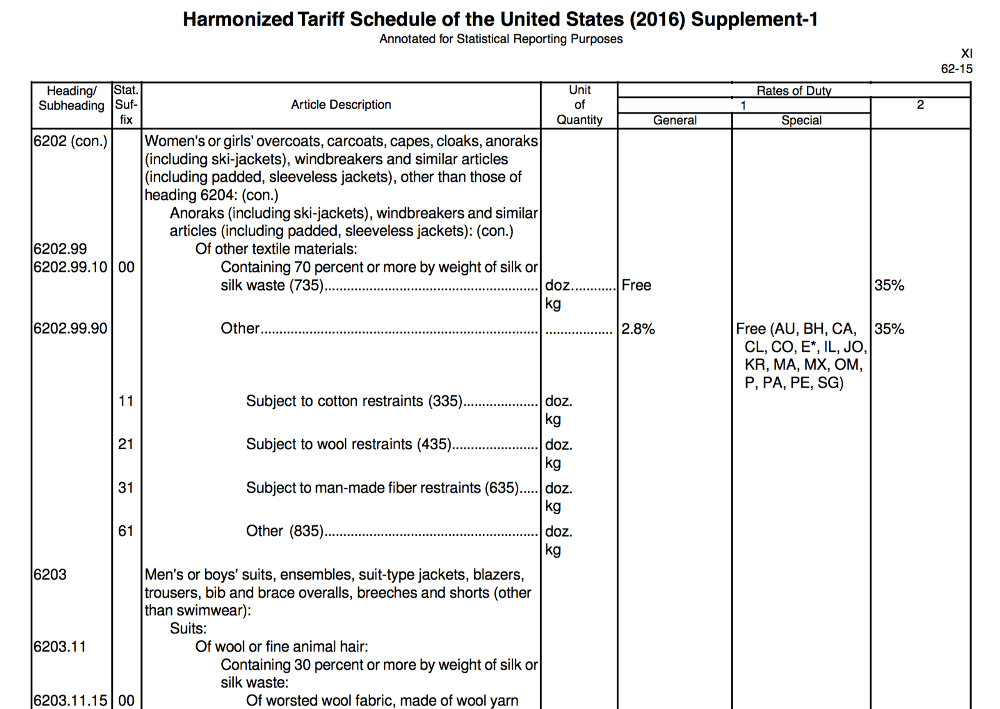
For instance, there’s what I consider to be the mother of all tables: The United States’ “Harmonized Tariff Schedule,” a table that stretches over 3,550 pages and lists every single good that can be imported into the US, including such thrilling entries as “Men’s or boys’ overcoats, carcoats, capes, cloaks, anoraks (including ski-jackets), windbreakers and similar articles (including padded, sleeveless jackets).”
The ire raised by data tables is due, no doubt, to just how awful they can look when they’re not well designed. The design of a table is its linchpin: if it’s done right, it makes complex data easy to scan and compare. If it’s done wrong, it can render information completelyincomprehensible.
So let’s do it right, right?
Know your numerals
Not all numbers were created equal. I’m not talking about π and ∞ (though I often do, at parties); I’m talking about numbers that are either tabular or oldstyle, either lining or proportional.
Here’s a quick illustration of the difference between oldstyle and lining figures.
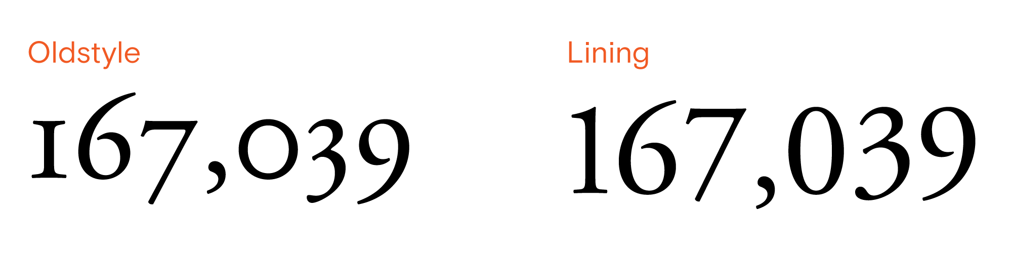
Oldstyle figures look nice in sentences, where they better match the size and spacing of lower-case letters; lining figures are more uniform, and reinforce the grid-like structure of the table.
The difference between proportional and tabular figures is not quite so obvious:
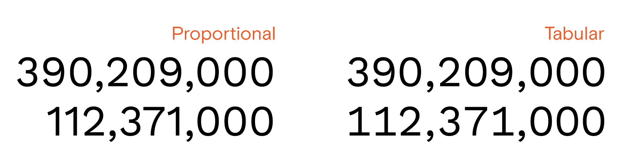
Proportional figures are designed to match the color — that is, the general sizing and spacing — of the typeface. Tabular figures, on the other hand, are all identically-sized, so that columns of numbers line up properly. While the difference may not seem great on the scale of one or two lines, using tabular figures makes scanning large tables significantly easier and less error-prone.
A technical note on using tabular lining figures
When designing, you’ll need to do a bit of work to ensure the numerals you’re using are the correct ones (tabular lining figures aren’t typically the default). Adobe Products have an “opentype” panel that can be used to set the figures properly, and CSS provides a slightly-cryptic syntax for enabling this feature. Beyond that, some basic googling should lead you down the right path.
But now for the bad news: not all typefaces have true tabular lining figures available. The ones that do tend to be pretty expensive. There are a few exceptions: The excellent Work Sans is a free typeface that has true tabular lining figures.
If you can’t find a suitable typeface that has tabular lining figures, a good fallback is monospace fonts— while they tend to have a more “source code” look, they’ll always be well-suited to displaying numbers in tables. Additionally, the new Apple system default typeface San Francisco has excellent tabular lining figures and looks great at small sizes.
Alignment Matters
3½ simple rules to follow:
1. Numerical data is right-aligned
2. Textual data is left-aligned
3. Headers are aligned with their data
3½. Don’t use center alignment.
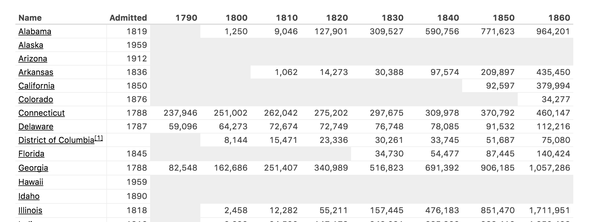
Numerical data is read right-to-left; that is, we compare numbers by first looking at their ones digit, then their tens, then their hundreds, and so on. This is also how most people learn arithmetic — start on the right and move left, carrying digits as you go.1 Therefore, tables should keep numerical data right-aligned.
Textual data is read (in English) from left-to-right. Comparing textual elements is typically done by sorting into alphabetical order: if two entries start with the same letter, the second letter is used, and so on. Trying to quickly scan text can be infuriating if it’s not left-aligned.
Headers, generally, should carry whatever alignment their data has.This keeps the vertical lines of the table clean, and provides consistency and context.
Center alignment causes the lines of the table to become “ragged,” which makes it much harder to scan entries, often necessitating extra dividers and graphical elements.
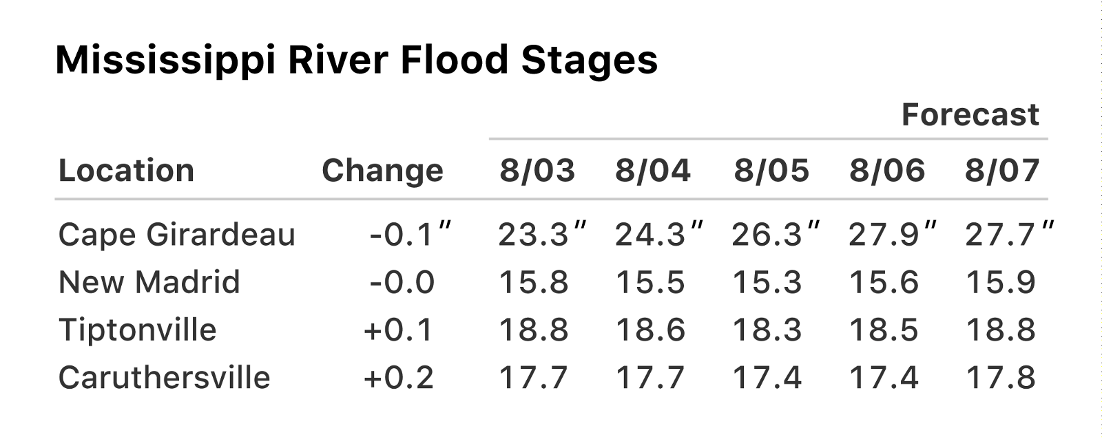
Consistent Significant Figures = Better alignment
One easy way to keep your tables properly aligned is to keep the same number of significant figures — usually the number of digits after the decimal — consistent within each column. Significant figures is a whole rabbit hole ofa topic, so I’ll keep my advice here brief: the fewer sig figs you can get by with, the better.
Fewer, Clearer Labels
Providing labels to accompany your data is crucial. These pieces of accompanying context allow a data table to be read by a wider audience, in a broader set of circumstances.
Title
It might sound like conventional wisdom, but giving your data table a clear and succinct title is as important as any other design decision you make. With a good title, tables are portable: they can be used in a number of different contexts, as well as cited from external sources.
Units
The most common label used in tables is the unit of measurement for the data; often, it’s repeated along with every single data point. Instead of repeating the label, only include it with the first data point in each column.
Headers
Keep headers as short as possible; the design of the data table should be focused around the data itself, and long header labels can occupy a lot of visual space.
As little ink as possible
When deciding how to style the graphic elements of a table, the goal should always be to reduce the table’s footprint without losing structural fidelity.One of the ways you can accomplish this is by using as little “ink” as possible — that is, whenever possible, choose not to style an element.
Rules
If you’ve properly aligned the data points in your table, rules become redundant. The primary benefit they provide is in allowing you to reduce the space between elements, while still being able to differentiate between elements. Even when used, rules should be extremely light to not interfere with quick scanning.
Horizontal rules are the most useful, as they allow you to significantly reduce the vertical space occupied by long tables, making faster work of comparing lots of values or seeing trends over time.
One unsubstantiated opinion I have about rules is that zebra striping is bad. Really, really bad.Take it or leave it.
Backgrounds
Backgrounds are most useful when indicating differences in the domain of data: switching between single values and sums or averages, for example. Highlighting values, providing additional context to data, or indicating changes in values from previous periods can be done without backgrounds, using graphical elements like ✻, † (one of my faves), or ▵.
Additionally, tables should be monochromatic. Using colors to provide organizational context or added meaning increases the likelihood of misinterpretation or error, and causes usability problems for those with impaired vision.
In conclusion
Tables might be boring, but they are such a major element of any data-rich document that they’re worth every ounce of design thinking we can apply to them. By designing more efficient, clearer, and easier-to-use tables, you can vastly improve the often-painful experience of analyzing and understanding large sets of data.
Further Reading & Inspiration
FiveThirtyEight has always been a great source of inspiration— they set their numerical data in a typeface called Decima Mono, which is specifically designed to fit lots of data in a small space.
Butterick’s Practical Typography is my go-to for all things typographical, and the kind of reference you keep multiple copies of — it’s so practical!
Lastly, no article on data design would be complete without an Edward Tufte shoutout. His insightful writing on design is indispensable.
Special thanks to kontur, Nathan D Huening, Robin Rendle, Scott Dawson, Karen Bachmann, and Kelly Jepsen for catching errors in this story.
For other interesting approaches to arithmetic, check out how Japanese children use a Soroban or how lattice multiplication works. ↩︎