“Change the fonts.” It’s a simple mission statement.
In reality, changing the fonts on wsj.com has involved years of coordination and planning between nearly every team at the Wall Street Journal. In the past month, the last few coordinated steps were executed with an incredible amount of patience and skill, and no shortage of white knuckles.
Why change the fonts?
The Wall Street Journal has a long history of quality typography. There’s a well of design wisdom behind the paper’s current look, as the evolution of news design is encoded in each page.
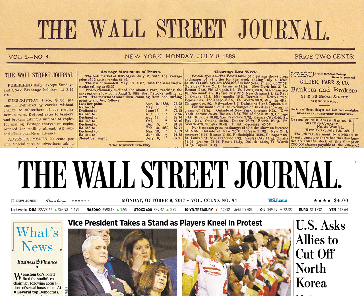
Each typeface currently used in print was designed specifically for the needs of the Journal’s format and printing process. Those typefaces are:
Escrow
Designed by Cyrus Highsmith in 2002. Escrow epitomizes what the news looks like: loud and authoritative. As a Scotch, expresses the legacy of the Journal.

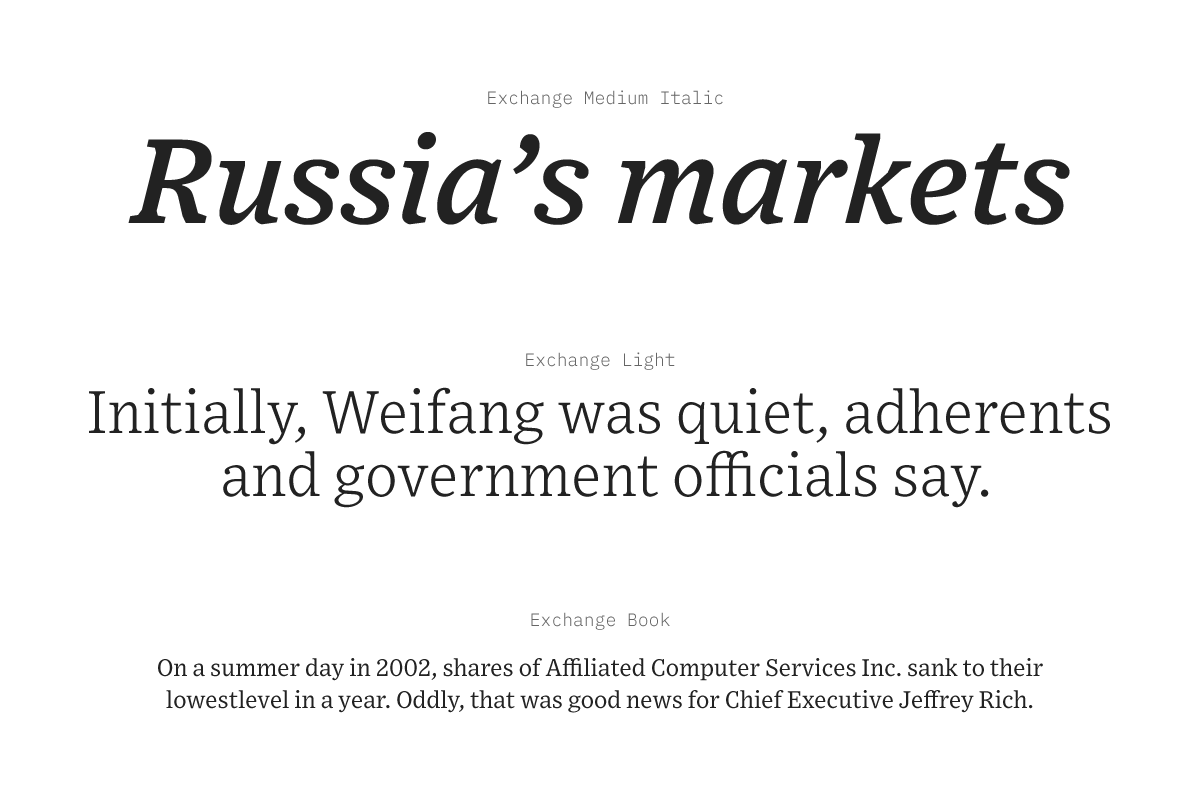
Exchange
Designed by Tobias Frere-Jones in 2002. Exchange welds the stability of Ionic slab serifs together with notes from Bell Gothic’s practical legibility.
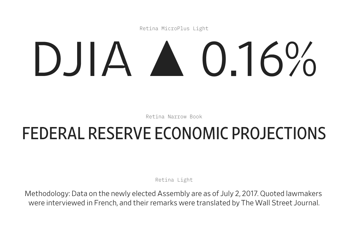
Retina
Designed by Tobias Frere-Jones in 2000. Retina takes clarity to the extreme. It was designed around the print process, allowing space for ink to bleed into newsprint.
While these typefaces are central to the brand of the Journal, digital channels are a significantly more complicated environment. Legal and technical hurdles meant that, until recently, we lacked the ability to use these typefaces on the web.
It took the time, patience, passion, attention, hard work, and cooperation of many, many people throughout the organization, and as of December 11, 2017, most of wsj.com is rendered in Escrow, Exchange, and Retina.
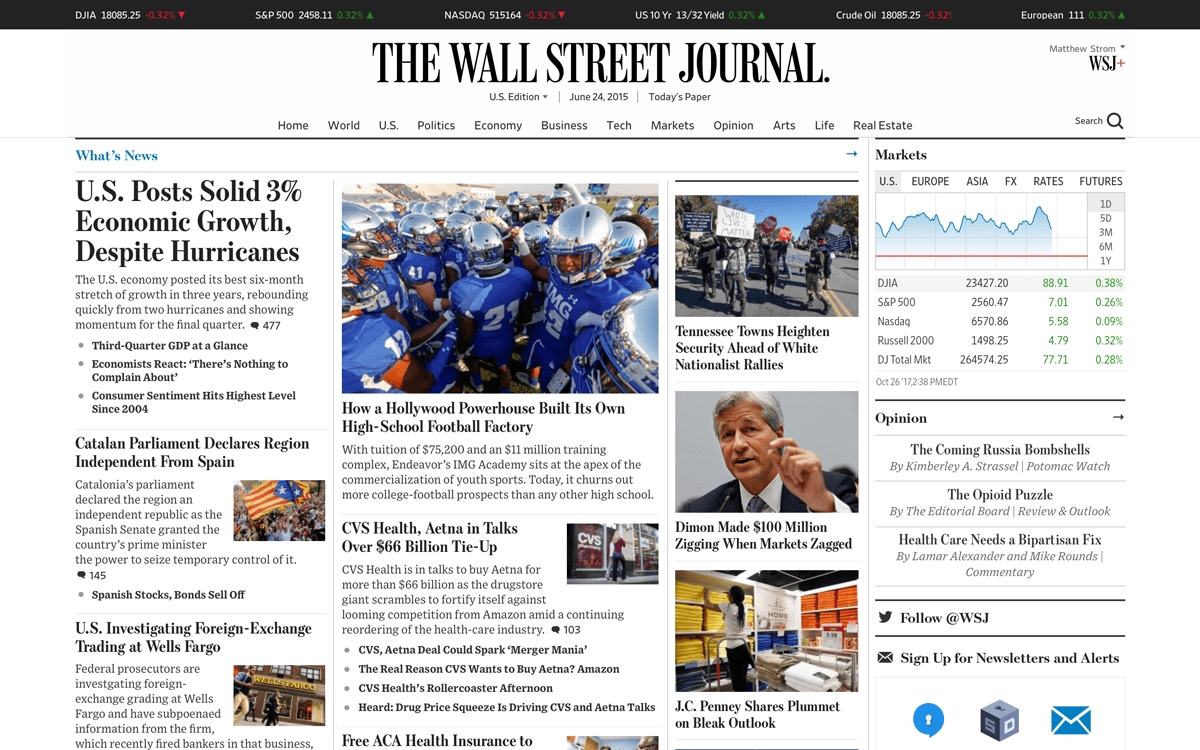
Here’s some things I’ve learned in the process:
The hard thing about easy things
The hardware and software that renders wsj.com is fascinating. My back-of-the-envelope calculation says that in the time you’ve been reading this essay, more than 10,000 people will have visited our site; each of them expects a nice-looking page to load quickly and work perfectly.
Depending on what page it serves, our web platform might rely on any number of separate applications, all of which are continuously deployed and deeply intertwined.
Editors and contributors are publishing and updating stories every minute, of every day, of every month of the year.
Our readers are in every corner of the globe, on every imaginable combination of internet connection and hardware quality.

To make a coordinated change between all the machines that make wsj.com go, the engineering team had to pull off an incredibly difficult feat. The best analogy I can come up with is that it is like putting a new coat of paint on a fully-loaded 747 in flight over the Pacific.
The spreadsheet
The tentpole of communication during this process was a humble spreadsheet. No sophisticated style guide or design system, no handoff software like Zeplin or InVision (though, we use all those things at times). A humble spreadsheet.
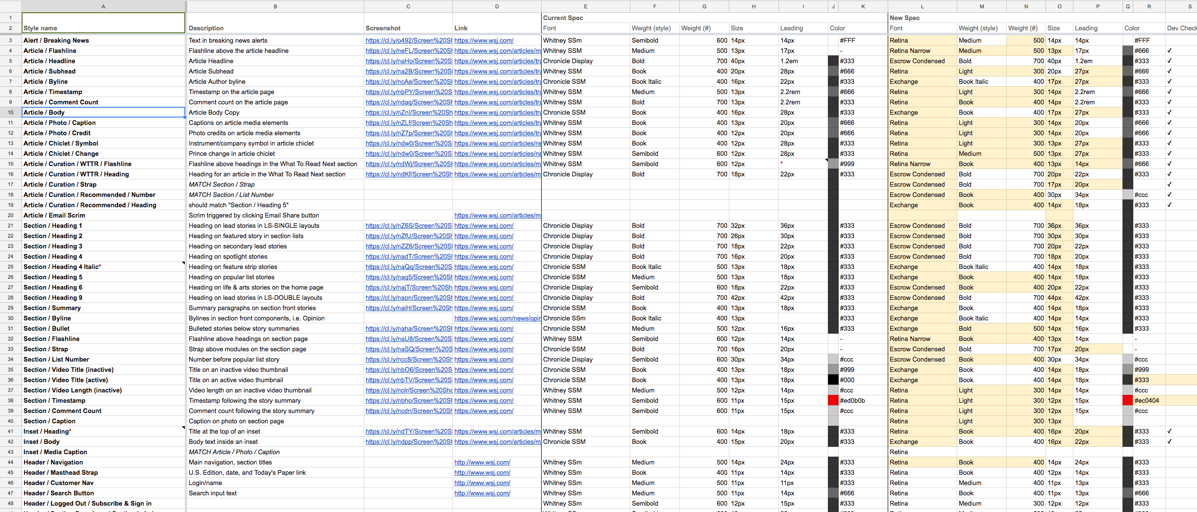
I love spreadsheets. Reactions to a tweet espousing my love for spreadsheets tell me that other designers love spreadsheets, too.
my favorite design tool is a spreadsheet
— Matthew Ström (@ilikescience) November 21, 2017
Spreadsheets work so well because they map information. In this case, the map showed where we were today, where we wanted to go, and provided exact instructions for how to get there.
Because Google Sheets can be collaborative, designers from across the organization can use them simultaneously with developers, sharing a simple, common language.
Getting 90% of the way there
To get the new fonts into an article page exactly how I think it should look, I could spend all day in Sketch moving text boxes inside a big rectangle. I get to nudge pixels until everything is just so, save a PDF, and preserve that perfection for all eternity. Then just attach it to a JIRA ticket, and move onto the next one.
Websites don’t actually work like this.
There are many, many shortcomings in the design tools we use; not that designers don’t have enough control, but that they have too much. The web platform is messy, and often out of our control. Our tools trick us into thinking we have agency.
To avoid this trap, in working with the web design team, I encouraged everyone to just account for 90% of the changes. The last 10% was such an unknown, and so liable to change, that it would be best to simply let it wait.
90% is a totally arbitrary number. By choosing this goal we acknowledge that shipping anything is better than not shipping the perfect thing.
Acknowledgements
To say this was a team effort would be to imply that there was such thing as a solo effort at The Wall Street Journal. Nothing here happens without the hard work of many people. Here’s some of the folks that made this particular project a success:
Head of Design Che Douglas held the vision, fought the hard fights, and made it possible for us to implement these typefaces.
Fellow Design and UX Directors Thomas Williams, Bonnie Jarvie, and Fernando Turch coordinated and collaborated with the design team to maintain the strength of the brand across all our products.
Product Designers Brian Feeney, Cory Etzkorn, Lee Yon, Adele Morgan and Studio Manager Jillian Breitfeller put many, many hours into the endless details of the changeover.
Program Manager Tania Feliz and Product Managers Marta Jakubanis, Delia Casa, Neesha Patel, Tyler Chance, and Sarah Pesin managed the chaos of such a complicated project, facilitating communication and ultimately guaranteeing our success.
The graphics team, Shazna Nessa, Dov Friedman, Elliot Bentley, Gabriel Gianordoli, Laura Holder, Tonia Cowan, Tyler Paige, Erik Brynildsen, and Tynan Debold, worked on our data visualization and graphics language to make the shift together with the product team.
Engineering leads Vishaal Patil, Morgan Vo, Ryan Yun, and Christian Sherland, along with the entire engineering team, worked with such supreme grace under pressure — I’m fortunate to work with such a collaborative and patient group.
Finally, many more people contributed to this feat, all of who I hope I have properly thanked in the many internal emails and slack messages that we’ve exchanged over the past few months.
Join the mailing list
I'll send new posts to your inbox, along with links to related content and a song recommendation or two.