In the early 1900s, recorded music was still a novelty, overshadowed by sales of sheet music. Early vinyl records were vastly different from what we think of today: discs were sold individually and could only hold up to four minutes of music per side. Sometimes, only one side of the record was used. One of the most popular records of 1910, for example, was “Come, Josephine, in My Flying Machine”: it clocked in at two minutes and 39 seconds.
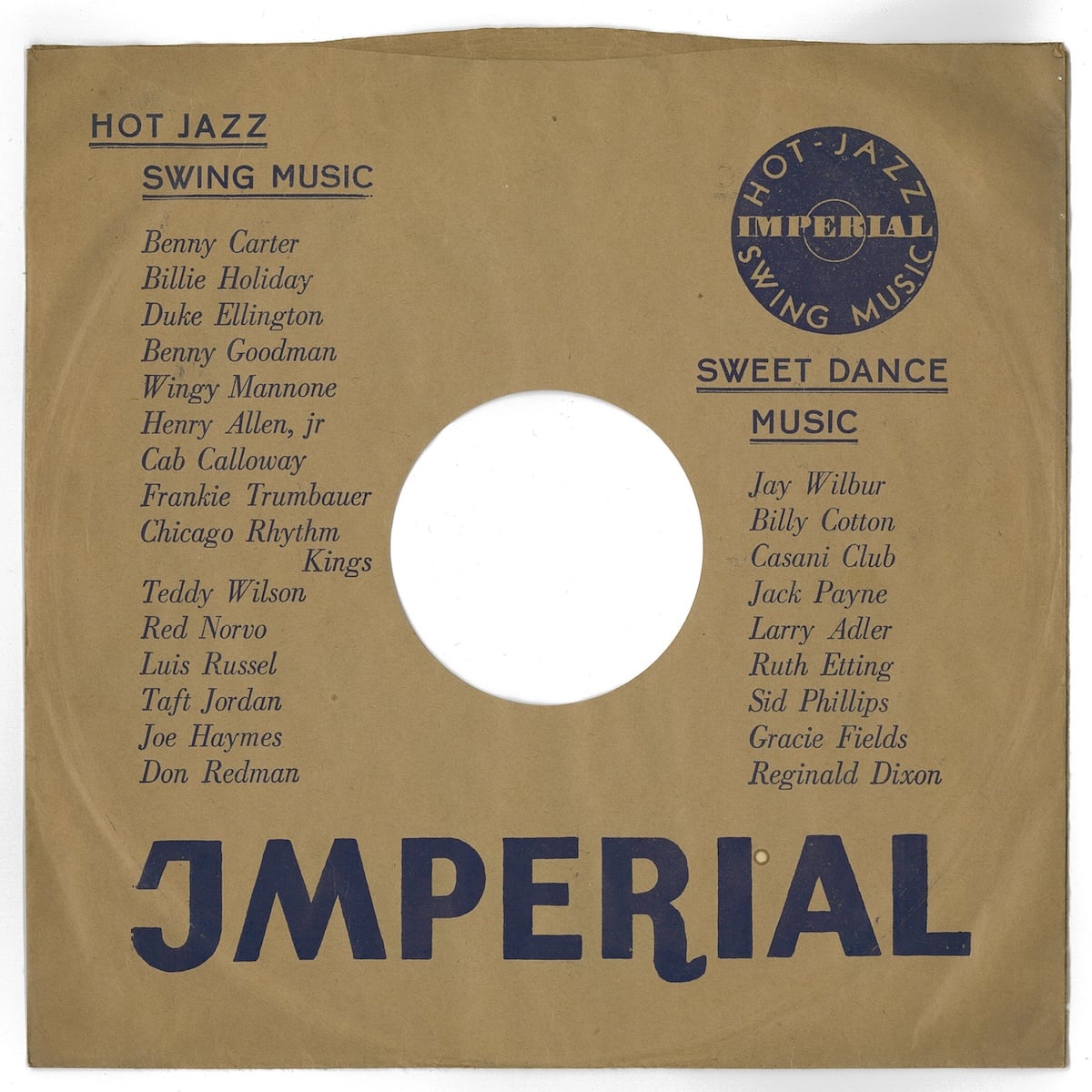
The packaging of these records was strictly utilitarian: a brown paper sleeve to protect the record from dust, printed with the name of the record label or the retailer. Rarely did the packaging include any information on the disc inside; the label on the center of the disc was all there was to differentiate one record from another.
But as record sales started to show signs of life, music publishers took note. Columbia Records, one of the first companies to sell music on discs, was especially successful. They pioneered the sale of songs in bundles: the individual discs were bound together in packages resembling photo albums, partly to protect the delicate shellac that the records were made of, partly to increase their sales. They resembled photo albums, so Columbia called them “record albums.”
There were many more technological breakthroughs that made it possible to mass-manufacture and distribute music throughout the world at affordable prices. The five-minute-long 78 rpm discs were replaced by 20-minute discs that ran at 33 ⅓ rpm, which were replaced by the hour-long 12″ LP we know today. Delicate shellac was replaced by the more resilient (and cheaper) vinyl. Both recording technology and consumer electronics were always evolving, allowing more dynamic music to fit into smaller packages and be played on smaller, higher-fidelity stereos.
The invention of album art can get lost in the story of technological mastery. But among all the factors that contributed to the rise of recorded music, it stands as one of the few that was wholly driven by creators themselves. Album art — first as marketing material, then as pure creative expression — turned an audio-only medium into a multi-sensory experience.
This is the story of the people who made music visible.
The prophet: Alex Steinweiss
Alex Steinweiss was born in 1917, the son of eastern European immigrants.
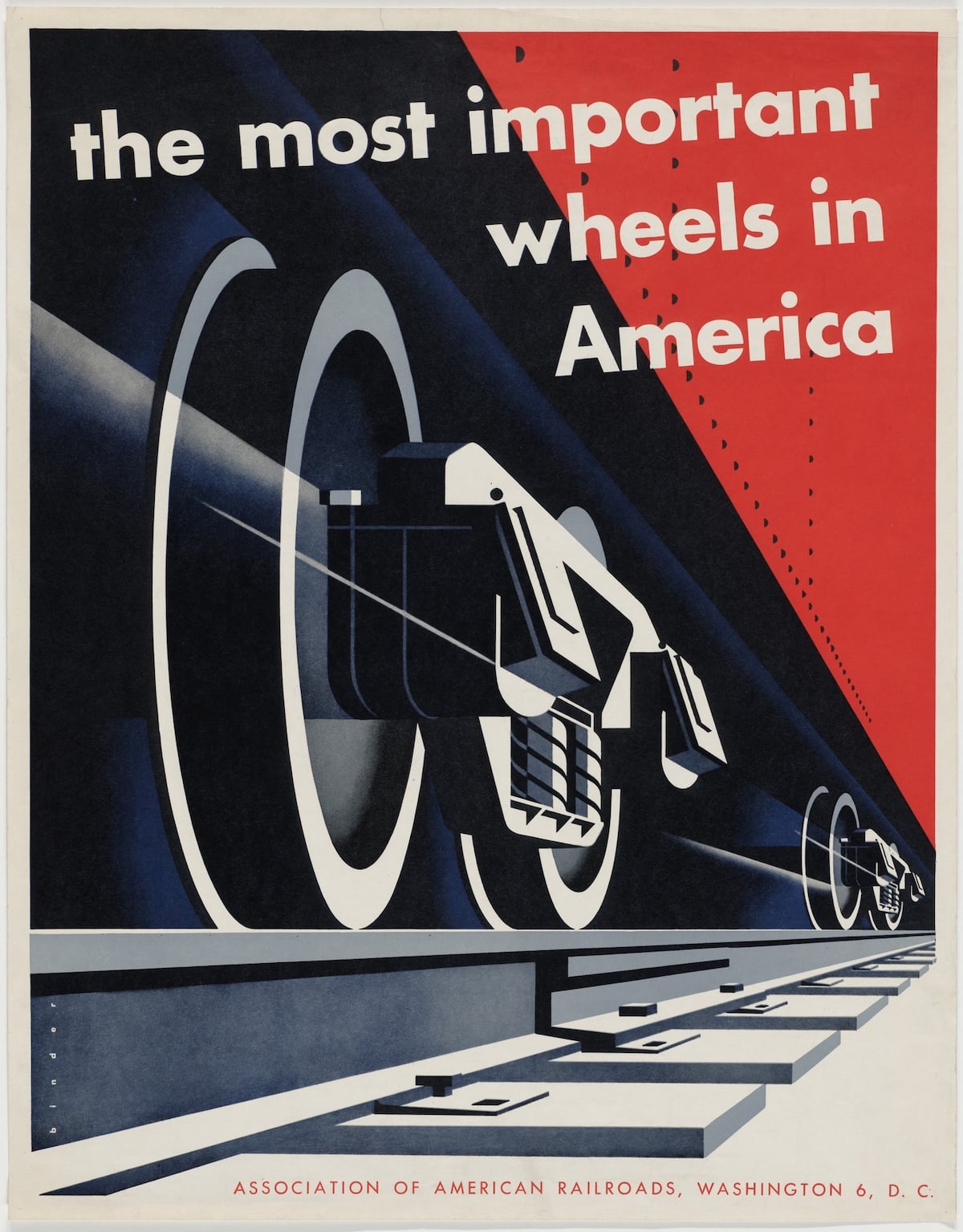
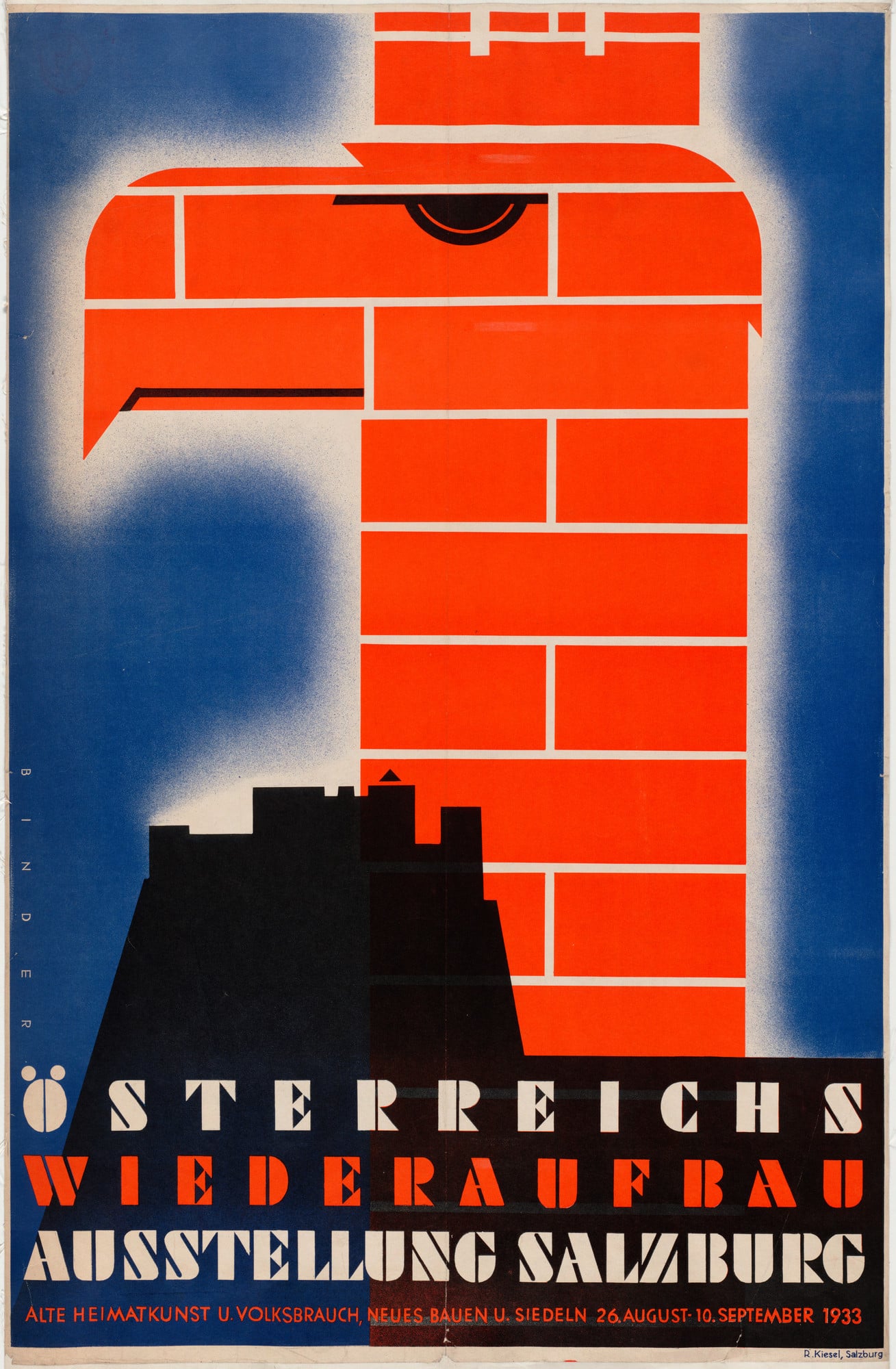
Growing up in Brooklyn, New York, Steinweiss took an early interest in art and earned a scholarship to Parsons School of Design. On graduating, he worked for Austrian designer Joseph Binder, whose bold, graphic posters had influenced design for the first decades of the 1900s.
Joseph Binder, The Most Important Wheels in America, Association of American Railroads (1952) via Moma
Joseph Binder, Österreichs Wiederaufbau Ausstellung Salzburg (1933) via Moma
Joseph Binder, Air Corps U.S. Army (Winning entry for the MoMA National Defense Poster Competition [Army Air Corps Recruiting])via Moma
After his work with Binder, Steinweiss was hired by Columbia Records to produce promotional displays and ads, but the job didn’t stick. At the outbreak of World War II, he went to work for the Navy’s Training and Development Center in New York City, designing teaching material and cautionary posters.
When the war ended, Steinweiss went back to freelancing for Columbia. At a lunch meeting in 1948, company president Ted Wallerstein mentioned that Columbia would soon introduce a new kind of record that, spinning at a slower speed of 33 ⅓ rpm, could hold more music than the older 78 rpm discs. But there was a problem: the smaller, more intricate grooves on the discs were being damaged by the heavy paper sleeves used for the 78s. After the lunch, Steinweiss went to work to create a new, safer jacket for the records. But his vision for the new packaging went beyond just its construction.
“The way records were sold was ridiculous,” Steinweiss said. “The covers were brown, tan or green paper. They were not attractive, and lacked sales appeal.” He suggested that Columbia should spend more money on packaging, convinced that eye-catching designs would help sell records.1
His first chance to prove his case was a 1940 compilation by the songwriters Rodgers and Hart — one of the first releases on the new microgroove 33 ⅓ records. For it, he asked the Imperial Theater (located one block west of Times Square) to change the lettering on their marquee to read “SMASH SONG HITS BY RODGERS & HART." Steinweiss had a photographer take a photo, and back in his studio, superimposed “COLUMBIA RECORDS’’ on the image to match the perspective and style of the signage. The last touch, a nod to the graphic abstraction of his mentor Joseph Binder, were orange lines arcing around the marquee in the exact size of the record underneath.
Album art was born.
Steinweiss' cover art for Columbia's Smash Song Hits by Rodgers & Hartvia RateYourMusic
Steinweiss would go on to design hundreds of covers for Columbia from 1940 to 1945. His methodology was rigorous; the covers went beyond nice pictures to be visual representations of the music itself. Before most people owned a TV set, Steinweiss’s album covers were affordable multi-sensory entertainment. Looking at the album cover and listening to the music created an experience that was more than the sum of its parts.
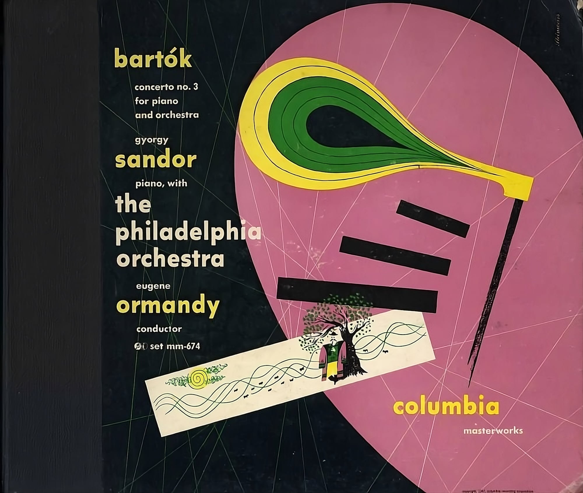
“I tried to get into the subject,” he explains, "either through the music, or the life and times of the composer. For example, with a Bartók piano concerto, I took the elements of the piano—the hammers, keys, and strings—and composed them in a contemporary setting using appropriate color and rendering. Since Bartók is Hungarian, I also put in the suggestion of a peasant figure.”
Steinweiss' cover art for Columbia's recording of Bartók's Concerto No. 3 via RateYourMusic
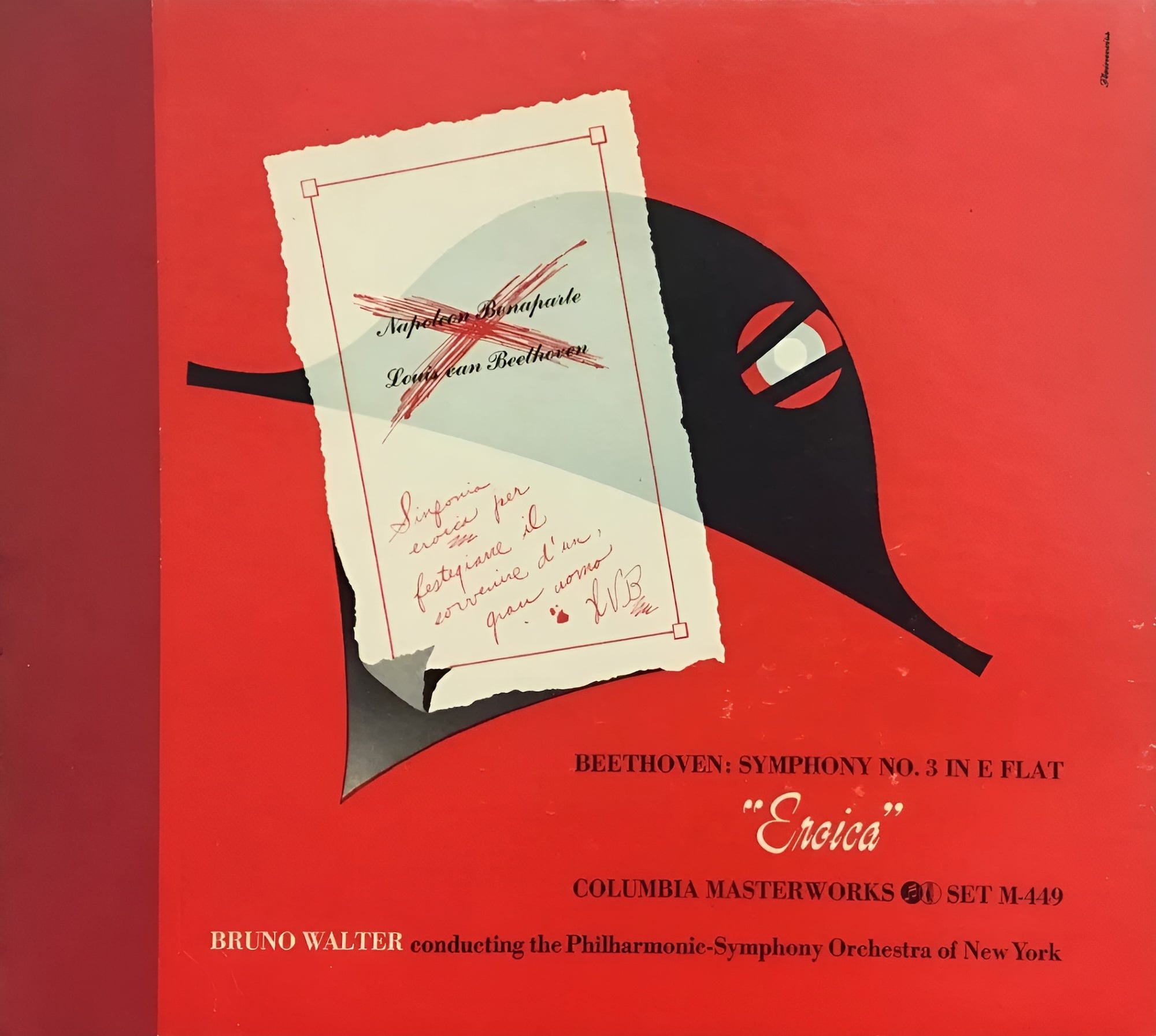
Steinweiss was prophetic: His colorful compositions sold records. Newsweek reported that sales of Bruno Walter’s recording of Beethoven’s “Eroica” symphony increased 895% with its new Steinweiss cover.” 2
Steinweiss' cover art for Columbia's recording of Beethoven's Eroica
The challenger: Reid Miles
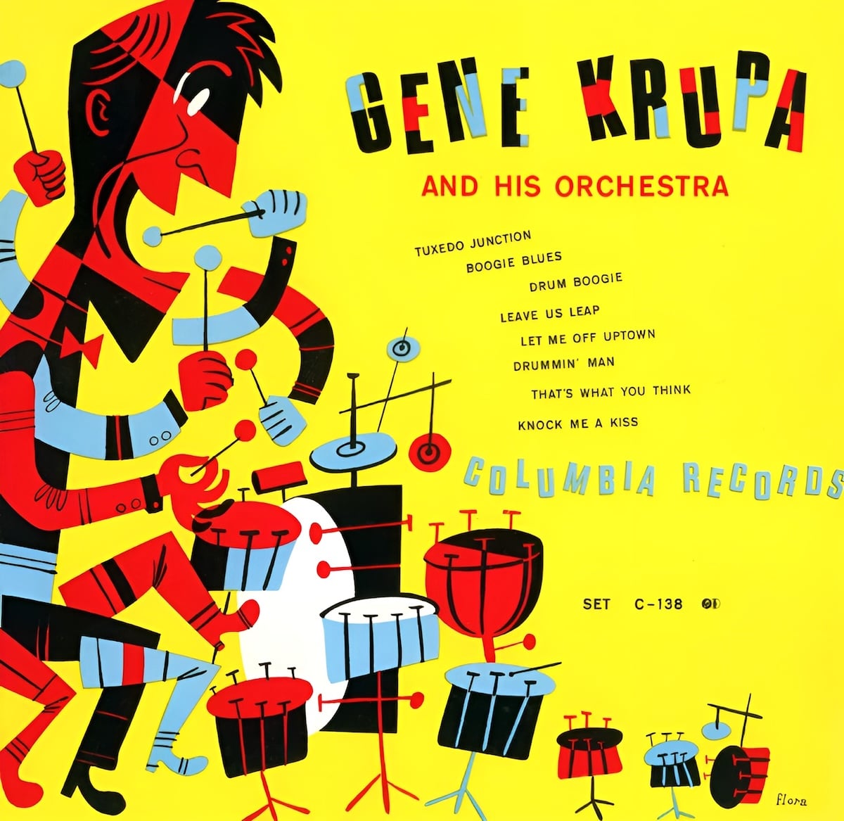
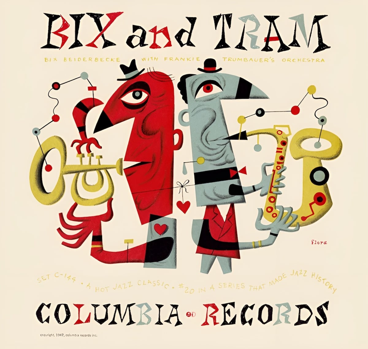
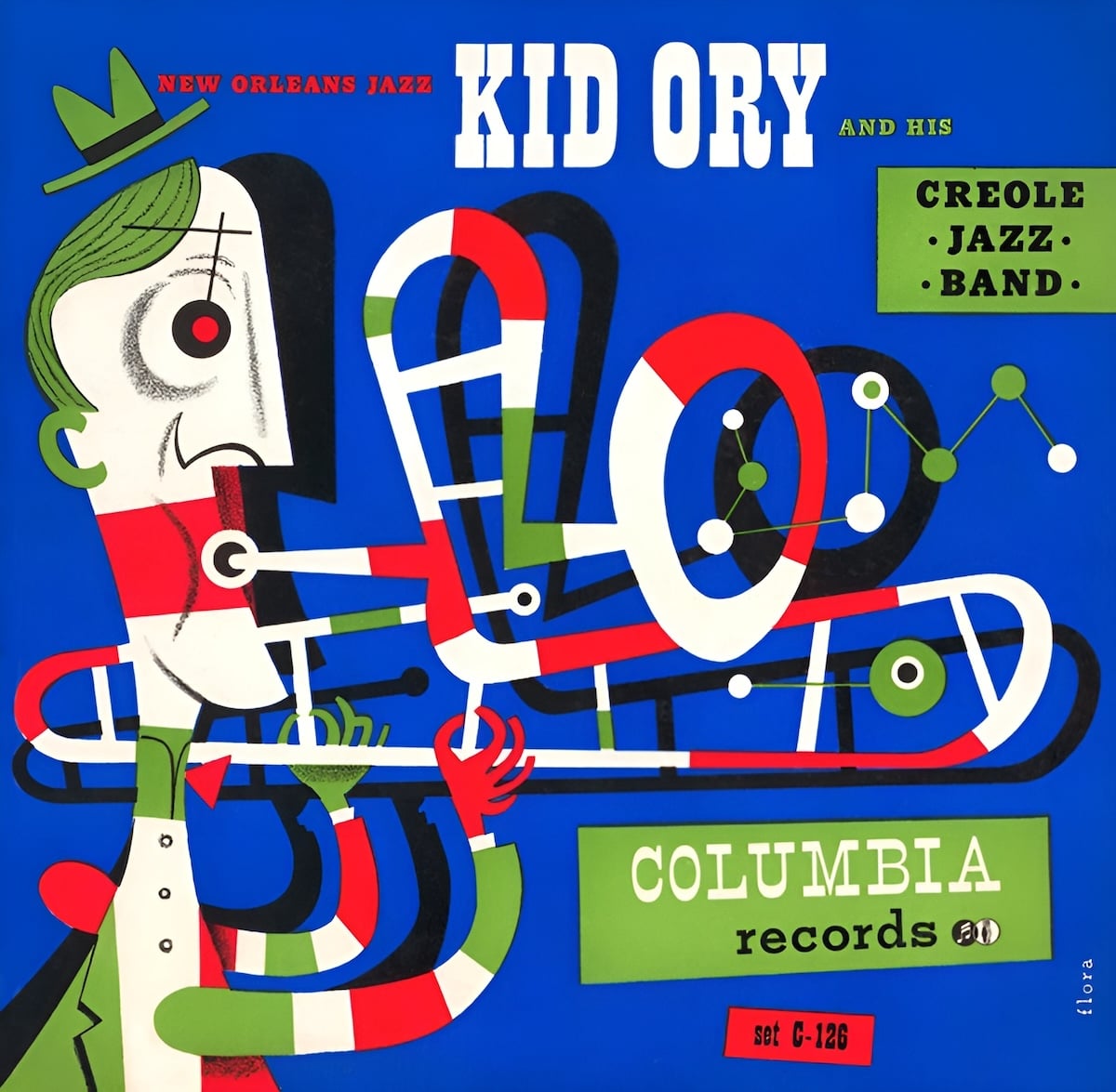
From 1940 to 1950, Columbia Records was the dominant force in music sales. Buoyed by Steinweiss’s initial successes, Columbia hired more artists and designers to produce album art. Jim Flora led the charge from 1947–1950 with irreverent illustrations and more daring explorations of typography, and like Steinweiss, his work mirrored the music on the records. During the era, Columbia began to focus much more on popular music. Flora’s campy compositions screamed “this isn’t your parent’s music.”
Jim Flora's cover for Gene Krupa and His Orchestravia JimFlora.com
Jim Flora's cover for Bix and Tramvia JimFlora.com
Jim Flora's cover for Kid Ory and His Creole Jazz Bandvia JimFlora.com
But while Columbia was focusing on making it into the hit parade, an upstart label was honing in on a sound that would come to define the era; Blue Note Records, founded in 1939, was fixated on the jazz underground.
From its founding and throughout the 1950s, Blue Note focused on “hot jazz,” a mutant strain of jazz descending from the big band swing era, often including twangy banjoes, wailing clarinets, and rambunctious New Orleans second-line-style drumming. Founder Alfred Lion wrote the label’s manifesto:
Blue Note Records are designed simply to serve the uncompromising expressions of hot jazz or swing, in general. Any particular style of playing which represents an authentic way of musical feeling is genuine expression. … Blue Note records are concerned with identifying its impulse, not its sensational and commercial adornments.3
One way Blue Note stood out from labels like Columbia was their dedication to their artists. Many of the working musicians of the ’50s lived like vampires, waking up after dusk and playing gigs into the early hours of the morning, then rehearsing until dawn. Blue Note would record their artists in the pre-dawn hours, giving musicians time to rest up before their next night’s gigs started.
Art Blakey, Thelonius Monk, Charlie Parker, Dizzy Gillespie, and John Coltrane are household names now; but then, because of their drinking, drug use, and frenetic schedules, labels wouldn’t work with them. Blue Note embraced them, feeding their fires of creative innovation and creating an updraft for the insurgency of jazz to come.
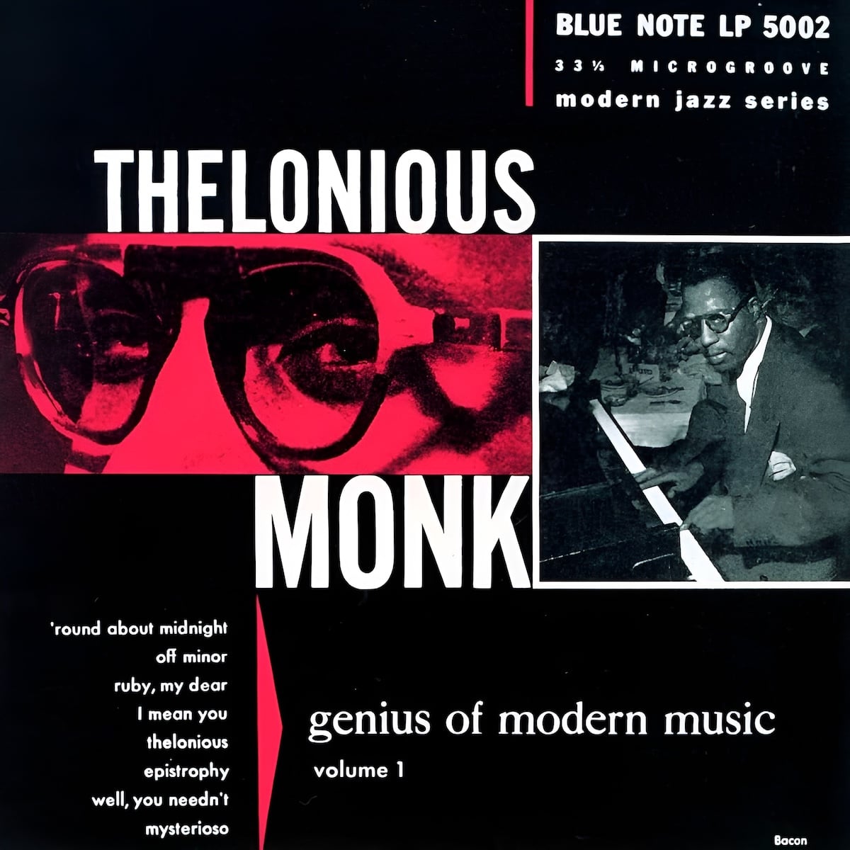
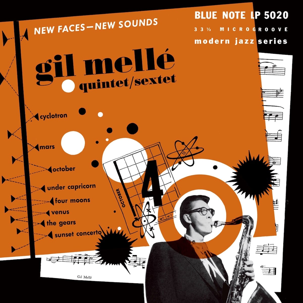
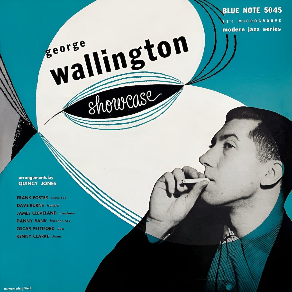
Album art was one more revolutionary way for Blue Note to explore “genuine expression.” Just as they fostered talented musicians, they’d give young designers a chance to shine. Alfred Lion’s childhood friend Francis Wolff had joined the label as a producer and photographer; he’d shoot candid portraits of the musicians as they worked. Then, designers like Paul Bacon, Gil Mellé (himself a musician), and John Hermansader would pair Wolff’s black-and-white photos with a single, bright color, then juxtapose them with stark, sans-serif type.
Paul Bacon's cover featuring Francis Wolff's photography for Thelonious Monk's Genius of Modern Music Vol. 1via Deep Groove Mono
Gil Mellé's cover featuring Francis Wolff's photography for his band's New Faces — New Soundsvia Deep Groove Mono
John Hermansader's cover featuring Francis Wolff's photography for George Wallington's Showcasevia Deep Groove Mono
As the 1960s approached, the musicians Blue Note worked so hard to cultivate were forging new styles, leaving behind the swing-era pretense of jazz as dance music. Charlie Parker and Bud Powell kept speeding up the tempo and stuffing more chords into progressions. Max Roach started playing the drums like a boxer, bobbing and weaving around the beat with skittering cymbals, waiting for the right moment to land a single monumental “thud” of a kick drum. Without the drums keeping a steady rhythm, bass players like Milt Hinton and Gene Ramey had to furiously mark out time with eighth notes, traversing chords by plucking up and down the scale.
This was bebop, and it was musicians’ music. Blue Note’s ethos of artistic integrity was the perfect Petri dish for virtuosic musicians to develop innovative sounds — they worked in small ensembles, often just five players, constantly scrambling and re-arranging instrumentation, playing harder and faster and louder.
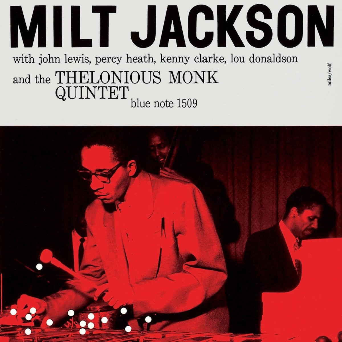
Then, around 1955, just as Blue Note was hitting its stride, Wolff met a 28-year-old designer named Reid Miles.
Miles had recently moved to New York and had been working for John Hermansader at Esquire magazine. He was a big fan of classical music but wasn’t so interested in jazz. Wolff convinced Miles to start designing covers for Blue Note all the same and kicked off one of the most influential partnerships in modern design.
The first cover Miles created was for vibraphone player Milt Jackson; it picked up from the established art style, with Wolff’s photos and a single bright hue. But the type was even more exaggerated, and the photo took up more than half the cover. White dots overlayed on Jackson’s mallets were the perfect abstraction of the staccato tones of the vibraphone. It’s a great cover, but it was just a hint of what was to come.
A common theme of Miles’ covers was the emphasis on Wolff’s photography. We’re familiar with these iconic images today, but at the time they were revolutionary; before, black musicians like Louis Armstrong and Ella Fitzgerald were portrayed in tuxedos and evening gowns, posed smiling genially or laughing, rendered so as to not offend the largely white listening audience. Wolff’s portraits were candid, realistic, showing black musicians at work.
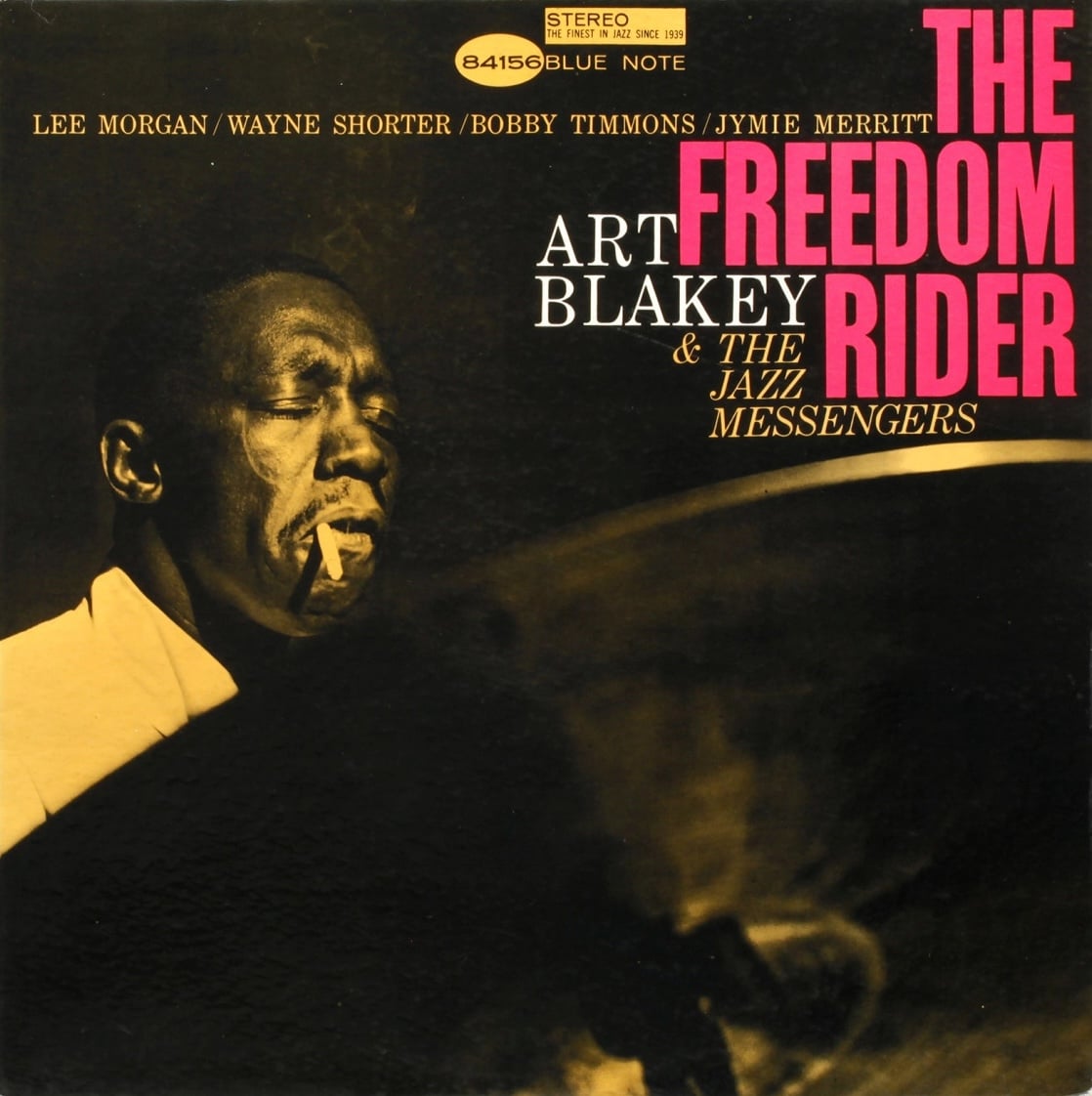
For example, the cover for Art Blakey’s The Freedom Rider shows Blakey lost in a moment, almost entirely obscured by a cymbal. The drummer is smoking a cigarette, but it’s barely hanging onto the corner of his lip — his mouth is half-open, his brows clenched in a moment of agony or ecstasy. Miles would let the photo fill up the entire cover, cramming the name of the record into whatever empty space was available.
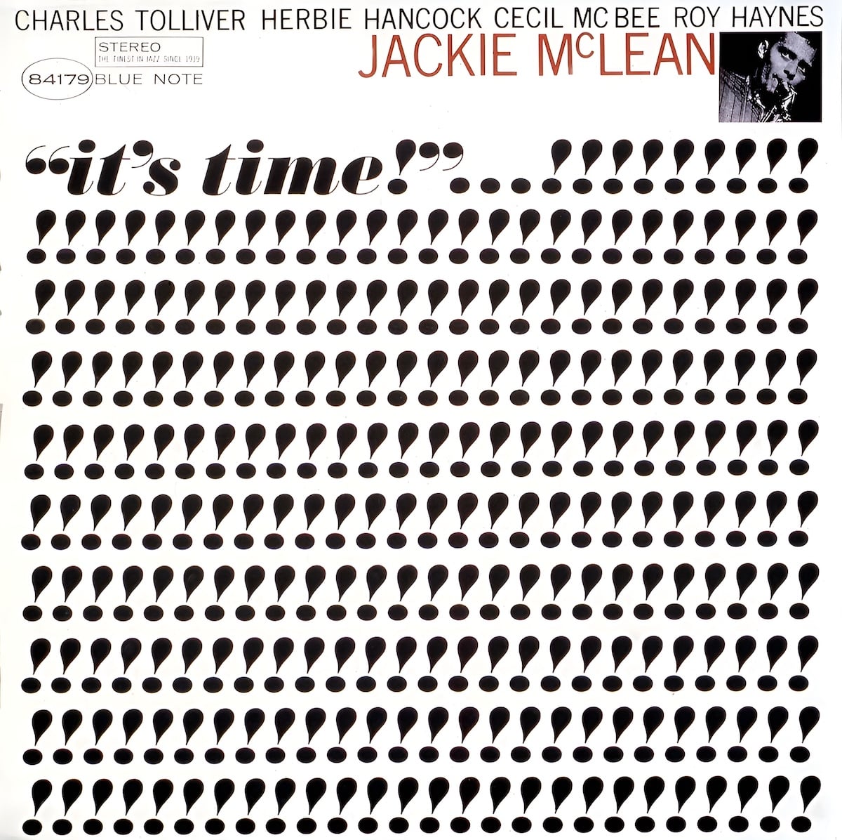
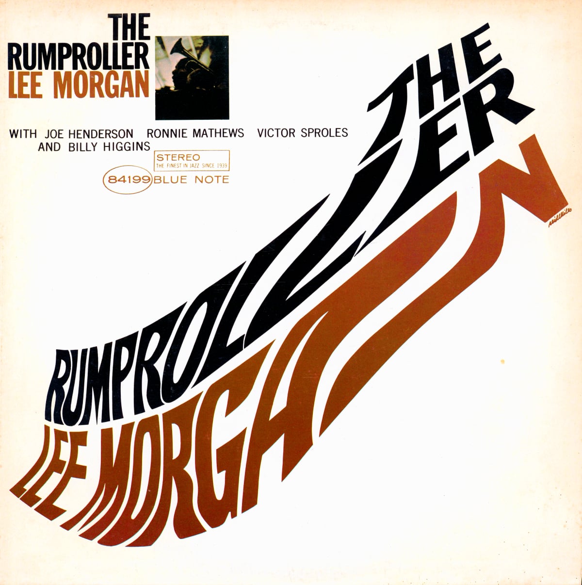
Miles sometimes reversed this relationship, pioneering the use of typography to convey the spirit of the music. His cover for Jackie McLean’s It’s Time! is composed of an edge-to-edge grid of 243 exclamation marks; a postage stamp picture of McLean graces the upper corner, almost a punchline. Lee Morgan’s The Rumproller is another type-only cover, this time with the title smeared out from corner to corner, like it was left on a hot dashboard for the day. Larry Young’s Unity has no photo at all; the four members of the quartet become orange dots resting in (or bubbling out of) the bowl of the U.
Reid Miles' cover for Jackie McLean's It's Timevia Ariel Salminen
Reid Miles' cover for Lee Morgan's The Rumprollervia Fonts in Use
Reid Miles' cover for Larry Young's Unity
Miles fulfilled the Blue Note manifesto. His album covers pushed the envelope of graphic design just as the artists on the records inside continued to break new ground in jazz. With the partnership of Miles and Wolff, alongside Alfred Lion’s commitment to artistic integrity, Blue Note became the standard-bearer for jazz.
Columbia Records couldn’t help but notice. Even though Blue Note wasn’t nearly as commercially successful as Columbia, their willingness to take risks had established them as a much more sophisticated, innovative, and creative label; to compete for the best talent, Columbia would need to find a way to win the attention of both artists and listeners.
The master: S. Neil Fujita
Sadamitsu Fujita was born in 1921 in Waimea, Hawaii. He was assigned the name Neil in boarding school — leading up to World War II, anti-Japanese sentiment was rampant, especially in Hawaii. Fujita moved to LA to attend art school, but his studies were cut short in 1942 when Franklin Roosevelt signed executive order 9066, allowing the imprisonment of Japanese Americans living on the west coast. Fujita was sent to Wyoming, where he enlisted in the 442nd Regimental Combat Team. Before the war was over, he’d see combat in Italy, France, and the Pacific theater.
After the war, Fujita finished his studies in LA. He quickly made a name for himself in the advertising world; his résumé landed on the desk of Bill Golden, the art director for CBS, which owned Columbia Records. Alex Steinweiss, the first album artist and Columbia’s ace in the hole, had moved on to RCA. Columbia needed a new direction. Golden called Fujita and asked him to run the art department.
Fujita would be building a whole new team, replacing the relationships that Columbia had built with art studios for hire. This wasn’t going to be the hardest part of Fujita’s work; when offering him the job, Golden warned him that he’d experience a lot of racist attitudes still simmering in the wake of World War II.4
Still, Fujita agreed to take the job.
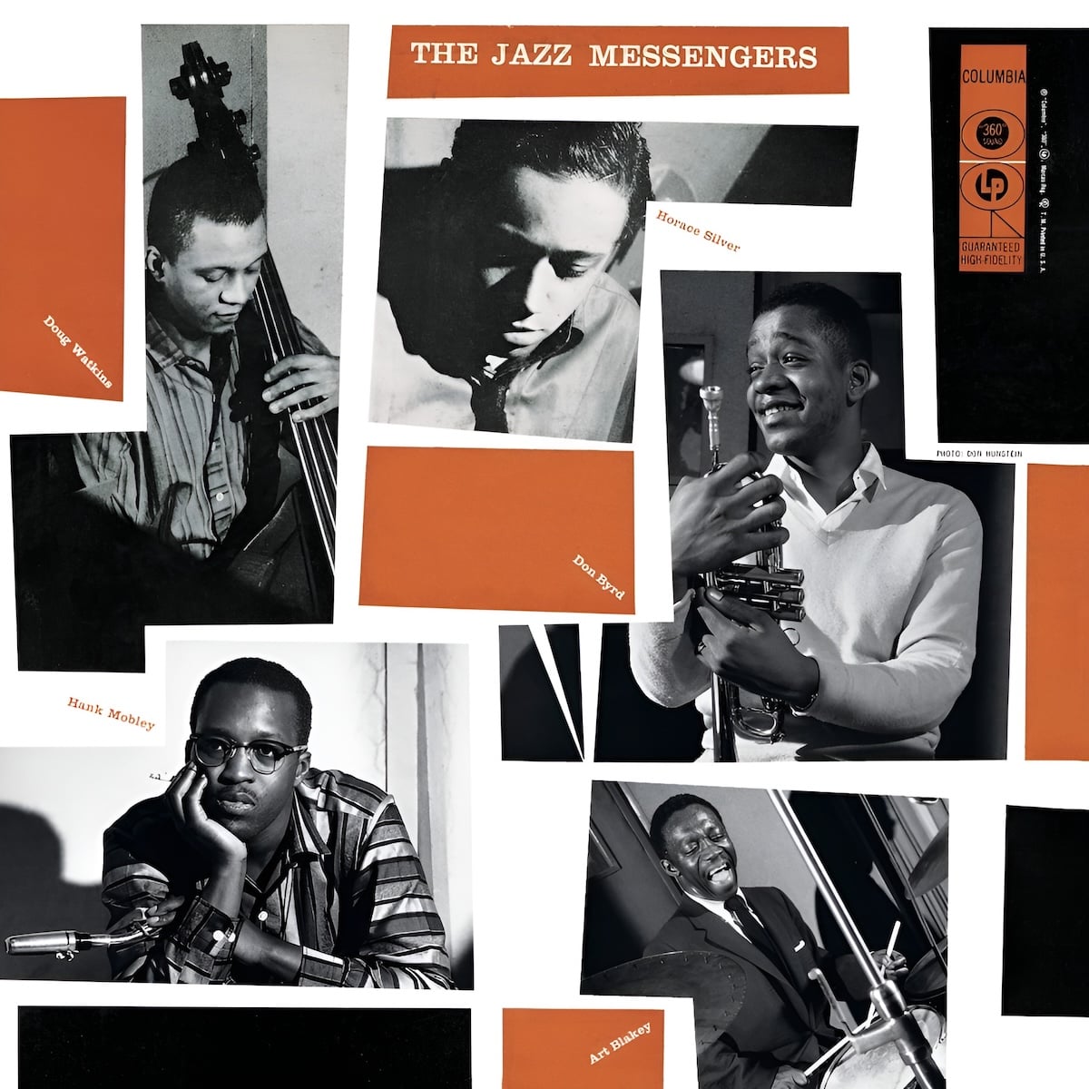
Fujita’s first covers fit in with the work that Reid Miles was doing at Blue Note: single-color accents set against black-and-white photography.
Fujita's cover for The Jazz Messengersvia Discogs
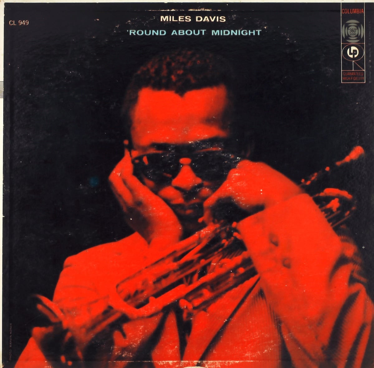
Fujita's cover for Miles Davis' 'Round About Midnightvia Discogs
In 1959, jazz was leaving the stratosphere. Ornette Coleman was performing what he called “free jazz,” frenetic, inscrutable compositions that drew backlash and praise in equal parts. John Coltrane recorded Giant Steps with a level of virtuosity that even his own bandmates struggled to keep up with. Miles Davis recorded Kind of Blue, which would go on to be regarded as one of the best recordings of all time.
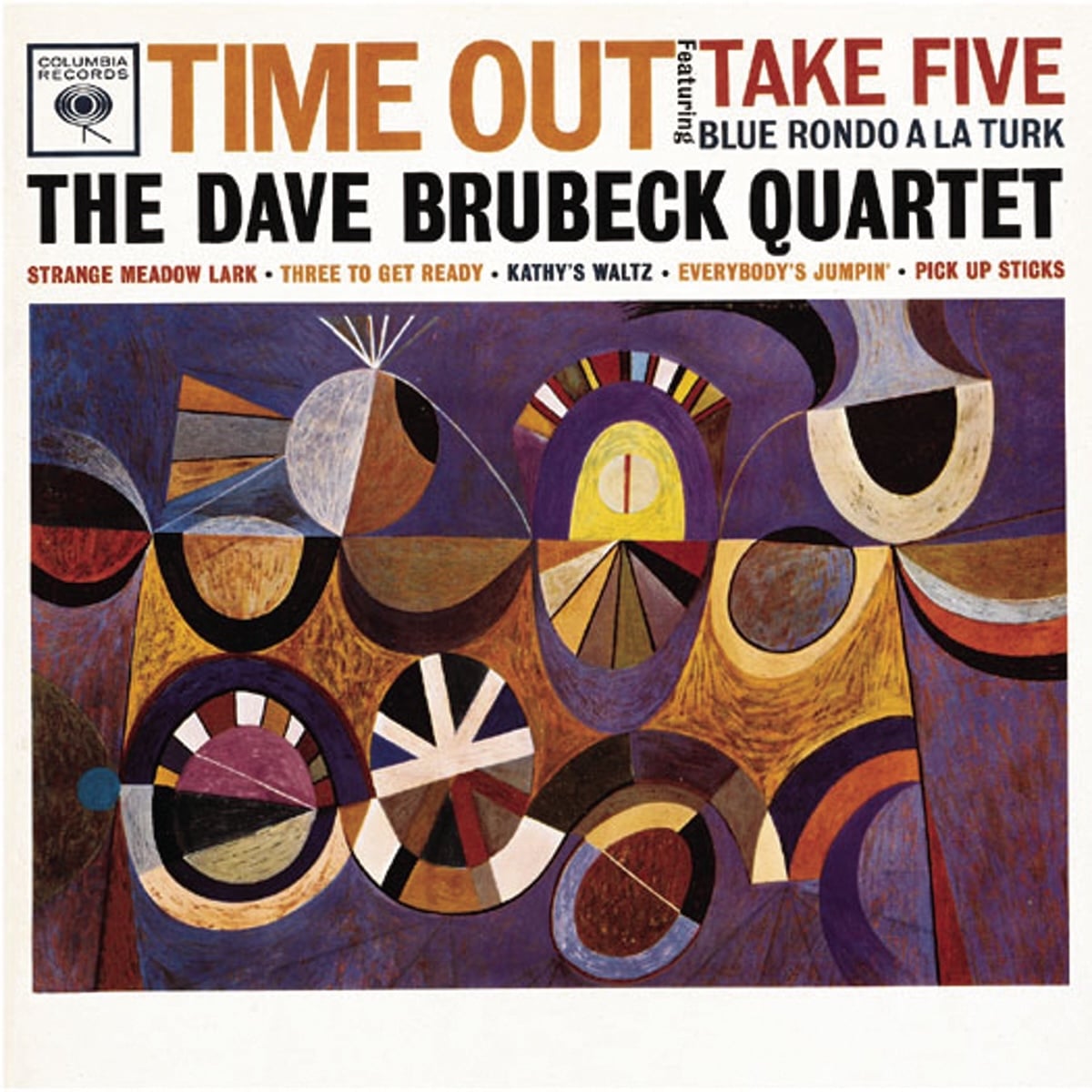
Fujita was also breaking ground at Columbia. He was one of the first directors to hire both men and women in a racially integrated office.5 He delegated work, tapping painters, illustrators, and photographers to contribute to covers. Fujita himself trained to be a painter before starting his career in design; he started looking for ways to incorporate his own original paintings into the covers: “We thought about what the picture was saying about the music,” Fujita recalled, “and how we could use that to sell the record. And abstract art was getting popular so we used a lot more abstraction in the designs—with jazz records especially.” He got the perfect opportunity to make his mark with two albums released in 1959: Charles Mingus’s Mingus Ah Um and Dave Brubeck’s Time Out.
Fujita's cover for Charles Mingus' Mingus Ah Um
Fujita's cover for Dave Brubeck's Time Out
Fujita’s abstract paintings reflected the pure exuberance of Mingus’ and Brubeck’s music. In the case of Mingus Ah Um, the divisions and intersections spanning the cover read like a beam of light passing through exotic lenses, magnifiers, refractors, and prisms; through his music, Mingus was reflecting on the transition of jazz from popular entertainment to mind-expanding creative exercise. For Time Out, the wheels and rollers spooling out across the page echo the way that Brubeck’s quartet was experimenting with how time signatures could be interlocked, multiplied, and divided to create completely new textures and musical patterns.
Fujita’s covers made it plain: Jazz was art.
’59 turned out to be a watershed for both jazz and album art. Brubeck’s Time Out went to #2 on the pop charts in 1961, and was the first jazz LP to sell more than a million copies; “Take Five,” the album’s standout hit, would also become the first jazz single to sell a million copies. For a unique moment in time, the music and art worlds were being propelled forward by a commercially successful record. Fujita’s paintings were making their way into millions of homes, driving sales of records by the vanguards of jazz.
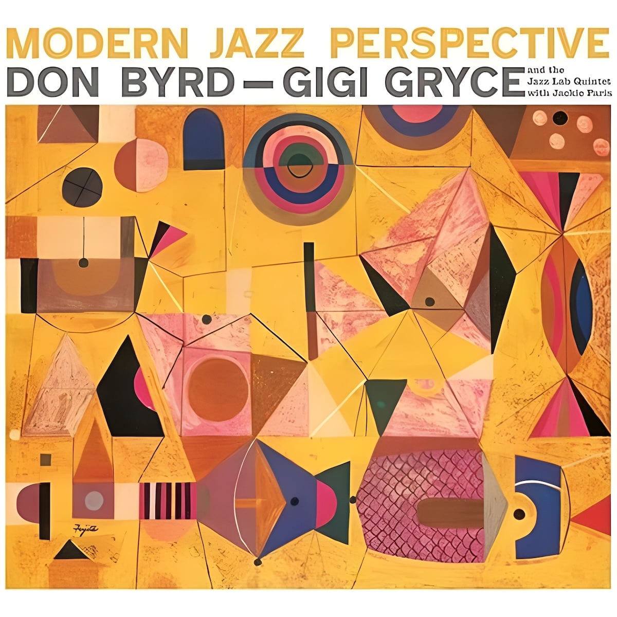
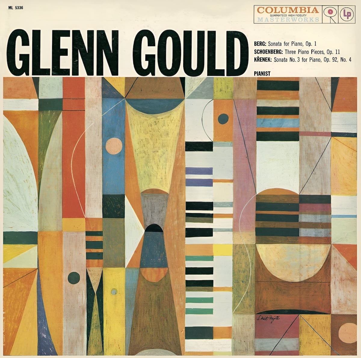
Fujita left Columbia records shortly after these major successes. “I wanted to be something other than just a record designer,” he said, “so I left to go on my own.” He’d go on to design the book covers for Truman Capote’s In Cold Blood and Mario Puzo’s The Godfather — when the latter was turned into Francis Coppola’s breakthrough film, Fujita’s design was used for its title and promotional art. But he’d continue to design album covers, creating paintings for each one.
Fujita's cover for Johnny Eaton's Far Out, Near In
Fujita's cover for Dony Byrd and Gigi Gryce's Modern Jazz Perspective
Fujita's cover for Columbia's recording of Glenn Gould performing Berg, Křenek, and Schoenberg.
The next generation
As jazz continued to evolve throughout the ’60s and ’70s, melding with rock ’n roll to produce punk, electronic, R&B, and rap, album art evolved alongside.
Packaging became more sophisticated: multi-disc albums came in folding cases called gatefolds, accompanied by booklets of photography and art. New printing techniques allowed for brighter colors, shiny foil stamps, and textured finishes.
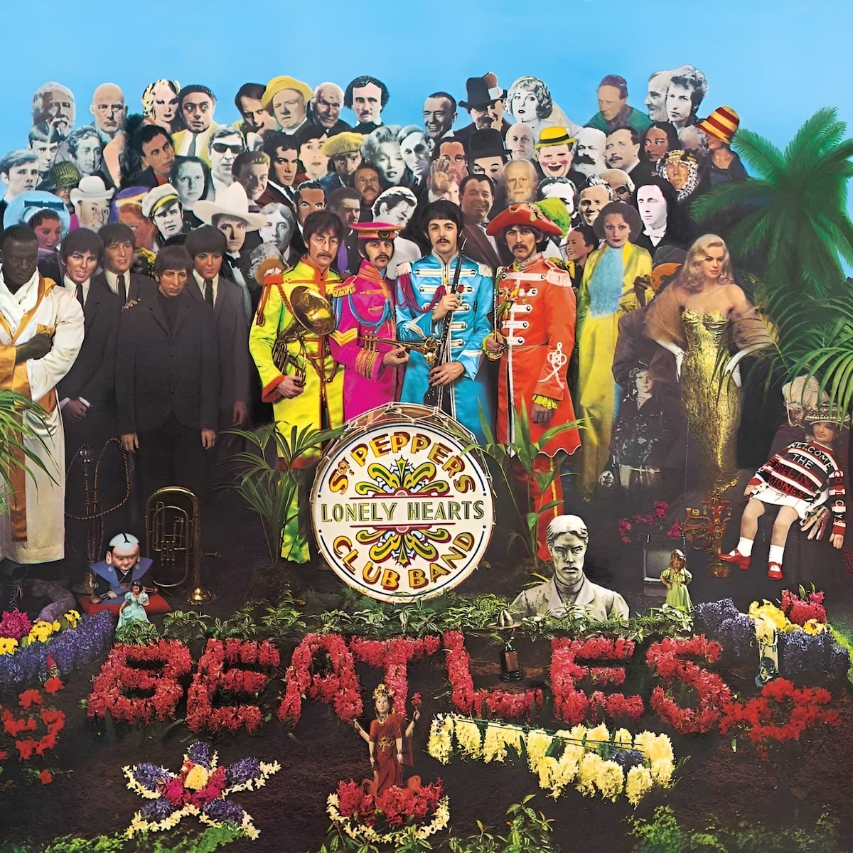
Budgets for production grew larger and larger. The Beatles’ Sgt. Pepper’s Lonely Hearts Club Band featured an elaborate photo of the band members, 57 life-sized photograph cutouts, and nine wax sculptures. For the first time for a rock EP, the lyrics to the songs were printed on the back of the cover. In another first, the paper sleeve inside was not white but a colorful abstract pattern instead. Also inside was a sheet of cardboard cutouts, including a postcard portrait of Sgt. Pepper, a fake mustache, sergeant stripes, lapel badges, and a stand-up cutout of the Beatles themselves.
The zany campiness of Sgt. Pepper’s could only be matched by an absurd gift box full of toys and games. The stark loneliness of the Beatles’ next album would be paired with a plain white cover, without even ink to fill in the impression of the words “The Beatles” on the front.
The cover of Sgt. Pepper's Lonely Hearts Club Band, designed by Jann Haworth and Peter Blake and photographed by Michael Cooper
The cover of The Beatles, designed by Richard Hamilton via Reddit
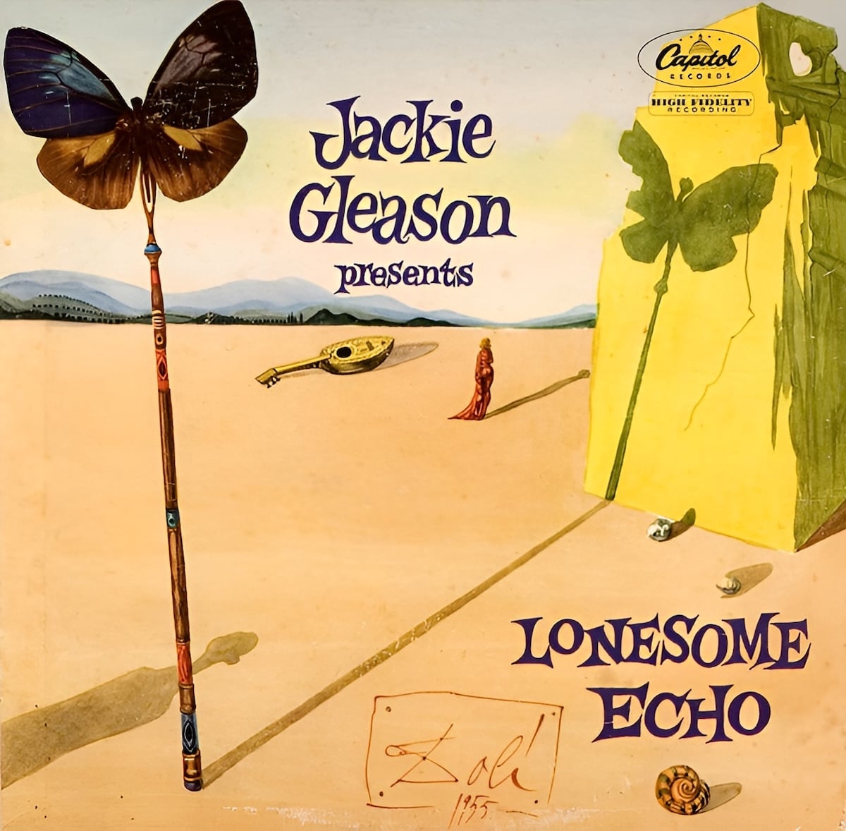
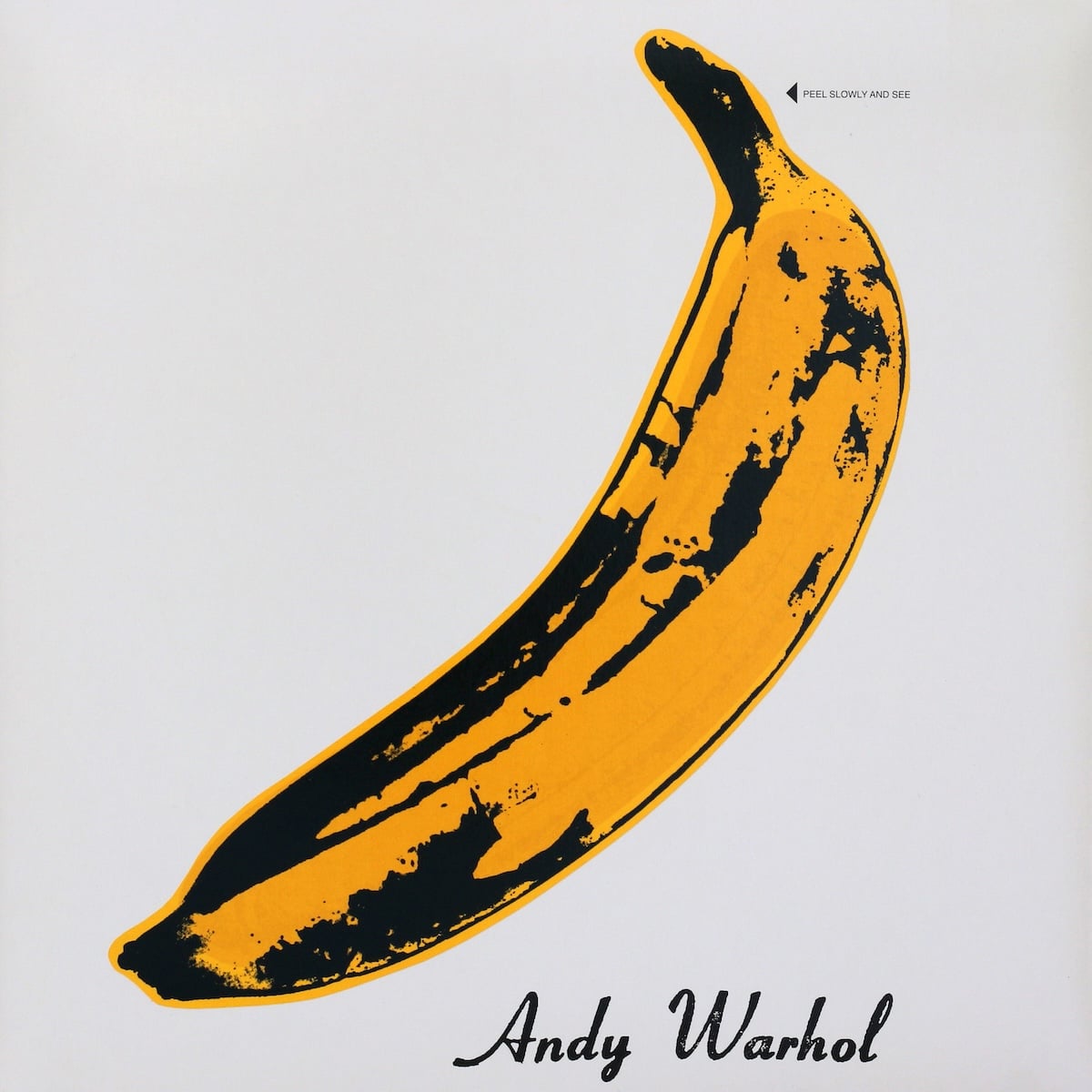
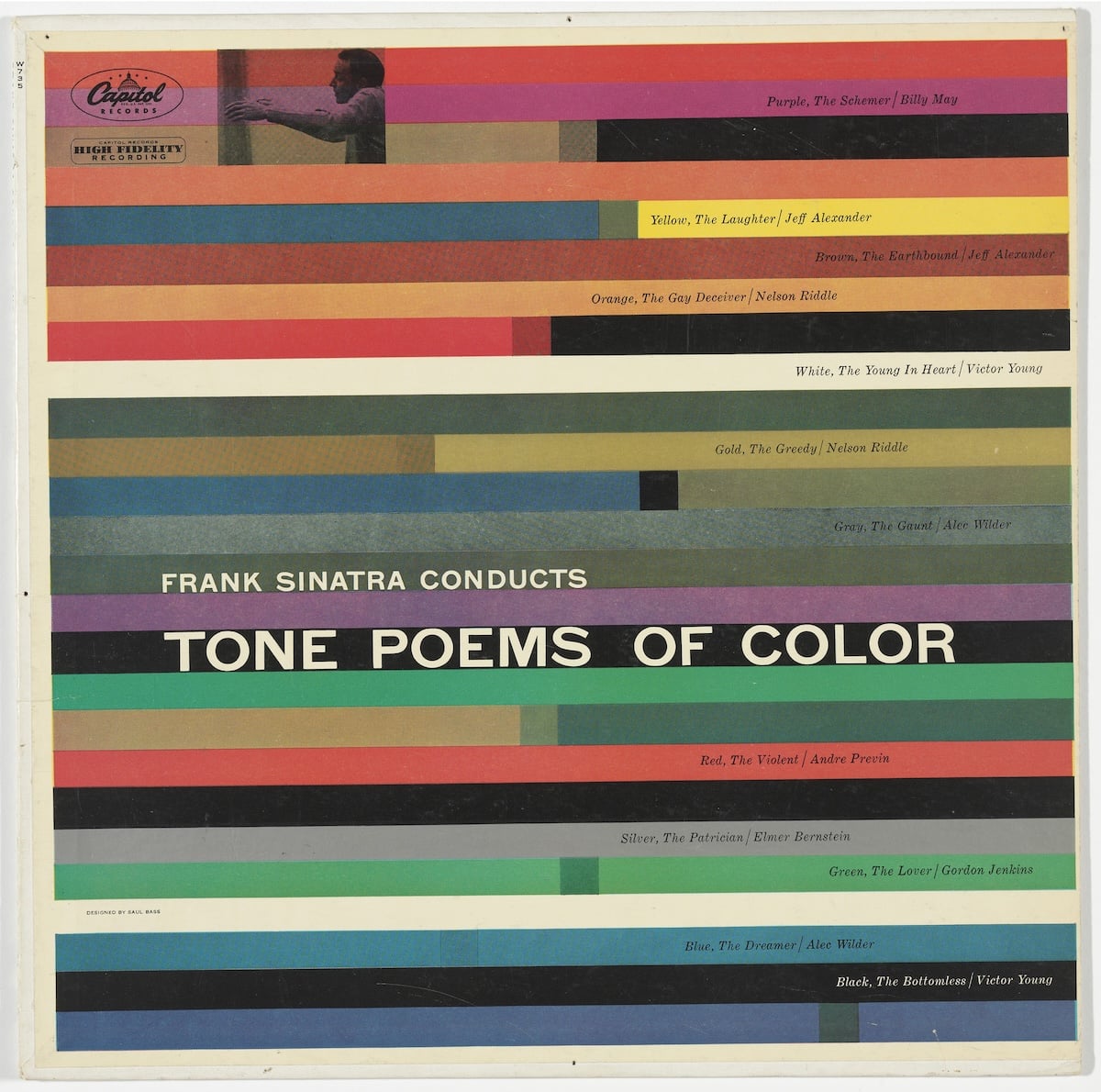
The most famous artists and designers of each generation would try their hand at album art. Salvador Dali, Andy Warhol, Saul Bass, Keith Haring, Annie Leibovitz, Jeff Koons, Shepard Fairey, and Banksy would all create work for albums. Some of those pieces would become the most recognizable ones in an artist’s catalog.
Salvador Dali's cover for Greatest Hits by The Modern Jazz Quartet
Andy Warhol's cover for The Velvet Underground & Nicovia Leo Reynolds
Saul Bass's cover for Frank Sinatra Conducts Tone Poems of Colorvia Moma
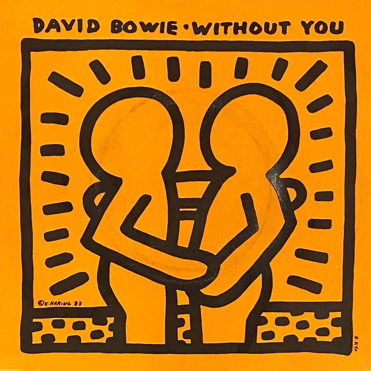
Keith Haring's cover for David Bowie's Without You
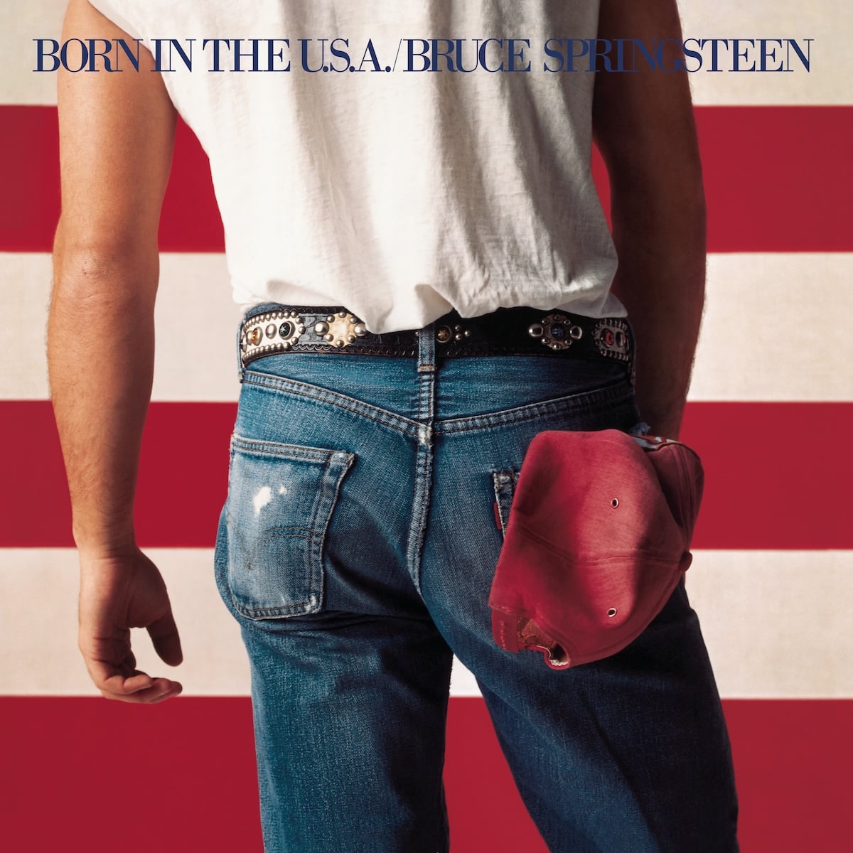
Annie Leibovitz and Andrea Klein's cover for Bruce Springsteen's Born In The USA
Jeff Koons' cover for Lady Gaga's Artpop
Shepard Fairey's cover for The Smashing Pumpkins' Zeitgeist
Banksy's cover for Blur's Think Tank
None of this would have been possible without the contributions of Alex Steinweiss, Jim Flora, Paul Bacon, Gil Mellé, John Hermansader, Reid Miles, S. Neil Fujita, and others. If not for the arms race between Columbia Records and Blue Note for the best art and the best artists of the ’50s, many artists would never have found their career. And in some cases, an album like The Rolling Stones’ Sticky Fingers would be remembered more for its art than for its music.
When music was first pressed into discs, design was less than an afterthought. Today, album art is an extension of music itself.
Join the mailing list
I'll send new posts to your inbox, along with links to related content
and a song recommendation or two.