3 billion people used the internet for the first time in the past decade. Can you imagine what that was like? When I began using the internet, the web was pretty much just text. Interface design required finagling websites from knots of spreadsheet-like tables, and even the most sophisticated designs couldn’t do much more than blink and display images. Now, 37% of the world has the internet literally at their fingertips, allowing them to manage their finances and healthcare, communicate in real-time using pictures and videos, and purchase everything from hamburgers to houses. Complex functions require complex interfaces; so how has interface design changed to accommodate?
Well, in many ways, it’s gotten boring.
Information rules supreme
In 1990, a group of researches concluded that “Absorptive Capacity” — “the ability … to recognize the value of new, external information, assimilate it, and apply it to commercial ends” — would become one of the most important factors in a company’s success. Their paper has since been cited by 26,347 others, and 25 years later, the $890B IT services industry is fitting proof of this prediction’s accuracy. But our brains change at a pace much slower than the rate at which technology advances. So how do we use new technology to even our odds? Let’s look at one of the most commercially successful business interfaces of the last 25 years: the Bloomberg Terminal.

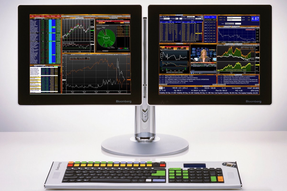
This monstrous pile of letters and numbers nets Bloomberg roughly 6.3 billion dollars a year. Friends who have used it rave about its ability to quickly visualize a vast amount of information; a specialized keyboard allows users to command financial data with speed and accuracy. It is ugly as can be, but it is brilliantly designed: There is a deliberate hierarchy, an accurate color scheme, concise and useful charts, and clearly-labeled tools throughout.
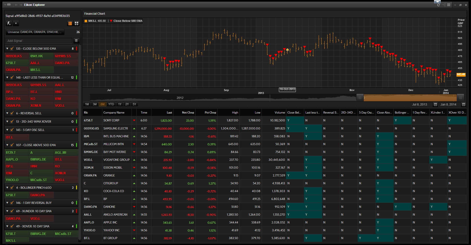
Perhaps more importantly, it’s boring. There’s no thinking “outside the box.” No Jony-Ive-slinging-superlatives-in-a-black-t-shirt materials. No cleverly branded names, no breath-taking or game-changing, and certainly nothing even close to “intuitive.” Just data. This aspect — the lack of design-award aspiration — means that there’s little between the user and the information they’re assimilating. These terminals often span 4 or more crowded screens: no whitespace means more information. Despite its steep learning curve (or, perhaps, because of it), its charts and graphs are *lingua franca *of the financial industry. Its closest competitor, Reuter’s Eikon system, is only marginally less ugly, maintaining the same density and resistance to interface metaphors.

Autonomous cars look boring, too
Of course, the design of the Bloomberg Terminal is unknown — and not at all important — to most people. However, one of the most of the exciting recent developments in tech is helping us master an interface familiar to 210 million people in the US alone: cars. With new technology aiding computer-driven vehicles (in fact, 8 million people a day fly in planes that are almost entirely autonomous), it’s becoming increasingly clear that we’ll stop driving cars soon. There will be no gear shifting, no turn signaling, no braking or accelerating, and no windshield wiping. So what sort of interface is best for an autonomous car?
There is a rich history of “interface design” for the complex information once required to drive cars. But in a self-driving car, this information is redundant, and so is that interface. Google has kept the dashboard out of the pictures of its driverless car, but why? One possibility is that the car’s dashboard is shockingly absent of controls. It’s not sleek and sexy, or full of fancy gauges and real-time readouts; it’s just an empty space, which is going to be a jarring experience for most people.
As an interface designer, I’m disappointed. Growing up, I watched countless movies and TV shows that portrayed interfaces as beautiful holograms spinning in the air, manipulated in space by flicks and swishes, surrounded by rainbow-splashed screens full of shapes and numbers. But as we see new technology accomplishing wonderfully complicated things beyond our imagination, like air-lifting goods directly to our doorstep and storing, tagging, and organizing all of our photos forever, we’re having to come to terms with fantasy vs. reality.
Let go of shiny things
Computers are starting to outpace the computational abilities of our brains, and fine-grained controls in interfaces are becoming overwhelming. The more we can do with a tool, the more the interface has to get out of the way. Sometimes, we can do so much with a tool, that we need the help of artificial intelligence to unlock its full potential. This isn’t just a simplification of interface; it’s a complete shift in how we design our digital tools.
The trend in interface design — away from the shiny and complex, towards the simple and boring — is only beginning.In my experience, it’s inevitable. Boring works. In the past year, I’ve started countless projects with richly detailed interfaces, only to have users tell me they prefer simpler and more functional versions. In the world of product design, the user is always right. As the next 3 billion internet users come online, the interfaces that are the least noticeable will be the most widely adopted — even if that means there’s no noticeable interface at all. For the interface designer, that means we’ll ultimately have to take the Futurama-coined adage to heart: “When you do things right, people won’t be sure you’ve done anything at all.”
Special thanks to Josh Petersel for looking at drafts of this piece. Thanks Josh!
Join the mailing list
I'll send new posts to your inbox, along with links to related content and a song recommendation or two.