I recently read an essay on ‘compounding knowledge.’. Warren Buffet has used compounding knowledge to become the most successful investor of all time:
While most of us focus on consuming information that we won’t care about next month, let alone next year, Buffett focused on knowledge and companies that change very, very slowly or not at all.
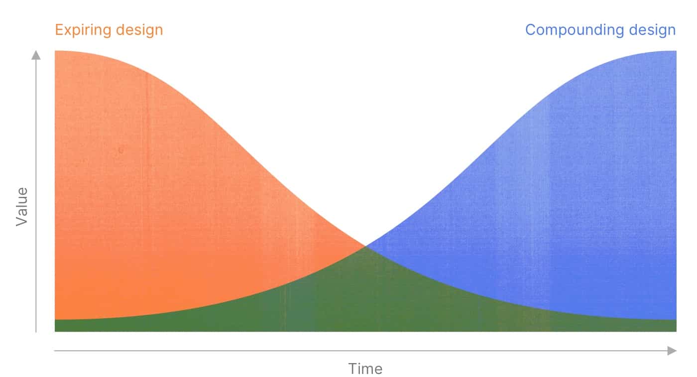
Compounding knowledge builds on itself, like a snowball rolling downhill. Most importantly, compounding knowledge becomes more useful over time.
The opposite of compounding knowledge is ‘expiring knowledge’:
…lacking details and nuance, it’s easily digestible … it’s commonly telling you what happened, not why it happened or under what conditions it might happen again … it won’t be relevant in a month or a year.
I think the same concept can be applied to design.
What is compounding design?
Compounding design, like compounding knowledge, stays relevant over a long period of time. It might be domain-specific, but it isn’t limited to a single application. Compounding design often is more about the process than the results.

Design principles are compounding design. Design principles create positive feedback loops, improving design that comes after them. They benefit both the designer (providing constraints to speed up decision-making) and the audience (providing consistency).
Design systems are another example of compounding design. They help designers, engineers, and end users by creating a consistent foundation for rapid iteration and improvement. Well built and carefully maintained design systems can influence a product for years. Material Design, love it or hate it, is a great instance of compounding design.
What is expiring design?
Expiring design is immediately useful, but quickly loses value. It captures the state of a problem at a precise moment in time. Expiring design, unlike expiring knowledge, is very detailed. It is single-use.
You can recognize expiring design by its filename. ‘Layout2_revision3_final’ is an expiring design.

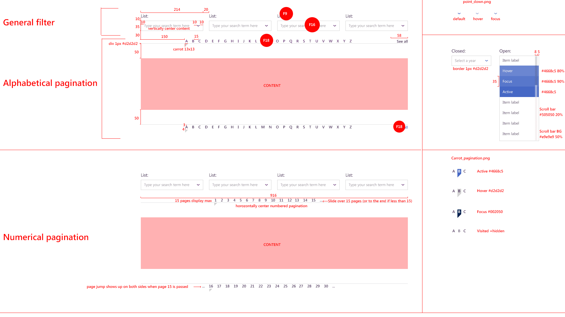
Redline mockups are an example of expiring design. Redlines are used to communicate specifications to a developer. They pack a lot of information into a single piece of design, but they are time and labor intensive. A redline mockup expires every time a change is made.
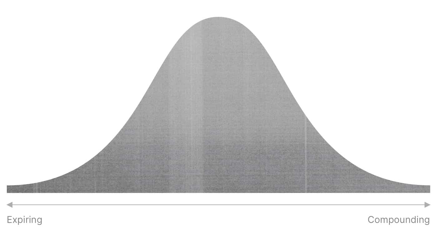
The expiring ↔ compounding spectrum
Expiring and compounding design aren’t yin and yang. All design falls somewhere on the spectrum. Most design is in the middle.

Just because a design is compounding instead of expiring doesn’t mean it’s fundamentally better or more useful. Sometimes it is best to design something you know will be quickly out-of-date.

I’ll give you and example: redline mockups are expiring design, since they lose their value over time. A tool like Zeplin, on the other hand, enables compounding design. Zeplin empowers engineers to get the information they need without a designer creating redline mockups. Zeplin syncs design files automatically, and is always up-to-date.
If you only need to tell a developer the size of one button on one screen, and if the developer is working on the button right now, an redline mockup is the right choice.
If you are planning an upcoming project and know you’ll need a tight communication loop between designers and developers around visual specifications, Zeplin is a better fit.
Know thyself
The key takeaway: all design is somewhere on the expiring ↔ compounding spectrum. There are advantages to both. When making decisions, it’s only important to know what kind of design fits your needs. Avoid choosing an expiring design when a compounding one is a better fit, and vice versa.
Join the mailing list
I'll send new posts to your inbox, along with links to related content and a song recommendation or two.