tl;dr — I’ve created a tool called Datum Ipsum to enable designers to use realistic data when mocking up data visualizations. Also, this is a written version of a talk I gave at Data Viz Camp 2016 in NYC. The slides for that talk are here.
In my career as a designer, both at Planetary and in my freelance work, I’ve constantly struggled with designing real-time data visualizations. You know the kind: dashboards, analytics, reporting tools — anything that displays data on an ongoing basis. Designers at publications like the New York Times, Guardian, Wall Street Journal, and Financial Times(paywall) have been pushing the envelope of design in data-first journalism and reporting, but applying the same principals to dynamic data sets is challenging. Though these visualizations are incredibly valuable to the people who rely on them every day, they’re some of the trickiest to get right.
My hunch is that no amount of aesthetic theory or design experience matters if a designer doesn’t understand the data. The real problem, then, is that …
Real data is hard to understand.
This fact has a lot to do with the lack of overlap between design and statistics — designers are often the ones who avoided taking statistics class and opted instead to spend their time in studios and darkrooms. But even a background in statistics can’t change the reality that humans simply struggle with data. A few reasons for this:
Real data isn’t intuitive
Our brains are really good at finding patterns. It’s one of the things that makes design so rewarding — looking at orderly shapes and patterns feels good. So when we look at data, we look for and often find patterns, even if those patterns are misleading or downright wrong.
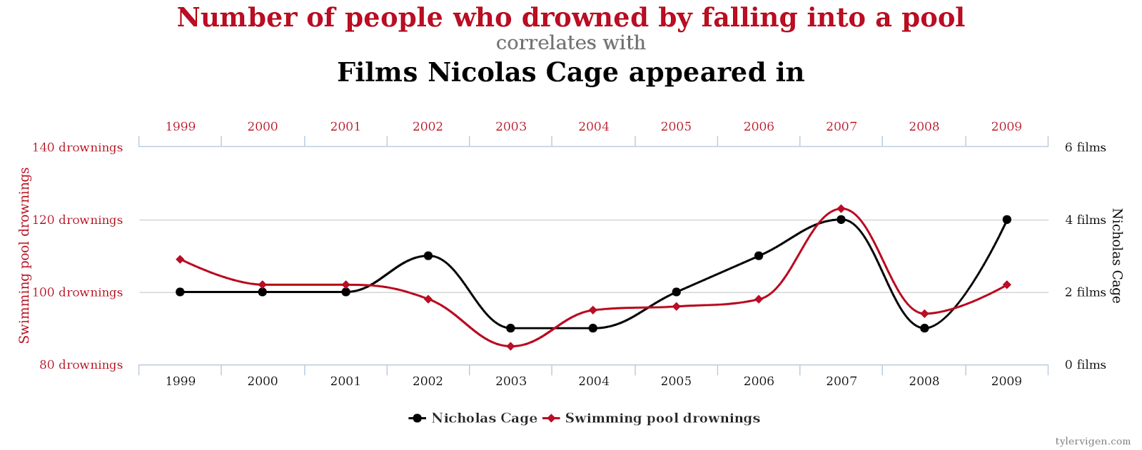
In addition to finding meaning where there is none, the patterns that are meaningful are often incomprehensible. Take the Birthday Problem, for example: in a group of people, what are the odds that two have the same birthday? For a group of 367 people, we can assume that there’s a 100% chance that two have the same birthday. What are the odds with a group of 70 people?
The surprising answer is 99.9%. Beyond that, for 23 people, there’s a 50/50 chance that two share a birthday. There’s certainly a pattern here, but it’s impossible to discern without analysis.
Real data is hard to fake
Try as we might, trying to fake data is a lost cause. One illustration of this is called the Gambler’s Fallacy, and it’s easiest to illustrate with a demo. We’re going to flip 20 coins (virtually); but before we do, enter in what you think the outcome will be — select either “Heads” or “Tails” in each row on the left, then click “flip!” to see how you fare.
What you’ll (probably) see is that your guess on the left alternates from heads to tails often, with few streaks, but the result on the right has streaks. Your guess likely has close to 10 heads and 10 tails, but rarely does the actual result come up an even 10 and 10. These differences are attributable to our assumptions about probability (that a coin flip has a 50/50 outcome) being applied to a larger problem (20 actual coin flips).
There’s even a simple statistical property (called Benford’s Law) that can be used to identify faked data sets. In short, in any large enough data set, patterns emerge in the first digits of each data point: more numbers will start with the digit “1” than any other number. This pattern is so pervasive and counterintuitive that it is often used to prove — in court — that data has been falsified.
Real data is unpredictable
Part of what makes data so tricky to work with is that our assumptions about the shape, domain, resolution, and volatility of a set of data are only just that: assumptions.
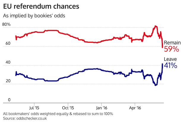
Even with the most reliable sets of data — say, an atomic clock — there’s always the possibility of error states or the occasional act of god. These one-in-a-million events are when great data visualization really shines: instead of breaking down in the face of anomaly, they highlight the rarity of the situation and respond appropriately.
But when we’re designing visualizations, how can we predict the unpredictable? It’s almost like something out of a Borges story; outliers aren’t really outliers if we’re expecting them.
Why not design with real data?
Real data sets of all shapes and sizes are easy to come by if you know where to look. There’s a slew of large, well-formatted data sets on GitHub, collected and maintained by the (excellently-named) Open Knowledge group. From financial data to global temperature indexes, these data sets can easily provide a reality check for your designs.
Unfortunately, my experience working with historical data sets fails to overcome some of the fundamental challenges of designing robust visualizations. Here’s why:
- It’s too hard to fine-tune. The time series of S&P 500 financials over the past 100 years probably isn’t going to fit your visualization domain and fidelity right out of the box. The benefit of having lots of data to work with becomes a curse when you’re trying to normalize lots of values.
- It’s too easy to pick and choose. I find myself discarding data when it doesn’t come out quite like I expect it to. Instead of taking the harder route of improving the visualization to handle the data at hand, I’ll just select “better” data.
Let’s use placeholder data instead.
Placeholder data is a lot like placeholder text. It’s a design tool meant to ensure the final product — in our case, a real-time data visualization — matches our mockups. It’s useful in all the same ways placeholder text is useful:
- Placeholder data allows a designer to test her assumptions about the product.
- Placeholder data makes decision-making much easier by providing realistic constraints.
- Placeholder data sets realistic expectations for clients and stakeholders.
What does placeholder data look like?
Just as with placeholder text, we can achieve varying degrees of placeholder data realism by choosing our parameters very carefully. When mocking up a page layout, I can choose the classic placeholder text “lorem ipsum dolor sit amet …” to help pick the right typeface, leading, measure, etc. A placeholder data version of “lorem ipsum” might look just like random numbers, a sort of meaningless pattern that looks like real data if you aren’t looking too hard.
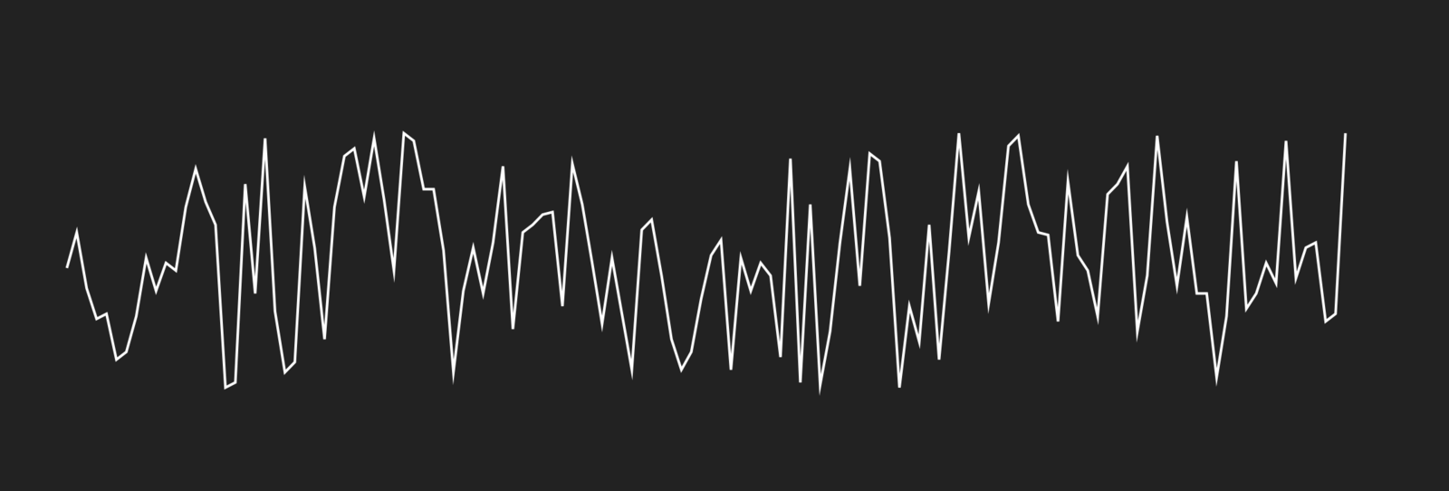
I’ve often run into trouble using “lorem ipsum,” though, and you probably have, too: it is too obviously fake. Clients have questioned my sanity, when all their mockups look like they’ve been done in latin. And in making decisions with nonsense text, I sometimes run into problems down the line when the real text goes in.
Instead of using “lorem ipsum,” I’ve started to use real text from various sources. If the final text will be highly technical in nature, I can pull from scientific papers in the public domain. If it’s meant to be exciting, Jules Verne serves as a good placeholder. Choosing the qualities of my placeholder text helps me make better decisions, and sets better expectations with my clients.
How do we apply this concept to data? Can we create “flavored” placeholder data, without losing the benefit of randomness and unpredictability?

Perlin Noise (or, a better kind of random)
In 1983, a computer scientist named Ken Perlin was working on a very similar problem: how can a computer generate random images that don’t look like they were generated by a computer? While working on a movie titled Tron (the one without Daft Punk), Perlin developed an algorithm to draw textures that he could apply to the computer-generated images in the film to make them appear more realistic. And while the CGI in Tron looks laughably primitive compared to what we see in theaters today, at the time Perlin’s work was revolutionary. In 1997, he won an Academy Award for the algorithm, which by then was referred to as “Perlin Noise.” The award read:
“The development of Perlin Noise has allowed computer graphics artists to better represent the complexity of natural phenomena in visual effects for the motion picture industry.”
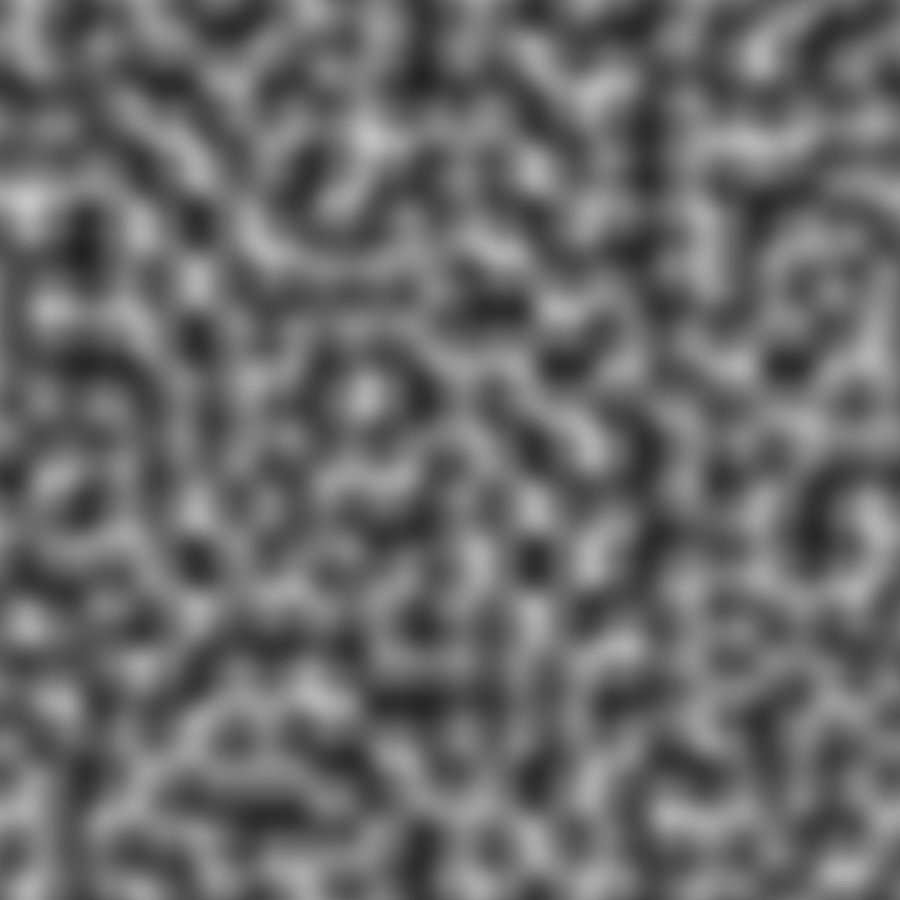
This is an image of Perlin Noise. The technical description of the algorithm isn’t important for this post, so let’s just leave it at “random vector fields.”1
If we draw a line across this image, and track the color values as we go — “high” for white, “low” for black — we get a nice-looking smooth graph of the Perlin Noise field; its peaks and valleys are flattened out to a simple two-dimensional line.
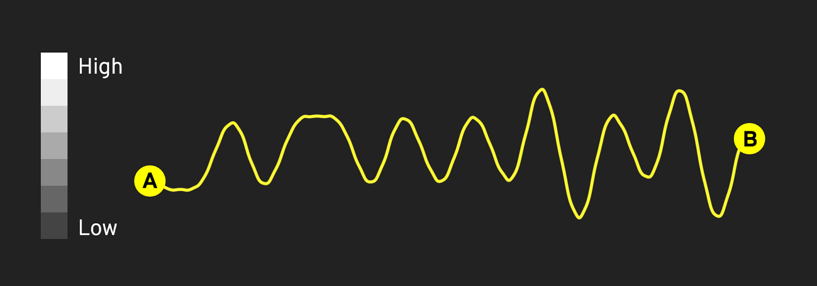
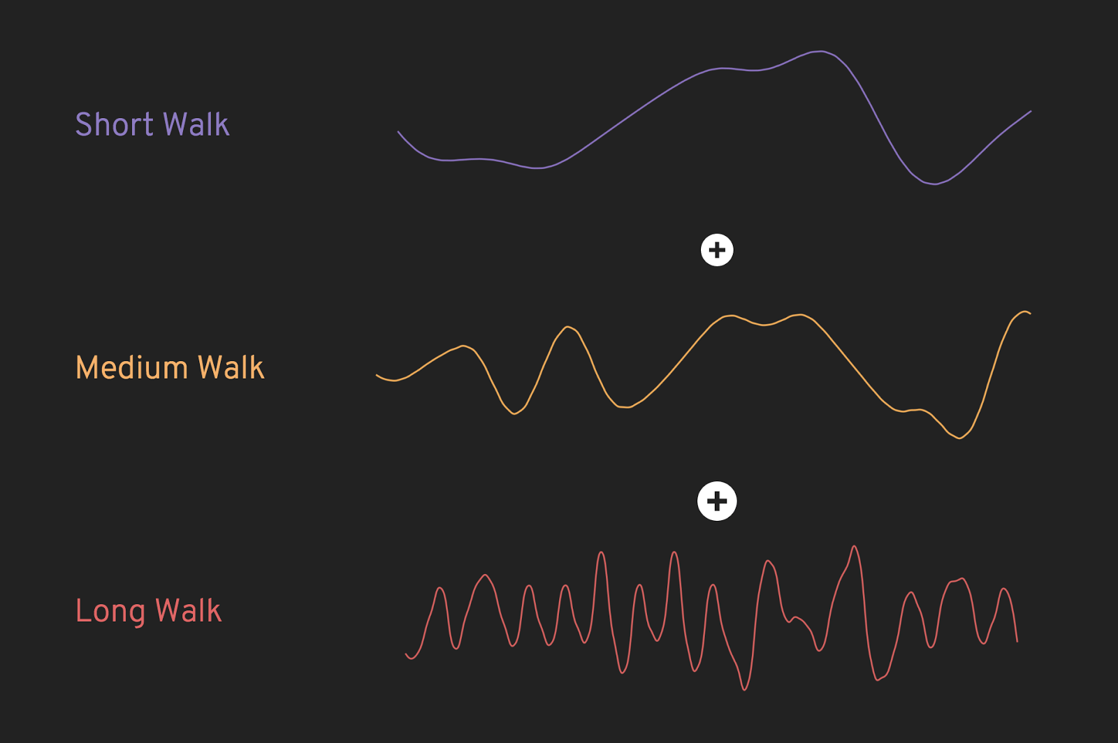
Drawing lines across the noise field is akin to taking a walk with a FitBit and watching the elevation change as you go; a short walk might only have a few elevation changes, while longer walks have many more ups and downs.
Putting Perlin Noise Into Practice
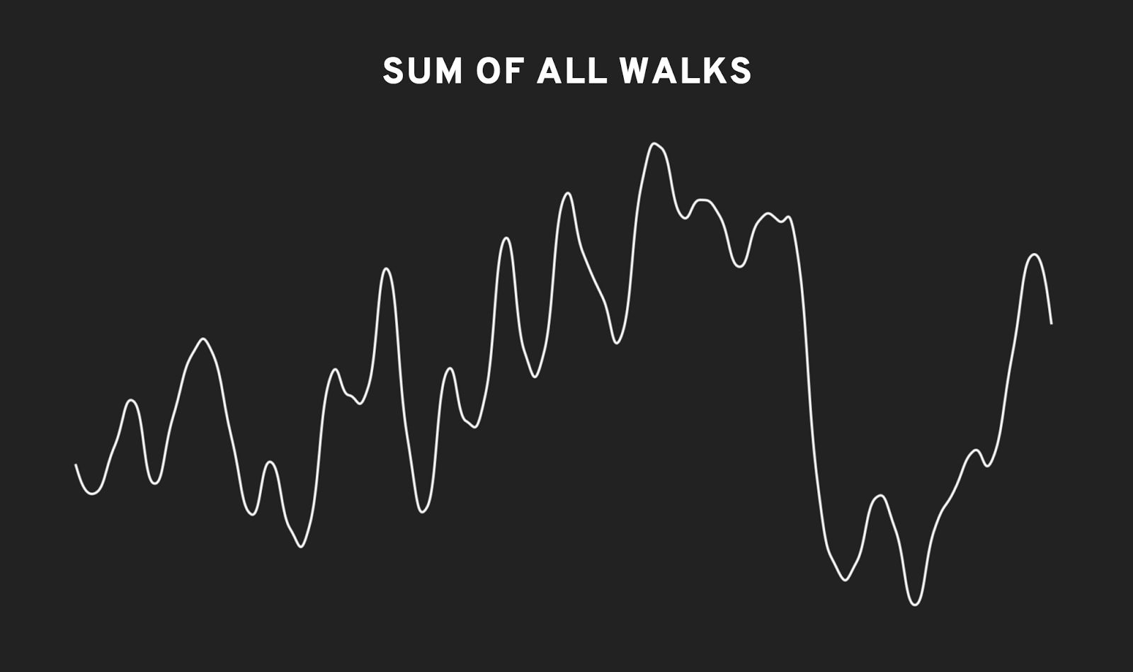
One nice thing about this sort of data is that it can be added together to make more varied graphs. For instance, if we add up a few different walks across the noise field, we get a line that has short rises and falls, a plateau here and there, and the occasional rapid change.
Additionally, adding these graphs of Perlin Noise together with very basic functions like sine waves can generate data that resembles real-world patterns. For instance, a graph of the daily active users of a website follows a cycle; during the daytime, there are lots of users on the site, and in the late evening and early morning there are typically not as many. Combing a cyclical wave (in this case, a sine wave) with one of our noise graphs gives us a very realistic simulation of a website’s traffic!
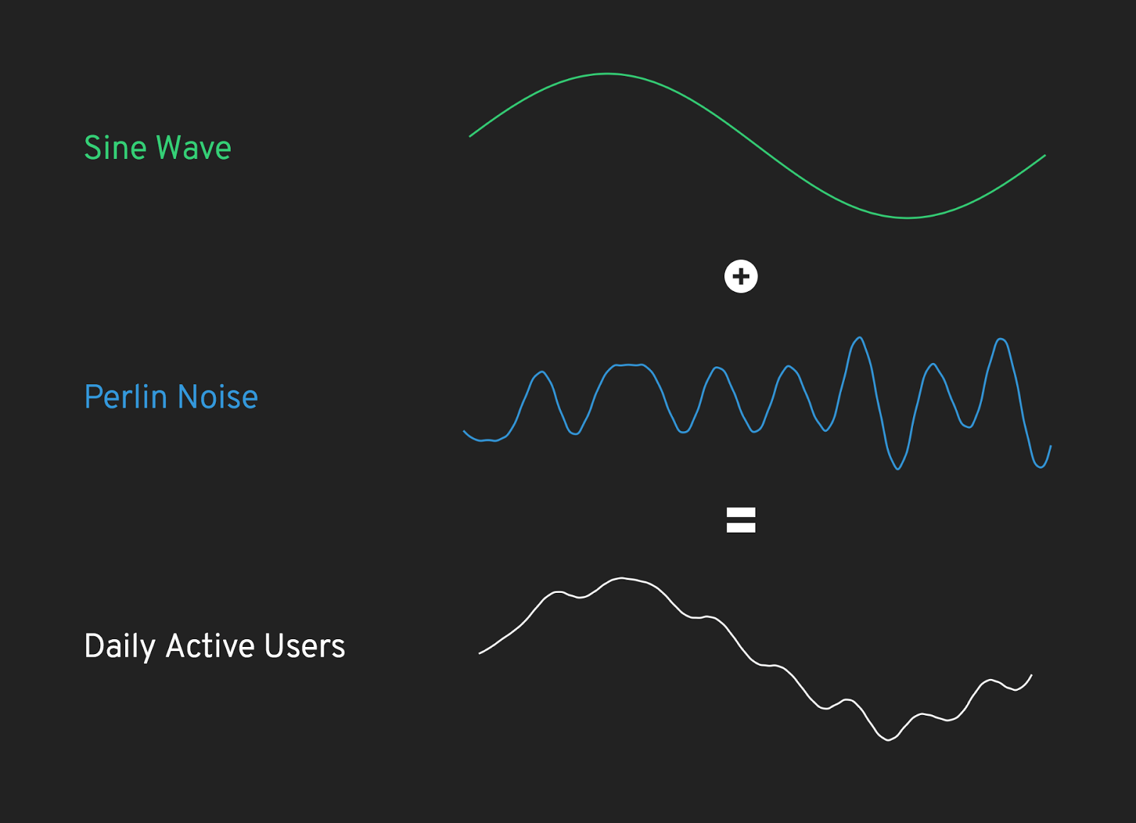
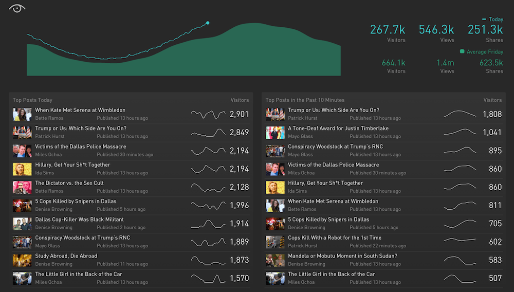
Combining graphs of simple functions with Perlin Noise has a nearly infinite number of possible permutations, making it an incredibly effective tool for mocking up real-time data visualizations. In practice, Planetary uses this method to test our software platforms, like this one, which visualizes the performance of a publication’s stories in near-real time:
To make these noise functions accessible and easy to generate, I’ve created a tool called Datum Ipsum. Just like you might use placeholder text to mock up websites and apps, my hope is that you’ll use realistic placeholder data when creating data visualizations.
By using realistic placeholder data, you can make your designs more robust and free from bias. In putting constraints on the source material you work from, you’ll be challenged to solve problems that typically arise only after real data is available. With tools like Datum Ipsum, you can create tools that handle the unpredictable, difficult-to-understand nature of data in real time.
Join the mailing list
I'll send new posts to your inbox, along with links to related content and a song recommendation or two.
If you’d like to learn more about Perlin Noise and its uses, I’d highly recommend Daniel Schiffman’s Youtube series on the subject. ↩︎