As we at the Wall Street Journal kick off a new round of hiring1, I’m reminded of my least favorite practice in design hiring: the Exercise. Why do we put ourselves through it? Why do we put each other through it? What could we possibly gain from it? I’d like to hazard an answer these questions. I also have a strange idea of how to improve the exercise — more on that in a bit.
What is the Exercise?

The Exercise is one step in most organizations’ design hiring process. It happens somewhere between interviews and a hiring decision. It usually comes in one of three flavors:
- “Fix our product” - A designer asks the candidate to do their work for them.
- “Fix someone else’s product” - The candidate is asked to redesign a portion of an existing product. Since it’s someone else’s product, the candidate has no context or insight into why the product works the way it does. Alex Barashkov provided a strongly-worded send up on the shortcomings of such redesigns.
- “Design an imaginary product” - The candidate is given a hypothetical brief, and designs a product from scratch. This has been my preferred Exercise in the past, but it has some major shortcomings.
Exercises can have a few different formats, too:
- Take-home - The candidate is given a brief, then produces work on their own time, at their own pace. Sometimes, the brief suggests a given amount of time, but if the candidate is anything like me, they’ll spend way more time on it than suggested.
- Solo Whiteboard - The candidate is given a brief, then has to immediately produce work. A whiteboard is provided, along with one or two colors of markers. This format was adopted from engineering hiring practices, where it is loathed.
- Collaborative Whiteboard - The candidate shares a whiteboard and a few markers with other designers from the company. Together, they’re expected to produce some work. The candidate is usually not clear on who’s who, and has to quickly work out team dynamics in addition to drawing/talking.
Why do companies run the Exercise?
Portfolios and résumés aren’t enough: to make a good hiring decision, we need to see how a candidate works.
Engineers have tackled this problem with whiteboards (and, before those existed, pens and paper) for decades2. Engineers have also engineered the heck out of hiring. They’ve scaled organizations quickly and found great talent (they’ve also produced some epic monocultures, but that’s a different essay). My hunch is that design hiring has adopted a lot of engineering practices over the last few years, but we’re still trying to figure out what works and what doesn’t.
What do we have to gain from the Exercise?
During most of the hiring process, we talk about the inputs in outputs of work: past experience, portfolio highlights, etc. With a well-run design exercise, we can really dig into the process of design.
In exercises I’ve been a part of, things really click when the interviewer-interviewee relationship starts to blur. The good ones are improvisational; they engage the problem-solving parts of the brain. The active context of the Exercise can be a valuable look into day-to-day design thinking. Plus, it can be fun.
Why doesn’t The Exercise work?

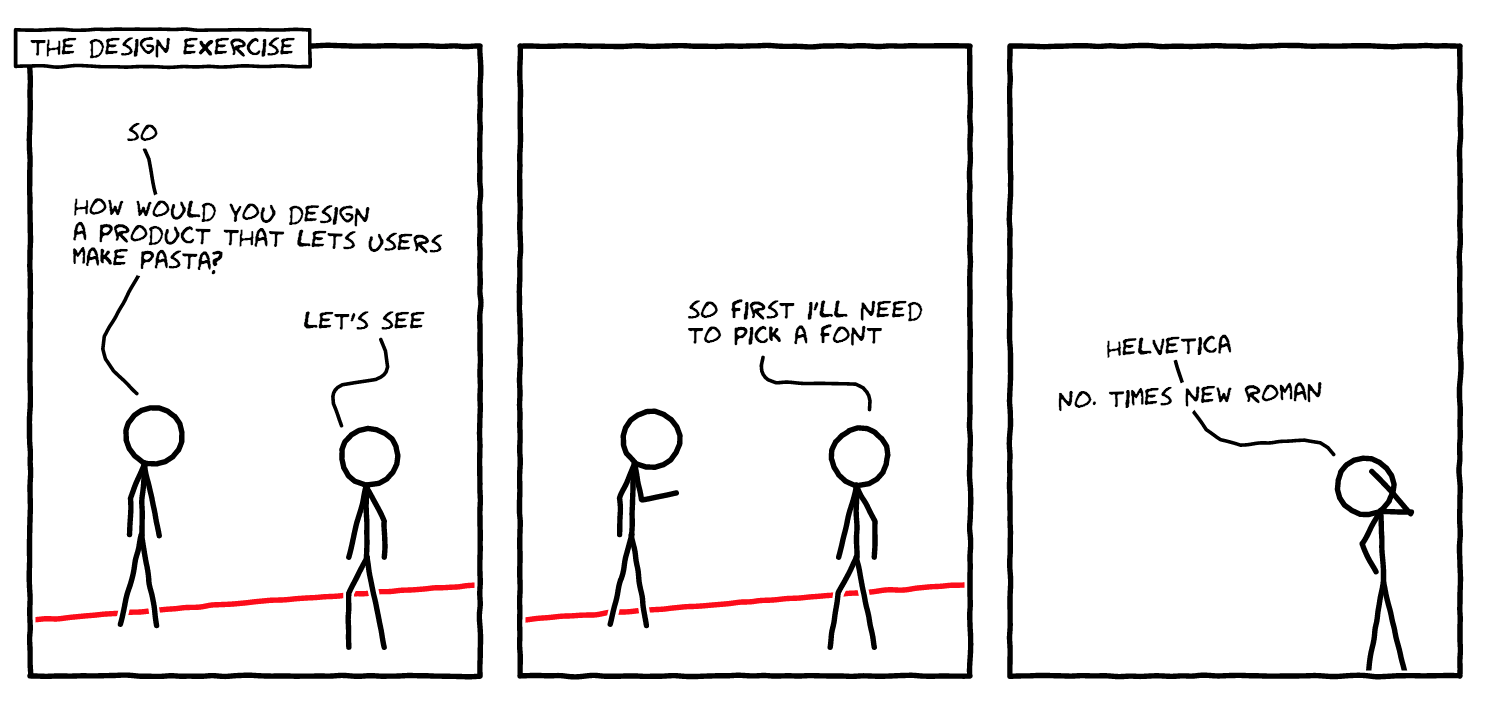
The exercise usually fails to simulate real design work.
In the case of take-home exercises, everyone misses out on the unpredictable nature of day-to-day design work. With whiteboarding, we simulate a bizarre world where all design happens on whiteboards. No matter what, asking a candidate to solve problems out of context is setting them up for failure.
Also, if you’re drawing on a whiteboard, you probably have your back to the person judging you. This isn’t comfortable for anybody.
So what?
Should we care that design exercises don’t simulate real design? Probably not. However, we should stop pretending that they do. Nobody does their best work in contrived circumstances.
So now, my really strange idea for better design exercises: instead of asking a candidate to design the best version of something, ask them to design the worst version of something.
Tentatively, let’s call it a Bad Design Exercise. This is an awful name, but I think it is fitting with the spirit of this essay.
I think we can learn a lot about good design by thinking about bad design. To wit, a real-life Bad Design Exercise:
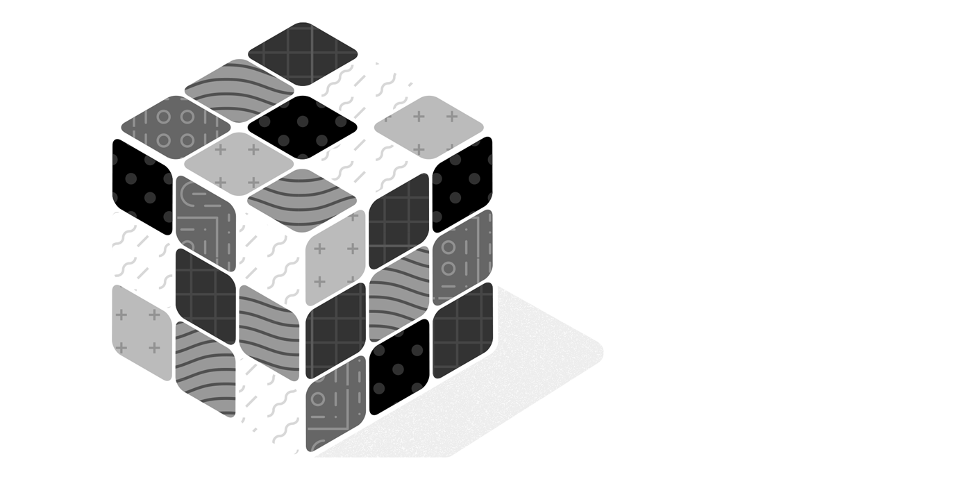
Really Bad Rubik’s Cubes
By looking at some real-life “bad” Rubik’s Cubes, we can learn a lot about the designers that made them.
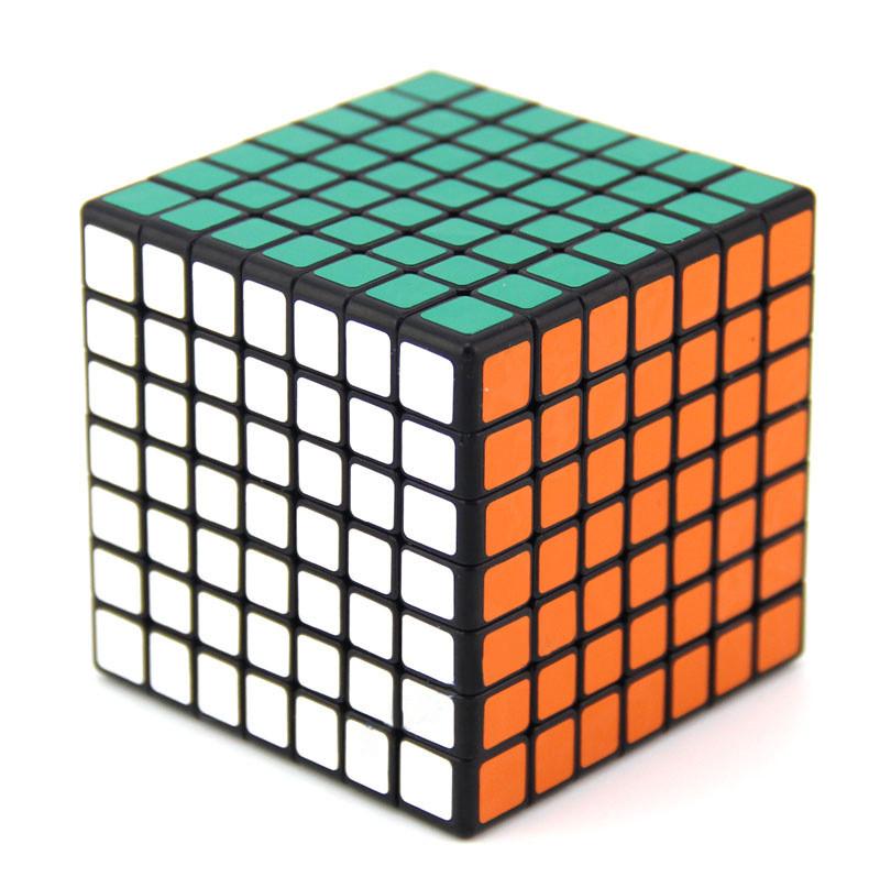
Exhibit A: 7x7 Cube

I can’t solve a regular Rubik’s Cube. To me, this Rubik’s Cube puts the allure of success even further out of reach.
Why is it bad? If all Rubik’s Cubes were this complicated, very few people would ever pick one up.
What can we learn? If you’ve never seen these higher-order versions, you think of the Rubik’s Cube as a classic symbol of a hard puzzle to solve. But we take that — and lots of design — for granted. The 7x7 cube is a good example of seeing the core identifying element of a thing, and taking that one (or four) steps further.
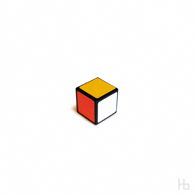
Exhibit B: 1x1 Cube

I Googled this thinking it was a ridiculous idea, but lo and behold, you can buy it. I can’t figure out if it’s always solved, or unsolvable.
Why is it bad? It takes all of the function out of the puzzle.
What can we learn? Often, we learn by subtracting. A good designer will know when to stop, and when to keep reducing. In this case, the designer knew what they were doing: it’s obviously a Rubik’s Cube, and obviously a really bad one.
Exhibit C: Color-changing stickers
This cube’s stickers are lenticular lenses. Depending on what angle you view it from, the stickers appear one of two different colors.
Why is it bad? Technically, you can solve it. But you’ll never get all the stickers right at all angles.
What can we learn? This cube isn’t harder, mechanically speaking, than the regular 3x3. However, it undermines a key assumption of Rubik’s Cubes: that all faces of the cube are one and only one color. When designing, it’s important to question even the most basic assumptions.
How to successfully run a Bad Design Exercise
A successful design exercise accomplishes three things. It:
- Gives the candidate a platform to comfortably express themselves
- Gives the reviewer an opportunity to ask questions about the candidate’s process
- Involves as little work as possible
To do all these things, a design exercise might look like this:
Step 1: Briefing
Set aside time to walk a candidate through the exercise. Share a written brief with them before this meeting, and encourage them to ask questions. Clearly communicate your expectations. Maybe send them this essay, too.
Step 2: Time Box
Explicitly limit the time the candidate can work on the exercise. In the past, I’ve done this by bookending the working time with the briefing and the review. Allow the candidate to work alone, uninterrupted, and make sure they have access to their preferred tools.
Step 3: Review
How do you conduct design reviews with your team?3 Run the same process with the candidate. Invite team members to participate, and use this review time as an opportunity to share your process with the candidate.
Step ∞: Have Fun, Embrace the Bad
It might seem impossible, but design exercises can be fun. Talking about bad design reduces the you vs. them friction of the interview process. And don’t take the work too seriously; pressure and stress shut conversations and candidates down.
In conclusion, design exercises can be really awful, if you let them. Improving the exercise will save time and emotional energy on both the candidate and the hiring manager side. Better conversations about design can increase the likelihood of hiring the right candidate, and maybe even convince the right hire to join.
Join the mailing list
I'll send new posts to your inbox, along with links to related content and a song recommendation or two.
You should come work for us! Here are our current openings. ↩︎
https://www.forbes.com/sites/vivekravisankar/2015/05/04/the-rise-and-looming-fall-of-the-engineering-whiteboard-interview/#318ca8161c82 ↩︎
If you don’t have a formal design review process, I have some suggestions. ↩︎