Data-driven interfaces are on the rise. Financial District CEOs want to see a birds-eye view of their bottom line as much as Silicon Valley Co-founders want to watch their growth hackers hack. Each user has their own hopes and fears about data, but there’s one thing nobody wants to see: a blank space.
Unfortunately, errors happen. No database is perfect, and as designers and product owners, we have to prepare for the worst. So let’s look at a (real-world!) example from some recent work at Planetary:

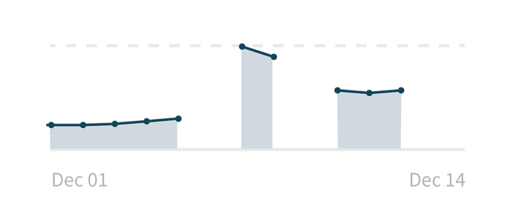
In this graph, the values for December 6th, 9th, 13th, and 14th are missing. What are the possible ways of handling this?
The first answer, of course, is “make sure the data is there.” But as I mentioned, there are likely going to be cases where we have to handle missing data — changes in the vendor APIs, hardware issues, acts of god — so let’s analyze a few solutions.
Solution 1: do nothing
This is what we’re currently doing. If we don’t have the data, we’re simply not drawing that portion of the graph.
Pros:
- It’s not misleading: we don’t have this data, so we don’t display anything.
- It’s technically simple: we don’t have any other design or development concerns: no need to distinguish between “we have data for these days” and “we don’t have data for these other days.”
Cons:
- It lacks information: a user has no idea what’s going on here. If asked what this graph means, all they can say is “well, there are gaps in the graph.”
- It doesn’t look good: while missing data is not, by default, a reason to panic, having gap-filled graphs might inspire stress in our users.
Solution 2: fill in the gaps
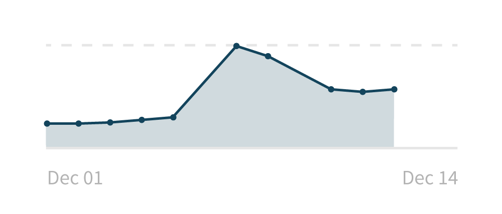
Here’s what it would look like if we simply filled in the gaps by connecting the dates that we do have:

Pros:
- It looks good: It makes it much easier to track the trends in the data that we do have — there was a big increase in the middle of the time period, and that’s easier to understand this way.
- It’s technically simple: Again, no tricks in design or development: if anything, this solution is slightly easier than not showing data we don’t have.
Cons:
- It’s misleading: By drawing a line between December 5th and 7th, we’re implying what the data was for December 6th. While training and close inspection might lead a user to doubt the interpolation, it’s a little too easy to take the smooth line for granted. Was December 6th lower than the 5th? Higher than the 7th? Showing the line here might lead to inaccurate conclusions.
- It lacks information: even though we’ve connected the dots, we can’t display anything for the most recent two days because we don’t have any points to extend the line. Again, we can’t give a user any idea of what happened these days.
Solution 3: error states
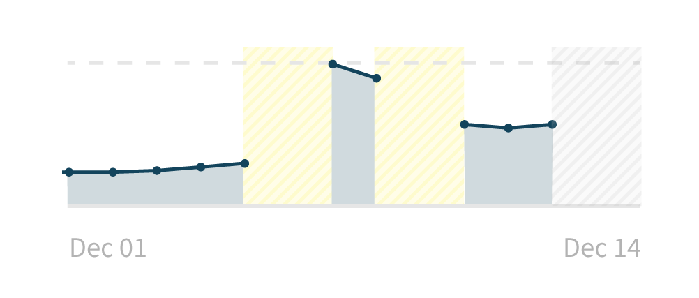
What if we shaded in the regions for which we didn’t have data with some informative error state?

Pros:
- It’s not misleading: While we don’t have data for those days, we do have some information about why — for the yellow regions, we couldn’t collect the data. For the gray region, we haven’t tried to collect yet. There are a number of different reasons why we don’t have data, and we can provide that to the user.
- It has lots of information: This approach allows a user to answer questions not only about the data, but about the state of the application. It’s the most informative of the solutions.
Cons:
- It’s technically complex: Implementing this solution is tricky, as it requires a number of steps to record the error state and then display the error state. In addition, a key needs to be present for this to be useful to untrained users.
- It might not look good: I say “might” because it really only gets ugly if we have lots of error states. Seeing lots of these errors could be anxiety-inducing for the user, even if the problem is on our end as the product manager.
Conclusion
As an advocate of user needs even over technical requirements, I prefer solution 3. But I’ve employed all three of these approaches in products, and each can be useful depending on the circumstance.
I’m curious to hear how others have addressed this problem. Opinions? Alternative solutions? I’m all ears.
Join the mailing list
I'll send new posts to your inbox, along with links to related content and a song recommendation or two.