Data visualization is everywhere. From analytics platforms to infographics, across newsrooms and social media channels, there are vast swaths of the internet devoted to delivering data in non-tabular format. There are entire blogs devoted to the subject, such as the ubiquitous Five Thirty Eight and the up-and-coming Polygraph. With such an immense interest in seeing and understanding complex data, designers are constantly challenged to produce images that both catch a viewer’s eye and accurately depict the information at hand.
With such a high demand, there are (inevitably) a great number of approaches being employed; some to great success, others to embarrassing failure. It’s possible, then, to learn from these approaches to create data visualizations that are good-looking and informative.
- Label everything in plain english. By “plain english,” I mean “words that you speak out loud regularly.” Depending on where you work, you might say phrases like “regular spectral density potential” regularly — so instead think of words your audience speaks out loud regularly.
- Show highs and lows, let the viewer fill in the rest. Most graphs fall victim to “too many axes” syndrome: lots and lots of grid lines dividing up the space, ostensibly to give the viewer a hand in judging the data. However, humans are pretty good at spatial estimation, so only plot the maximum and minimum on each axis.
- Give your graph a title. For such a seemingly obvious component, the title is often forgotten. What do you want your viewer to get out of a graph? If you answer this question in a title above the graph, you’ll provide the viewer with vital context and a good sense of what they’re looking at.
Let’s say I’m preparing a graph for a client who makes pizzas. They’re interested to see how their pizza production rates have fluctuated over the last four months. Here are a few examples of how these three guidelines can be applied (or not).
Too cold: the Power Point approach
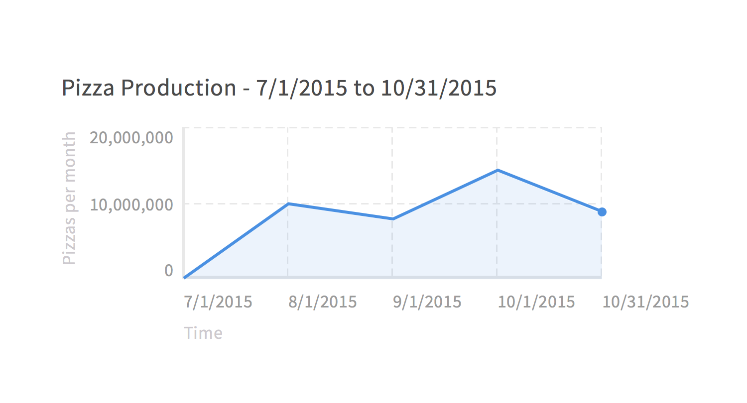
In every board room in the world, there’s a laser pointer landing on a graph that looks like this:

This graph has everything: big numbers, lots of lines, overly redundant labeling. There’s no way you could misinterpret this!
Is everything labeled in plain english? Well, it’s labeled. But isn’t “July first” much easier to say than “seven-one-twenty-fifteen?”
Are the highs and lows shown? This is an example of over-labeling. We’re only looking at four months here — no need for all the lines.
Does the graph have a title? It does! But it’s a little too literal.
Too hot: the Dribbble approach
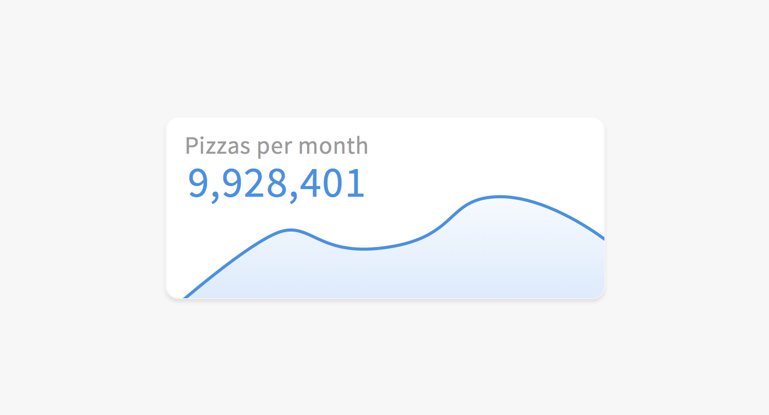
If you look at the front page of Dribbble, chances are there’s some sort of data visualization being done. And more often than not, it looks something like this:

Of course, there are good examples of data viz on Dribbble and other showcase sites, but in many cases, the design is being done from a strictly aesthetic point.
Is everything labeled in plain english? Nope. Nothing is labeled.
Are the highs and lows shown? No! I have no sense of scale.
Does the graph have a title? Kind of. But it’s not very descriptive.
Just right: the goldilocks approach
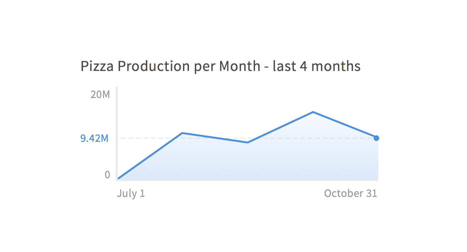
Let’s split the difference between these two. We’ll show what’s necessary to preserve the aesthetic qualities, but label clearly and simply to ensure accuracy:

Much better.
Is everything labeled in plain english? Yes. We’re really clear about the time scale, as well as the domain and purpose of the graph.
Are the highs and lows shown? They are! Also, the extra zeros on the numbers are truncated to save some space.
Does the graph have a title? It does; “…last 4 months” spells out the time frame in a much simpler manner than “7/1/2015 to 10/31/2015.”
Conclusion
These examples and guidelines are a (biased) set of tools for making good-looking and useful graphs. There are a huge number of topics I’ve glossed over, each of which holds innumerable hints on properly visualizing data; for more information, read the works of Edward Tufte, a critic of poor data visualization and a proponent of the just-right approach.
Lastly, no approach is successful without constant improvement and experimentation. Edit frequently and update your methods constantly. By refining and revisiting, you’ll find the happy medium between overwrought powerpoint and abstract art doodle.
Join the mailing list
I'll send new posts to your inbox, along with links to related content and a song recommendation or two.