For the past two weeks, I’ve been exploring Tokyo. Until the last few days of 2018, I had never been to Tokyo — or, for that matter, any city as large as Tokyo. And while I have many many great memories of the city, I’m particularly eager to share my impressions of the Tokyo subway1.
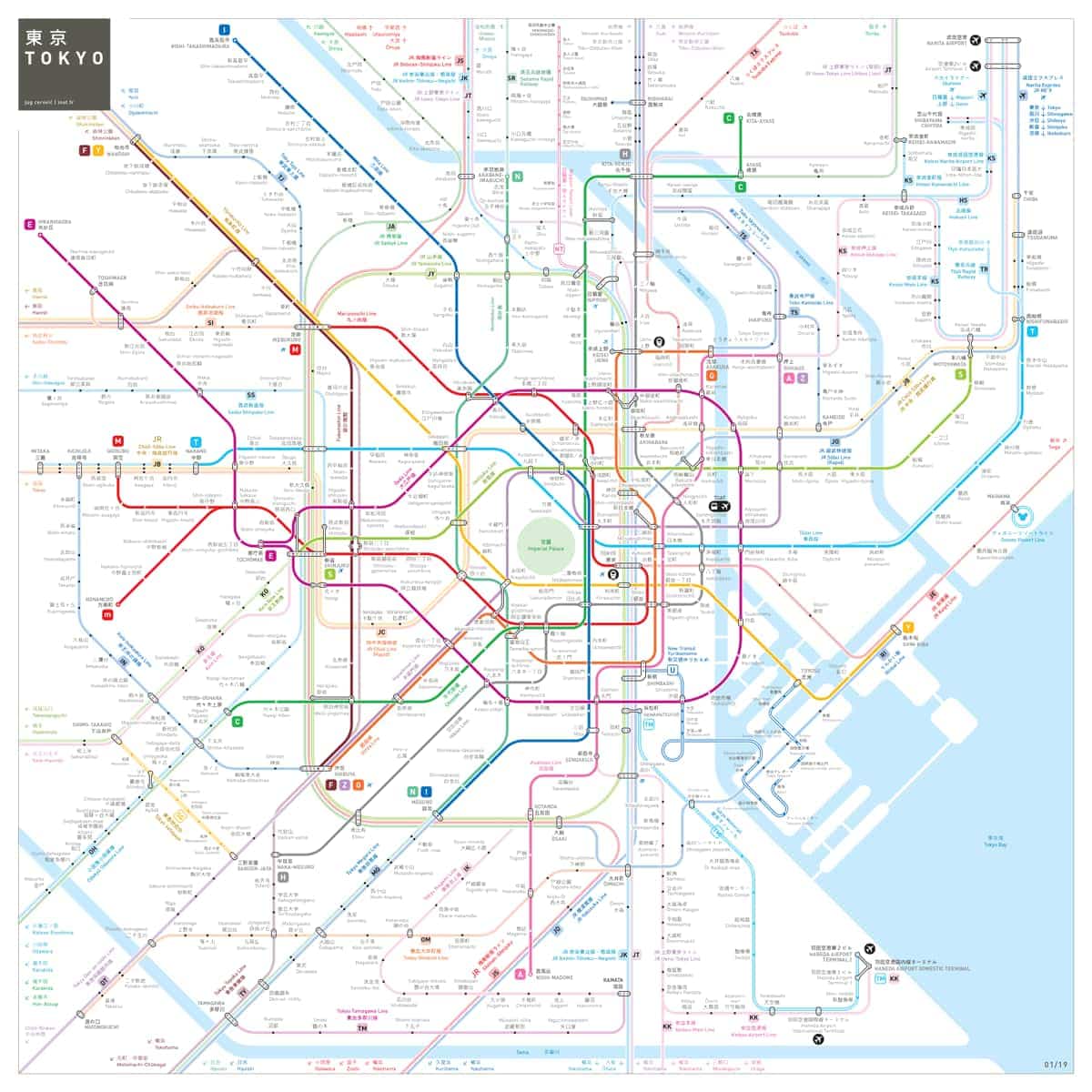
Tokyo’s subway system is incredibly extensive: multiple private and public companies operate hundreds of stops between more than 15 separate lines. The largest of these stops, Shinjuku Station, ties multiple subway lines to commuter rail and bus, all underneath a massive shopping district. Despite having fewer lines and less track than the NYC Subway, the Tokyo system serves 1 billion more passengers per year — a total of 2.7 billion passengers annually2.
I’m no public transit pro. Despite riding the New York City subway daily for half a decade, I still get lost from time to time. But despite the stunning complexity of the Tokyo subway, I felt comfortable and confident riding throughout the city. With the exception of one service outage, I didn’t get lost. I spent hours on trains during my stay, plenty of time to consider and document the system. My takeaway: inclusive design underlies every aspect of the Tokyo subway system.
But first, a note on inclusive design
Inclusivity is often used interchangeably with accessibility in discussions of design. There are many ways to split those hairs, but for this post I’ll define inclusive design as follows:
Inclusive design is the practice of creating systems to be as fair as possible by removing any barrier that might prevent a person from getting the most benefit possible.
The differences between accessible and inclusive design is in equity: accessible design gives all people some value, inclusive design gives all people all value.
Now, back to the subway,
Language
In the Tokyo subway, everything is in both Japanese and English, from signs to ticket machines to announcements. This is great for English- or Japanese-speakers, but the system is navigable even without an understanding of either language.
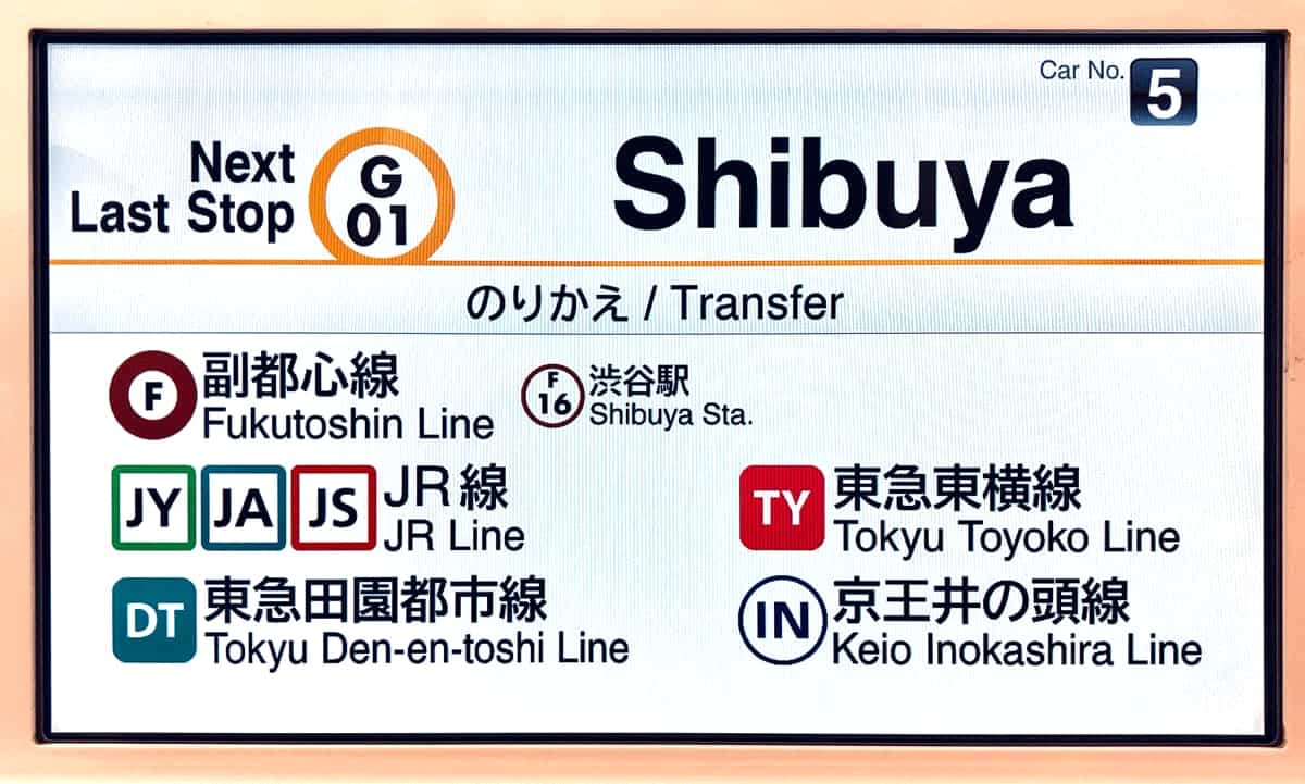
This is because:
- Each line has a distinct color. The Ginza line, for instance, is orange. Even trains that share tracks don’t share colors like in New York (looking at you NQRW).
- Each station has a unique letter and number combination. The Shibuya stop on the Ginza line is G01. Next is G02 (Omote-sando), G03 (Gaiemmae), and so on. Without knowing the station name or its location, any rider can find their stop and know how far it will be.
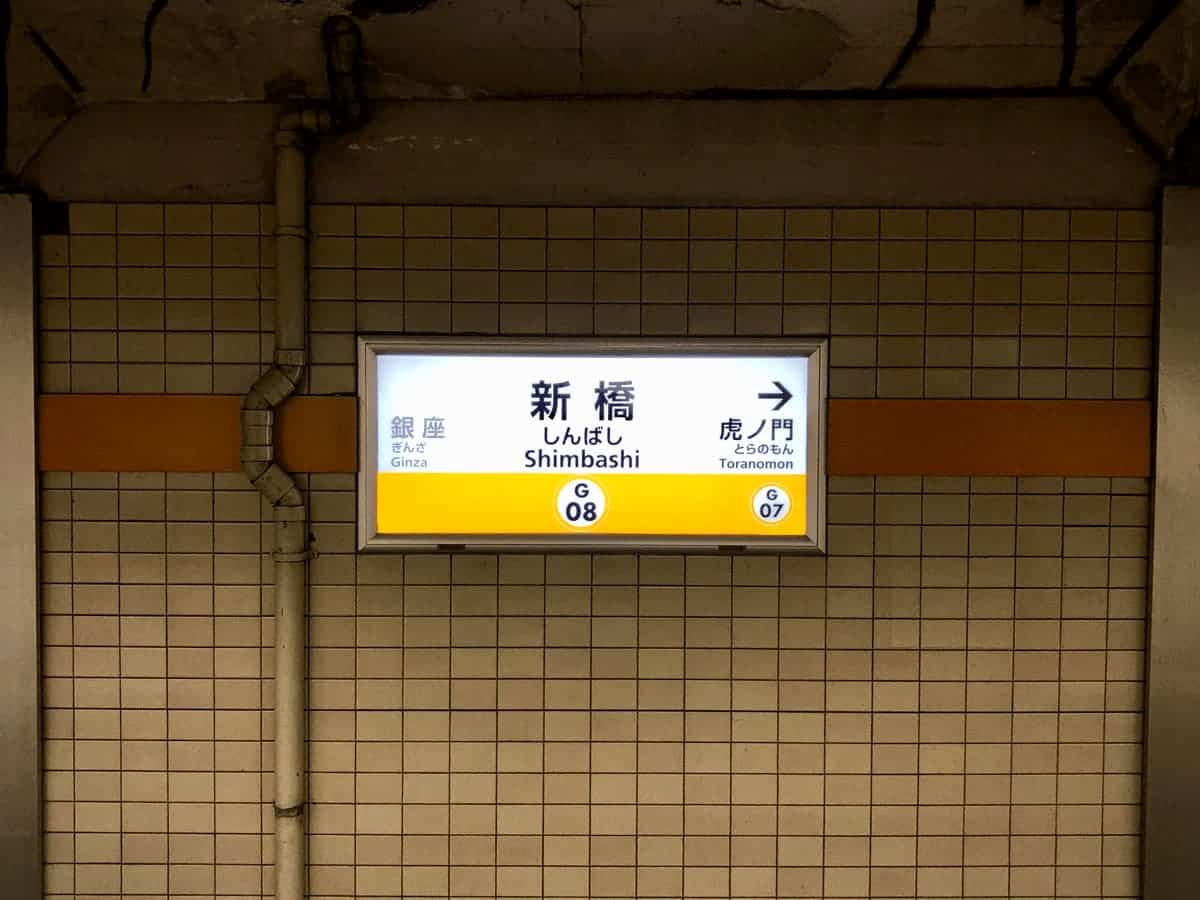
- Before the train departs, a jingle plays. Each station has its own unique song; for a sampling of these jingles, watch this video. Riders with visual impairments can find the right train or station, even without speaking the language.
- Platforms and trains carry the color of the line they are on. For instance, the JR platforms in Shinjuku station serve the Yamanote line (green), Chuo line (red), and Sobu line (yellow). This means riders of the Yamonote line can follow green signs to the green platform and take the green train.
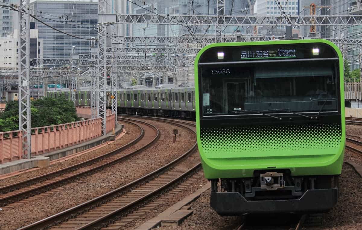
Letters, numbers, colors, and sounds all add up to a clear system of navigation for all riders, regardless of the language they speak.
Navigation
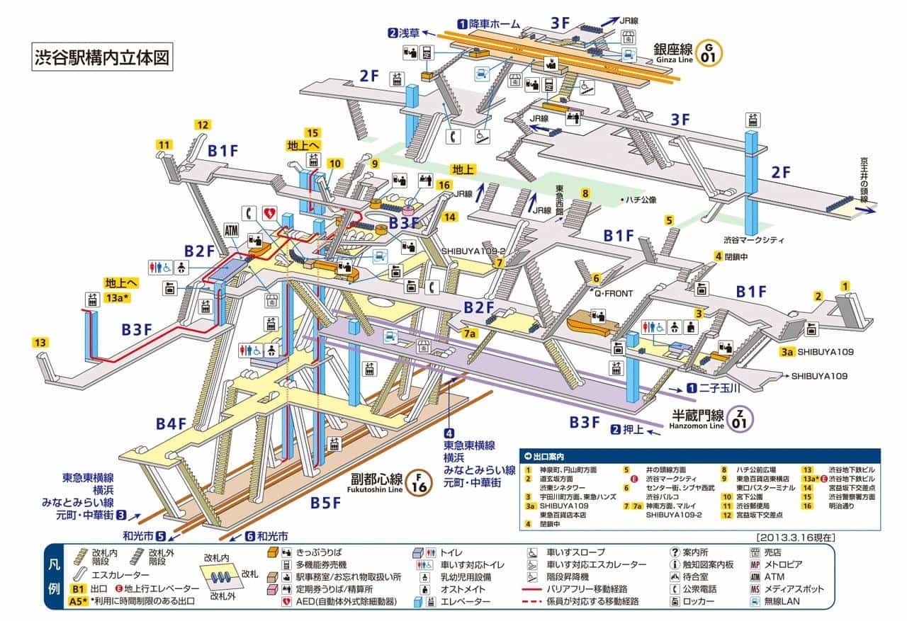
This is Shinjuku station, the world’s busiest transport hub. In 2007, 3.64 million people used the trains here every single day. I spent a few days coming and going from this station; believe it or not, it’s even more complicated in person.
Once again, Tokyo has made a chaotic hive of activity easy to navigate. There are signs everywhere. Signs tell you which platforms are where, signs point out exits and nearby landmarks, signs indicate bathrooms and ATMs. Many signs tell you exactly how far (in meters) a platform or exit is. There are signs on poles, signs on the ceiling, and signs on the floor. You are never out of view of a sign.
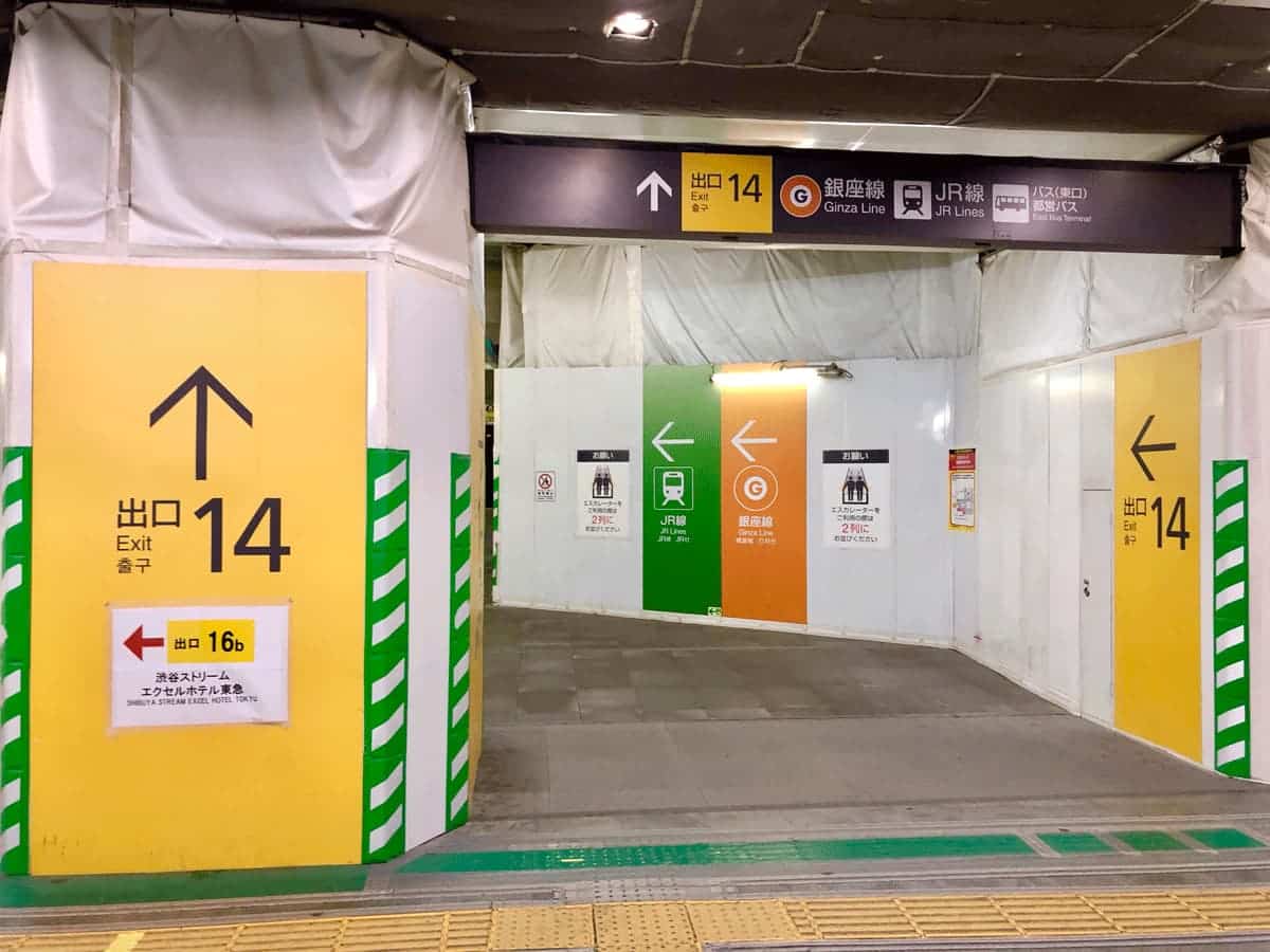
This may not contribute to the aesthetic value of the environment, but holy smokes does it make navigation easier. Using Google maps, I could enter via the New South Exit, go to Platform 3, and catch my train without much mental overhead.
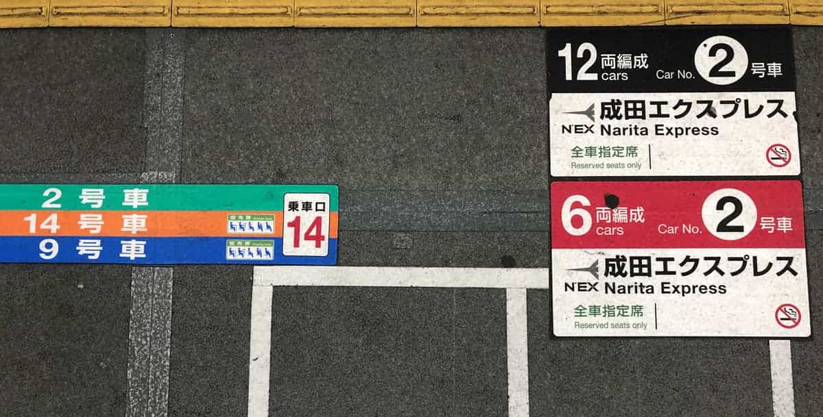
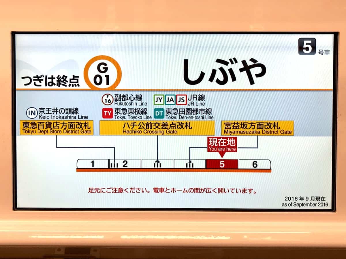
Besides the abundant signage, each car on each train is numbered. Riders can use the car numbers to navigate complex stations, aided by illustrations onboard the train. On each platform are signs indicating where each car will stop. Lines form at these markers, making for an extremely orderly boarding process.
Conclusion
Given its scale and complexity, along with my own general anxiety, I worried about taking the subway. As a tourist, the language barrier alone could have made it impossible. But the unsung, unseen designers of the system have made it possible for anyone to travel through Tokyo with ease, regardless of mental, physical, or cultural differences. As I come back to work in 2019, I am inspired to make my own design more inclusive.
Postscript: more inclusive cities
The Tokyo subway system is impressively-designed for its complexity. But why is it so complex in the first place?
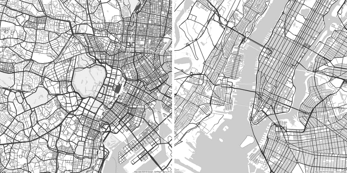
Take a look at the street grid of Tokyo (left). The complex shape of the Tokyo subway mirrors the irregularity of the city itself. New York City (right) is more grid-like, allowing its subways to run in neater parallel and perpendicular lines.
It’s possible for tourists to navigate Tokyo’s underground, but above ground can a be different story. Addresses in Japan look like this:
3 Chome-7 Nishishinjuku, Shinjuku-ku, Tōkyō-to
This means that the building at this address (the Park Hyatt) is the 3rd building, in the 7th neighborhood, in the district of Nishishinjuku, in the ward of Shinjuku, in Tokyo. Without knowing the detailed geography of each ward, it’s impossible to navigate using addresses alone.
Compare to the address of the Park Hyatt in New York:
153 W 57th St, New York
This means that the building is one block west of 6th Avenue on 57th Street.
Streets in New York work much like the Tokyo subway stops: 58th Street is north of 57th, 7th Avenue is west of 6th Avenue, and if you know this you can navigate by coordinates without needing to know much else.
This is to say: inclusive design matters at every layer of a system. Whether it’s the literal layers of a city’s streets and subways, or the figurative layers of software’s code and design, inclusion isn’t a given. Creators have to make inclusion a deliberate priority in order for users to benefit.
Join the mailing list
I'll send new posts to your inbox, along with links to related content and a song recommendation or two.
There are a few different ways to define the Tokyo subway system. For this post I’m including the Tokyo Metro, Toei Line, and the JR-operated Yamanote, Saikyō, and Shōnan-Shinjuku lines. ↩︎