A scene from the 2001 movie Zoolander1:
        INT. THE PALATIAL OFFICE OF FASHION MOGUL JACOBIM MUGATU (PLAYED BY WILL FERRELL)


            MUGATU desperately wants to hire DEREK ZOOLANDER (PLAYED BY BEN STILLER). MUGATU has prepared an employment offer that ZOOLANDER can’t refuse.


            MUGATU crosses his cavernous office to a small display stand, covered in a red velvet drape.


        MUGATU
        Without much further ado, I give you...


            MUGATU pulls back the drape to reveal a scale architectural model of a building.


        MUGATU
        The Derek Zoolander Center for Kids Who Can't Read Good!


            ZOOLANDER moves in to inspect the model. He scrutinizes the model closely with his characteristic pout. MUGATU and his assistant TODD stand nearby in nervous anticipation.


        ZOOLANDER
        (suddenly enraged)
        What is this?


            ZOOLANDER stares expectantly at MUGATU. Not hearing an answer, ZOOLANDER erupts, throwing the model across the room, shattering it. MUGATU and TODD look dumbfounded.


        ZOOLANDER
        (shouting, pointing at the broken model)
        A center for ants?!


        MUGATU and TODD are shocked. They stand frozen in a mixture of confusion and fear.


        MUGATU
        What?


        ZOOLANDER
        (incredulous)
        How can we be expected to teach children to learn how to read if they can't even fit inside the building?


        MUGATU
        Derek, it's just a small...


        ZOOLANDER
        (in a blind rage)
        I don't want to hear your excuses! The center has to be at least...


        ZOOLANDER looks at the broken model, calculating.


        ZOOLANDER
        ... three times bigger than this.


        TODD anxiously looks at MUGATU. MUGATU slowly turns to match TODD’s gaze.


        MUGATU
         (to TODD, loudly)
        He's absolutely right.


        ZOOLANDER
         (with conviction)
        Thank you. I have a vision.
If you design digital products, this scene probably hits a little too close to home. Here’s an even more relatable version from Clients From Hell:
Me: Since the final copy isn’t approved yet we have replaced it with Latin so we can focus on the design and not get hung up on the message.
Client: Well I can’t read any of this. How can we possibly approve this?
It’s easy to come away from a conversation like this thinking, How can my client be so dense? But I’ve worked with verifiably smart people who fall into the same stereotypes:
- Complaining they can’t click on links in a jpg
- Suggesting that the font size is too small when they look at a (desktop) mockup on their (2005-era) smartphone
- Asking to see 50+ edge cases of various user profile states before approving it for implementation
And designers aren’t the only ones with this experience. Developers have to describe byzantine concepts to their stakeholders without missing nuance or downplaying risk. Product managers sum up tangled webs of business value, user need, team velocity, technical debt, legal pitfalls, and personal ambition, often in the course of a single-page document or a 15-minute meeting.
It’s frustrating. I try to cope by spending a lot of time on presentations. I explain what lorem ipsum is, put big “FPO” stickers on all the mockups, document every possible caveat in excruciating detail in anticipation of questions. But no matter how much preparation I put in, there’s almost always a “center for ants” moment.
The work yields a knot of missed expectations, misaligned incentives, and basic misunderstandings.
In order to improve my own practice — and hopefully, shed some light for other designers — I want to dig in, to try and untangle the knot.
I use mockups and prototypes to communicate with my stakeholders, our peers, and our partners in implementation. They’re a source of constant friction. Why is that? And what can I do to make them better?
When I was a product designer, people would ask what I did for a living, and sometimes I’d answer “I draw pictures of websites.”2
Sure, I could just say “I design websites.” That’s true. The end result of my work is (hopefully) that a website looks better, works better, or results in better outcomes.
But most of my day isn’t spent looking at the website, or working on the code of the website, or manipulating the website directly in some way. It’s spent in Figma or Sketch, drawing pictures of how I think the website should look and work.
Through some kind of alchemy, the pictures I draw have an impact on the finished website. But they’re not all the same. The pictures have different purposes:
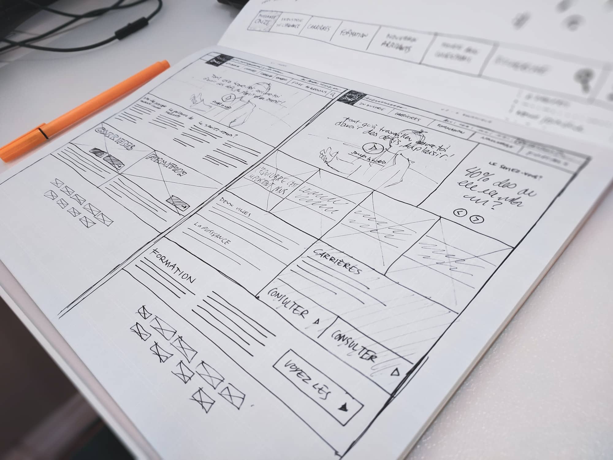
Some pictures are just for me. They’re part of the thought process, answers to questions I have about possible outcomes. I’ll share them with my peers to get their input on a problem I’m working on. Call these pictures that discover.
Some pictures, like Mugatu’s model, are meant to visualize an idea or plan, to make it easy to see how some decision or set of decisions might lead to how the website looks. Let’s call them pictures that define.
Other pictures are used to give very precise directions to the people building the website. These pictures are double- and triple-checked, then coated in a layer of technical language. These are pictures that deliver.
Discover, define, deliver. These are the three jobs of my pictures of websites. The key to improving each, to reduce confusion and misunderstanding, to improve our efficiency and eliminate wasted work, is to ask: what are the qualities of each that make them work? And how can I teach my partners to tell the difference?
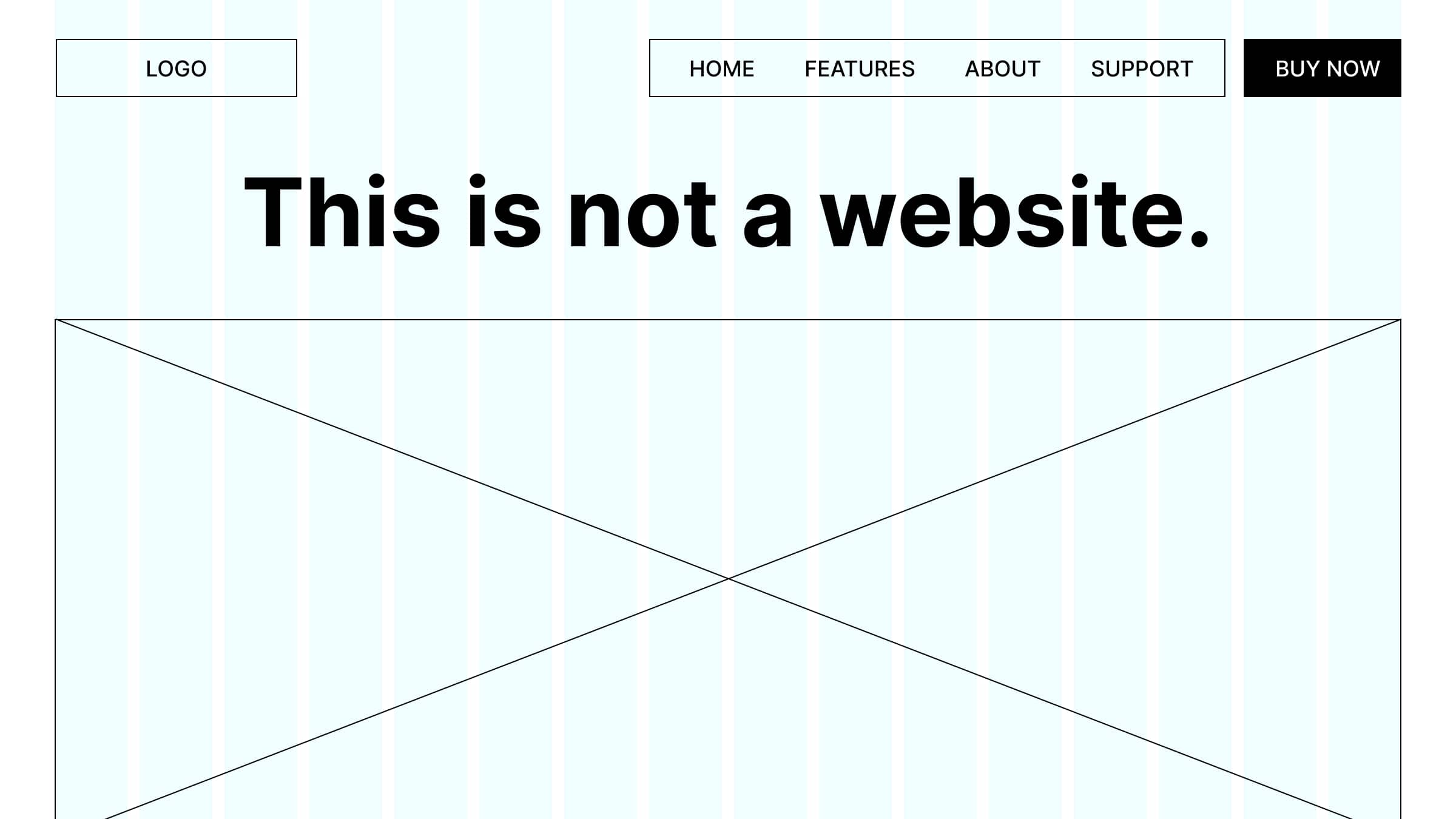
A picture of a website is not the website. Say it again. A picture of a website is not the website. Say it until it starts to become a song, a little tune you get stuck in your head, maybe a sea shanty or a jingle.
♫ A picture of a website is not the website… ♫
Sometimes, the picture looks nothing like the website, and nobody gets confused — it’s all marker drawings on a whiteboard, of course it’s not a website. But other times, the picture looks very much like a website. It might be in a browser window, it might be animated, or it might have a clever way to appear different when you look at it on your phone. This is probably the most common source of confusion between my stakeholders and me.
But it’s still just a picture of the website, and not the website:
- The picture can’t remember anything you do to it — it’s not connected to a database, which is one of the things that makes websites so useful.
- The picture is frozen in a moment in time, so it might quickly fall out of date with our knowledge or understanding.
- The picture is one person’s point of view of the website; it can’t show you how every person might see the website.
The technical reasons for the differences between pictures and websites are very complicated.
To explain to a layperson — say, a person with only the very cursory experience with both pictures and websites — why you can’t click on something that looks like a link, you’d have to explain the various file formats a picture can come in, and how the software of your computer reads and visualizes the code the files contain. You’d have to explain that links were invented to connect documents on the internet, that when the internet was invented, web browsers couldn’t even display pictures, so nobody thought to put links in pictures. Smart people would figure it out later, by the way, but at that point the older common file formats (like jpg) were standardized and implemented, so everyone just used pictures without links.
There are many, many places technical complexity hides in the mockups we show to people. Often, nobody knows to even ask the technical questions required to suss out the differences.
That’s why we should be more deliberate in preparing our presentations: focus on the purpose of your picture, and you can steer clear of some hidden complexities.
Pictures that discover are probably easiest to define and improve.
The purpose of a picture that discovers: explore the vast space of possible designs. Visualize alternate realities. Play.
These live in design tools like Figma, Sketch, or Adobe XD. I like to put them in a folder, artboard, or page titled “DISCOVERY” or “FUTURE EXPLORATIONS,” in case anyone is lurking through my work.
Pictures that discover are usually messy, unfinished, abandoned once the exploration is done. They’re sketches in notebooks, moodboards filled with screenshots, andunlabeled artboards in Figma.

In some ways, the messiness of these pictures is a symptom of modern design tools’ ways of keeping many copies of your work side by side. It’s a brilliant way of time traveling, creating many branches of reality where you can explore the possibilities of design decisions. But the tools don’t often have a way of organizing or managing the copies of your work.
They’re still focused on the pictures that define, which we’ll talk about in a bit.
Designer Jon Gold wrote an excellent piece of speculative design fiction about pictures that discover.3 Describing the problem with modern design tools, he cites J. C. R. Licklider’s seminal Man-Computer Symbiosis:
My “thinking” time was devoted mainly to activities that were essentially clerical or mechanical: searching, calculating, plotting, transforming.… My choices of what to attempt and what not to attempt were determined to an embarrassingly great extent by considerations of clerical feasibility, not intellectual capability.
Gold goes on to imagine a tool that frees the designer from clerical work. It’s a possibility machine: input a single design idea, define the things that might be changed, and the possibility machine does all the hard work of creating copies, making changes, and organizing them all in a way that encourages exploration.
Gold’s design tool visualizes the design process itself, making each step its own explicit document, preserving the path you took like a breadcrumb-dropping fairy tale character.
You can try a prototype of the possibility machine here. While it’s limited to just a few test cases, it’s not hard to see just how different it is from our industry-standard design interfaces.
As our design tools evolve, and as we embrace AI and machine learning, our discovery pictures will look more like Gold’s prototype than like Photoshop.
For now, the best we can do is to be very careful about when we show these pictures that discover to stakeholders or collaborators. They’re visions of possibilities, full of untested assumptions and leaps of faith. To fully articulate the thinking behind them, or the questions they pose, we need to draw a different kind of picture: pictures that define.
Pictures that define are all about communication.
The purpose of a picture that defines: place knowledge and understanding into a sense-making frame.
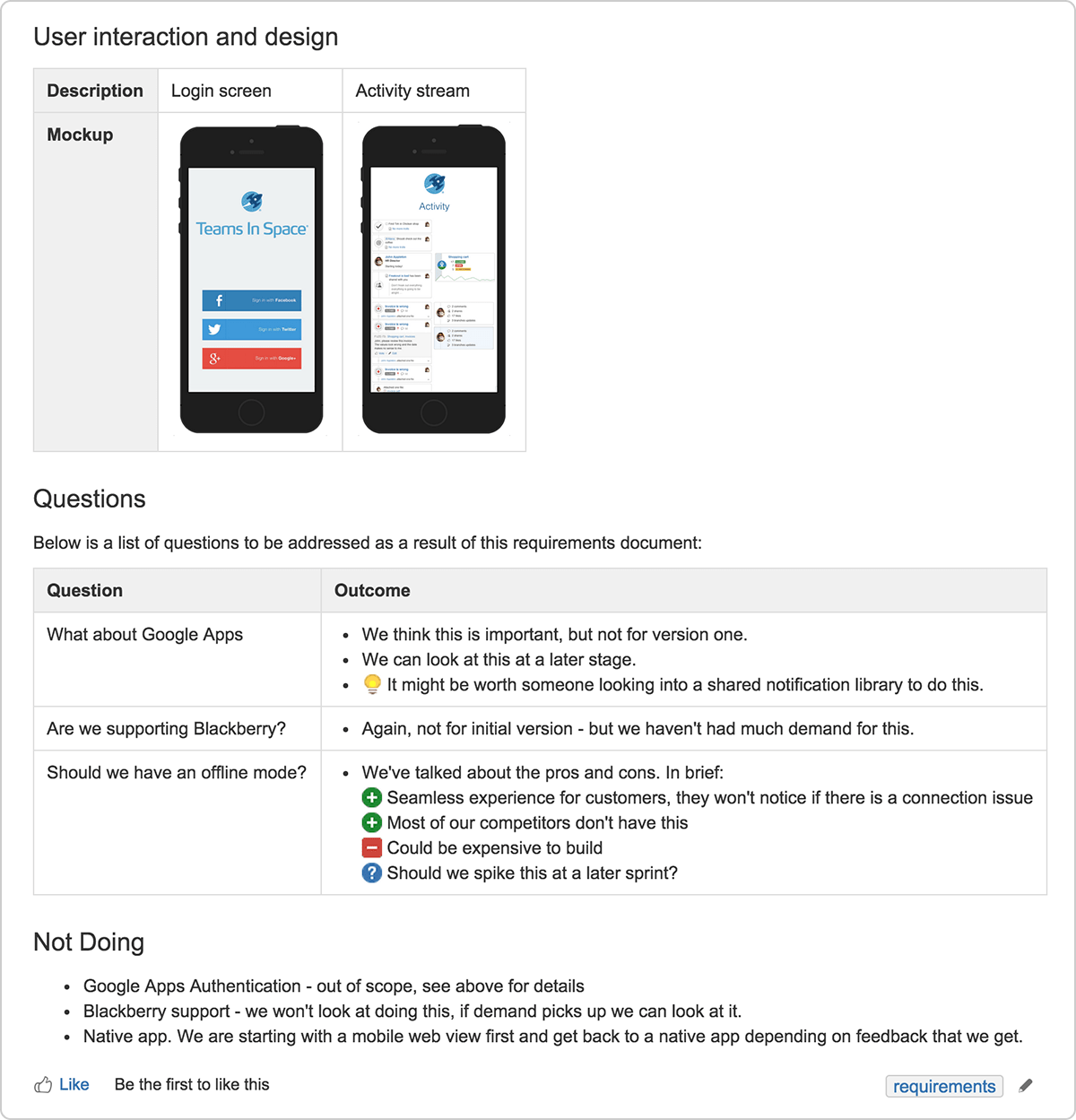
These pictures don’t communicate the “what” — pixels, colors, fonts — of a design, but the “why” — tradeoffs, strategy, long-term maintenance — and “how” — interactions, responsive sizes, edge cases, accessibility and internationalization.
Sometimes teams call this picture a “product requirement document.” It articulates the goals of a website or app feature, puts into words and pictures the decisions that the team has made about scope and capabilities, and often begins to shape the work the team has to do to implement the functionality.
Traditionally, this kind of documentation is the realm of a product manager. But in my work with product managers, a picture of our strategy and tactical decisions is a must-have. That’s because when we visualize our plan, all our assumptions and understanding are meeting reality for the first time. Missed opportunities become obvious. Incorrect assumptions leap off the page. And the picture of the strategy is usually much better at communicating than the paragraphs of description that it comes from.

Today, these pictures usually look a lot like this essay. Mostly words, plus a few pictures. Sometimes, they’re presentations à la slide decks. Of the types of pictures we make, these are the most ripe for disruption.
The newest rash of unicorn productivity apps — led by Notion, which recently blew past a two-billion-dollar valuation — is all about innovating documentation. Abstract, a product that launched as version control for design, is pivoting to focus on smart documentation for design. Google Docs and Dropbox Paper are adding features every day to make their documents more dynamic and interactive. New presentation tools like Pitch and Mmhmm promise to revolutionize the slide deck, and async video tools like Loom offer ways to produce documentation without writing a word.
What lends these tools so much potential is their ability to provide context to thinking. That’s what pictures that define are all about. Even without live-updating embedded design files, or a video commentary, or hyperlinks and tooltips and nested databases, a design document can be immensely powerful if it can communicate why and how a design works.
Pictures that define have to take a bird’s-eye view. Include too many specifics, and you risk your stakeholders losing the forest from the trees, getting fixated on a font here or a color there. To communicate the specifics — the “what” — we need yet another type of picture.
Pictures that deliver are maybe the most information-dense and exact of the bunch.
The purpose of a picture that delivers: give the builders detailed instructions on how to realize a design.
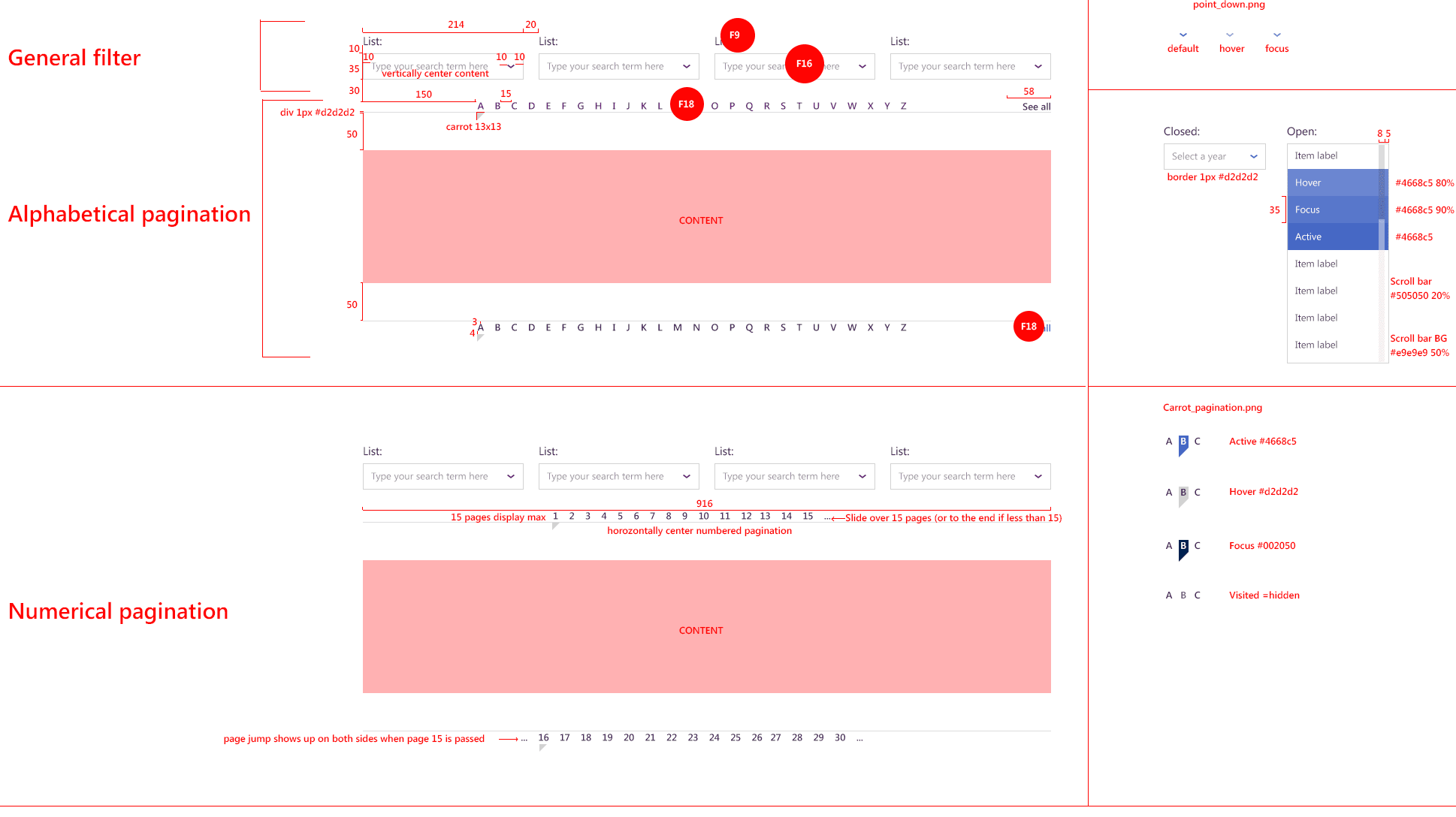
If you’ve seen these kinds of pictures, you’ll know why they’re often called “redlines.”

These inert diagrams were once a part of the day-to-day collaboration between designers and developers. In order to build the mocked-up website, a developer needed to know the size, spacing, font names, hex colors, shadow values, and more, of each and every element on the page, for every screen size a user might have.
Making these pictures is tedious. In the past five years, though, enterprising designers have built tools to make definition-pictures more interactive, more automated, and more informative. Applications like Zeplin, Abstract, Figma, and Invision have an “inspect” mode, which draws redlines on the fly from a designer’s mockup. The time saved and value generated by this automation is mind-boggling.
Tunneling from the other side of the channel, developers have created tools and frameworks that eliminate the need for separate design and engineering specifications altogether. Tools like Storybook, Modulz, and Framer promise to put code directly into the hands of designers — the pictures we make are more like quilts built of real bits of the website we’re drawing.
Design tokens are another piece of the puzzle. These are atomic bits of design, formulated in such a way that’s useful to both the design tools we use and the codebase of the websites and apps we’re designing. If both designer and developer use the same design token, there’s no longer any need to look up the hex value for a particular shade of blue.
Despite the surfeit of tools for drawing pictures that define, there will always be redlines. That’s because the point of these pictures, the source of their power, is to be as explicit, dense, and technically correct as possible. Eliminate all ambiguity, and you guarantee a fast implementation as bug-free as any (which is to say, always a few bugs).
It’s impossible for a picture to be good at discovering, defining, and delivering all at the same time.
This is a bitter pill for me. Almost every project requires all three. Do I really have to draw so many pictures?
I can play back the last few times I ran into hiccups in the design process and see how each one was in part due to having the wrong kind of picture. I sent a stakeholder early explorations without providing the how and why of my decisions, leading to misunderstandings and frustration. I jumped straight to high-fidelity mockups without exploring, developing some blind spots and missing an opportunity. I gave a mockup to a developer without explaining that certain elements needed new interaction patterns; by the time it was built, it was too late to go back.
These are just a few of the ways I’ve goofed. If you’re anything like me, you can instantly conjure a few of your own.
“But Matt,” you may say, “why should I have to do all the work to correct people’s misunderstandings about design? Shouldn’t they work a little harder to understand the design process?”
Hey, friend; that’s design. It’s our responsibility to meet our collaborators and stakeholders where they are. If we show them the wrong kind of picture, or don’t provide the important context, or don’t make it obvious that they’re looking at a picture of the website, and not the website, we’ll keep getting centers for ants.
The good news is that with all the technology and automation, a single designer can design a complex website that millions of people rely on every day. We have a unique kind of leverage among our peers, in that we get to walk the path from concept to vision to plan to execution smoothly and surely.
Embrace the pictures. Draw lots. Figure out what job each does, and make them better.
Join the mailing list
I'll send new posts to your inbox, along with links to related content and a song recommendation or two.
This is not the actual screenplay, but a reproduction I created for this essay. Watch the scene here if you’re into moving pictures. ↩︎
NB: I’m going to say “website” throughout this essay, where I really mean “digital interfaces.” These issues affect all digital product designers, whether you’re designing for the web, native apps, embedded technology, or digital services. ↩︎
The post is only available on the Internet Archive without pictures, so you’ll have to apply a bit of imagination. ↩︎
