Has design become boring?
A twitter thread by Sheehan Quirke (aka the Cultural Tutor) has been making the rounds lately, arguing just that. Quirke describes the many shortcomings of modern design: architecture, urban planning, industrial design, and interior design have all been reduced to a featureless sea of same-ness. Modern things lack beauty, variety, detail, and identity.
It’s a solid argument with good examples. Lots of folks agree and have added their own evidence to support the thread. But I think that these conversations stop short of an important conclusion (it’s Twitter, of course, not Plato’s Academy): design is a radically different exercise than it was in the 18th, 13th, or 5th century. Industrialization has made the world more deeply interconnected, automated, and chaotic. The aesthetics of the things around us are not in the way they look to us, but in the way they came to be, and the way they shape the future.
Beauty is no longer skin-deep.
Pre-industrial design
To understand how this came to be, let’s take Quirke’s example of a well-designed bollard as a study in pre-industrial design.

Quirke says that this design (called a Manchester bollard) has “some character.” What is that character? Where does it come from?1
“Bollard” originally meant a post that anchored ropes between ships and docks. The Sailor’s Word-Book of 1867 gives this definition:
A thick piece of wood on the head of a whale-boat, round which the harpooner gives the line a turn, in order to veer it steadily, and check the animal’s velocity. Also a strong timber fixed vertically into the ground, part being left above it, on which to fasten ropes. Also a light sort of dolphin for attaching vessels to. Wharves have bollards to which vessels are secured when alongside.
Bollards didn’t make their way to streets and sidewalks until the 18th and 19th centuries, when cities started giving more space to vehicles. Before paved roads and raised curbs, bollards gave protection to pedestrians, first from horse-drawn carts, then from streetcars and trains, then later from motorized cars. These barriers didn’t need the same features as their maritime namesakes, so many were wooden posts or short stones.2
What about the Manchester bollard? It doesn’t get its character from the early maritime prototypes or the first utilitarian street barriers. Instead, the design is a consequence of the 1805 British victory over the French at the Battle of Trafalgar: among the spoils of the battle were the cannons from the captured French ships. They were too large to be used on British ships, and too valuable to be melted down, so the British employed them as bollards throughout the East End of London. After that, bollards in other British cities — like Manchester — were designed to match the cannons, with black metallic finishes, tapered silhouettes, and rounded ends.

The Manchester bollard is a great example of how design happened in Europe before the rapid industrialization of the 19th and 20th centuries. Durable goods (like bollards, lamp posts, door handles, and park benches) were made using valuable materials and labor-intensive processes. The people who made these things were artisans, and the resulting products were expensive. Therefore, they were usually only available to the wealthy (or to wealthy governments, in the case of cannons).
Pre-industrial art and design was synonymous with materialism and frivolity. Operas, symphonies, ballets, and plays were made for the leisure class — they were ornamental, gilded, and plush. The great European universities and cathedrals were built and supported by the nobility and the monarchy, which hired the best artists and artisans to fill their spaces with their best work. A country’s art and architecture were extensions of their national or imperial identity, supporting the mythology of the state.

For centuries, design was a luxury. But throughout the 1800s, science — and the technology it created — would begin to make design more accessible to the masses. A design revolution was on the horizon.
Industrial design and the transition to modern consumerism
As manufacturing technology progressed, durable goods became more affordable. Because these things used to be exclusively available to the wealthy, entrepreneurs could capitalize on aesthetics. Goods would fetch a higher price just because they looked expensive: working men and women would pay extra to have homes, neighborhoods, clothes, and vehicles that broadcast their fellowship with the rich.
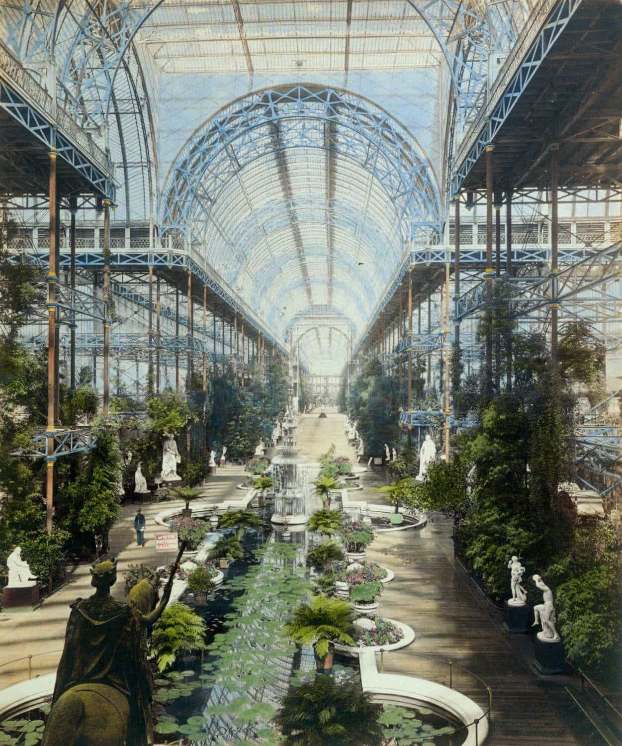
Unfortunately for the entrepreneurs, mass manufacturing wasn’t always compatible with the exquisite details and craftsmanship of pre-industrial design. Nowhere was this more apparent than in Britain’s Great Exhibition of 1851, where the products of the latest manufacturing technology were proudly displayed in the palatial Crystal Palace. The event was a commercial success, clearly demonstrating Britain’s manufacturing prowess. But art critics found it lacking. Ornamentation was applied superfluously, and the manufacturing was shoddy. Designer/activist William Morris called the exhibition “wonderfully ugly.”3 The philosopher John Ruskin had this takeaway: “our taste, thus exalted and disciplined, is dazzled by the lustre of a few rows of panes of glass.”4
Morris and Ruskin’s violent reaction to the Great Exhibition pushed designers of the time to seek a new style, one that emphasized intellectual purity and quality of craftsmanship above all else. This movement — later dubbed “Arts and Crafts” — was a countermovement to design as decoration. Arts and Crafts designers dusted off writing from medieval and classic scholars, fitting historic material into modern social contexts, aiming to define a grand unified theory of design.
Alongside Arts and Crafts, another movement was sprouting in the work of young architects and engineers. Like Morris and Ruskin, they were appalled at the soulless excesses of design. Unlike Morris and Ruskin, they believed the way forward was to remove historical context entirely from the equation, pushing modern materials and manufacturing into the spotlight. Architectural Modernism was a celebration of technology, forcing designers to master their technique by giving them nowhere to hide their mistakes. The architectural theorist Eugène Viollet-le-Duc summarized it in his influential 1872 book Entretiens sur L’Architecture: “Use the means and knowledge given to us by our times, without the intervening traditions which are no longer viable today, and in that way we can inaugurate a new architecture.”

Conversations around design, architecture, engineering, and manufacturing reached an unprecedented volume. Consumers — first wealthy elites, then the middle and lower classes — were beginning to make choices about what to buy, what to wear, and where to live, based on more than just their desire to show material wealth. Those choices reflected beliefs about art, society, economics, government, technology, the past, and the future. As the 19th century ended, consumerism became the dominant force in the evolution of design.
In the 20th century, two forces would combine to forge the new language of post-industrial design.
Post-industrial design
Post-industrial design was forged in the crucible of advertising and globalization.
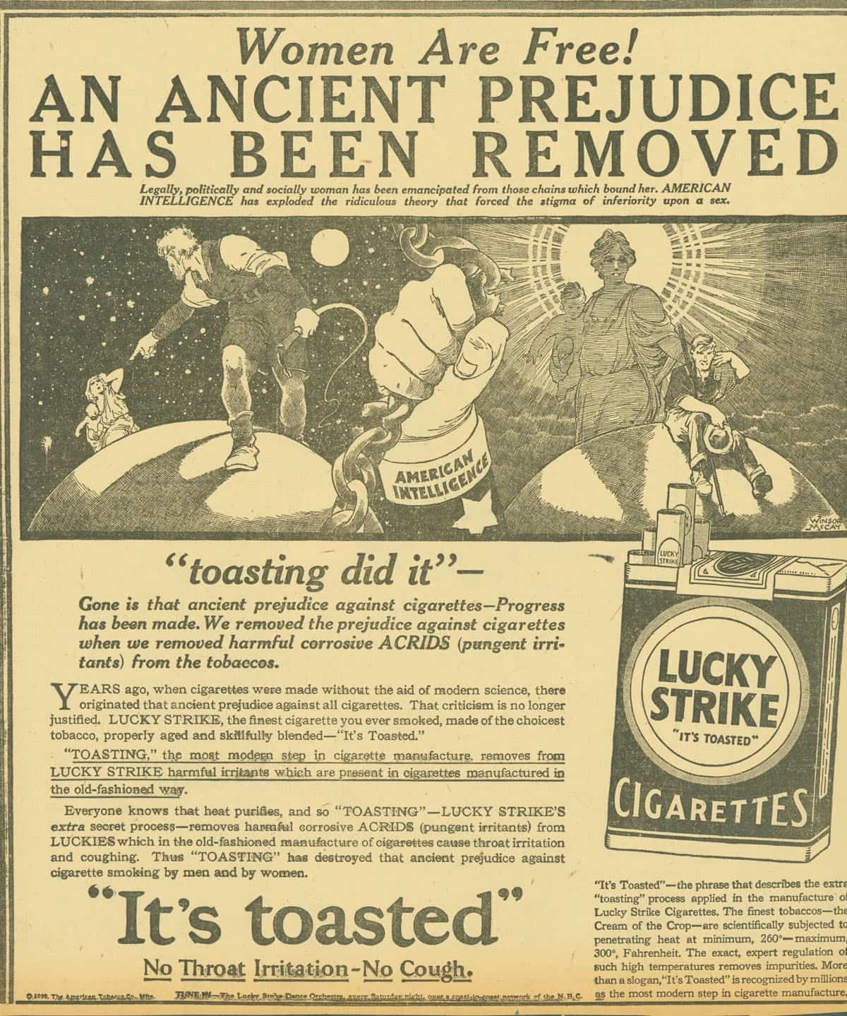
In the 19th century, advertising focused on quality, craftsmanship, and aesthetics. But as media grew in scope and speed, advertisers began experimenting with tactics and techniques first employed by governments in propaganda, incorporating the work of psychological pioneers like Sigmund Freud to take advantage of the subconscious mind. Advertising pushed consumers to make new decisions about the goods they purchased. Goods like cigarettes that had no aesthetic value and were previously advertised based on their quality now became part of a lifestyle: for men, cigarettes meant sex appeal, and for women they meant femininity and liberation.5
Meanwhile, new technology — air transportation, commercial refrigeration, and rapid communication — massively increased the distance and speed with which goods could move around the planet. For good and bad, global commerce vastly expanded the impact of each individual’s decisions. Before globalization, the impact of consumer decisions was limited to local communities. After, the most mundane purchases are now the result of thousands of actions by hundreds of people in a dozen countries spanning the globe.
Advertising and globalization create a feedback loop, giving consumers and corporations a wedge to drive into marketplaces. Upstart brands have been able to beat out incumbents by claiming their supply chain is more ethical, more eco-friendly, more politically popular. Governments have created standards and classifications identifying products as “free trade,” “organic,” or “hormone free,” along with certifications of origin like Italy’s “DOP,” France’s “AOC,” the EU’s “PDO”,6 and America’s “Made in USA.” Today, companies call attention to the invisible aspects of design: design of process, design of policy, design of consequence.
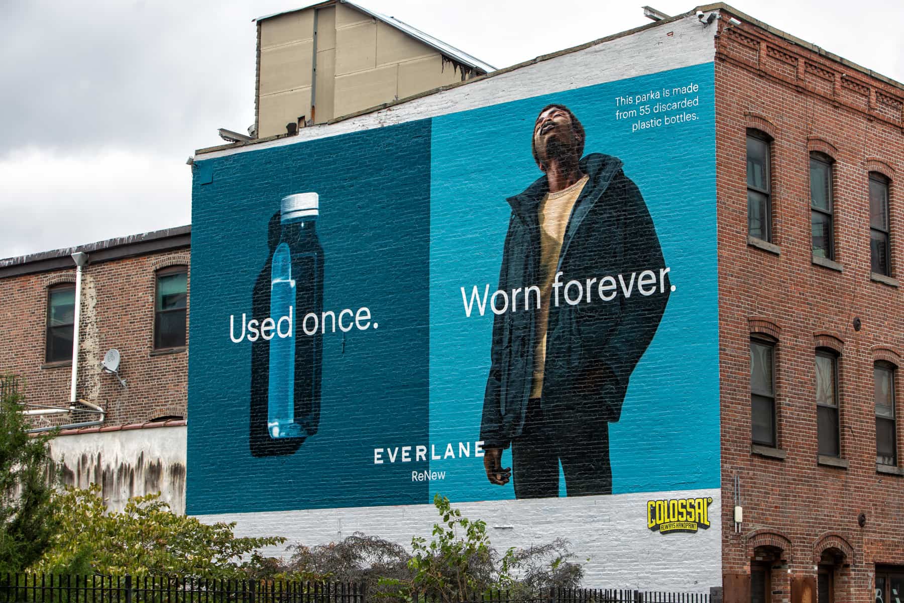
Design has migrated from the visible (aesthetics, material quality, and markers of social class) to the invisible (ecosystems, economies, and communities). A picture of pre-industrial design captures its entire essence; a picture of post-industrial design shows the tip of an iceberg.
The modern bollard
Back to the bollard. What character is missing from this design?
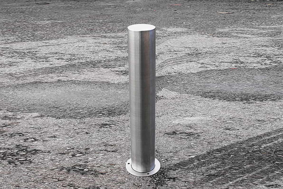
It has very few visible details. It’s about as simple as can be: a cylinder of stainless steel. No celebration of past maritime victories. No projection of nationalist identity. No way to know if it’s in a rich neighborhood in Malaysia or a poor neighborhood in Peru. So let’s look a little deeper.
The bollard is made of stainless steel. Compared to the cast iron in the Manchester bollard, stainless steel is far more resistant to corrosion; the cost to maintain a street lined with stainless steel bollards will be much lower as a result. There will be fewer disruptions in street traffic, less noise for the surrounding buildings, and more foot traffic to support nearby businesses.
While this particular bollard is fixed in place, the design has a feature that the Manchester bollard lacks: it can retract seamlessly into the ground. This means spaces can be dynamic and responsive to the needs of pedestrians and vehicles. For example, retractable bollards regulate bus lanes in many cities, giving commuters and tourists more affordable and environmentally friendly transit options.
The stainless steel bollard also has a substantially simpler manufacturing process, saving time, energy, and ultimately, money. It can be made lighter than the cast iron equivalent, and packaged more efficiently due to its shape. Specifications like height, diameter, and wall thickness can be adjusted down to the millimeter, making it much more useful in a wide variety of applications. In all these ways, the stainless steel bollard is a better design.
But all of these comparisons are misleading. Bollards are needed to protect pedestrians from vehicles, to separate spaces into different functional areas. They’re vital to cities that were designed around vehicles — that is, almost every large city in the world. But in the spirit of post-industrial design, architects and engineers have begun to question this underlying need.
Let’s take a look at a typical use of bollards. Here’s an image from Manchester, featuring the classic cannon lookalike:
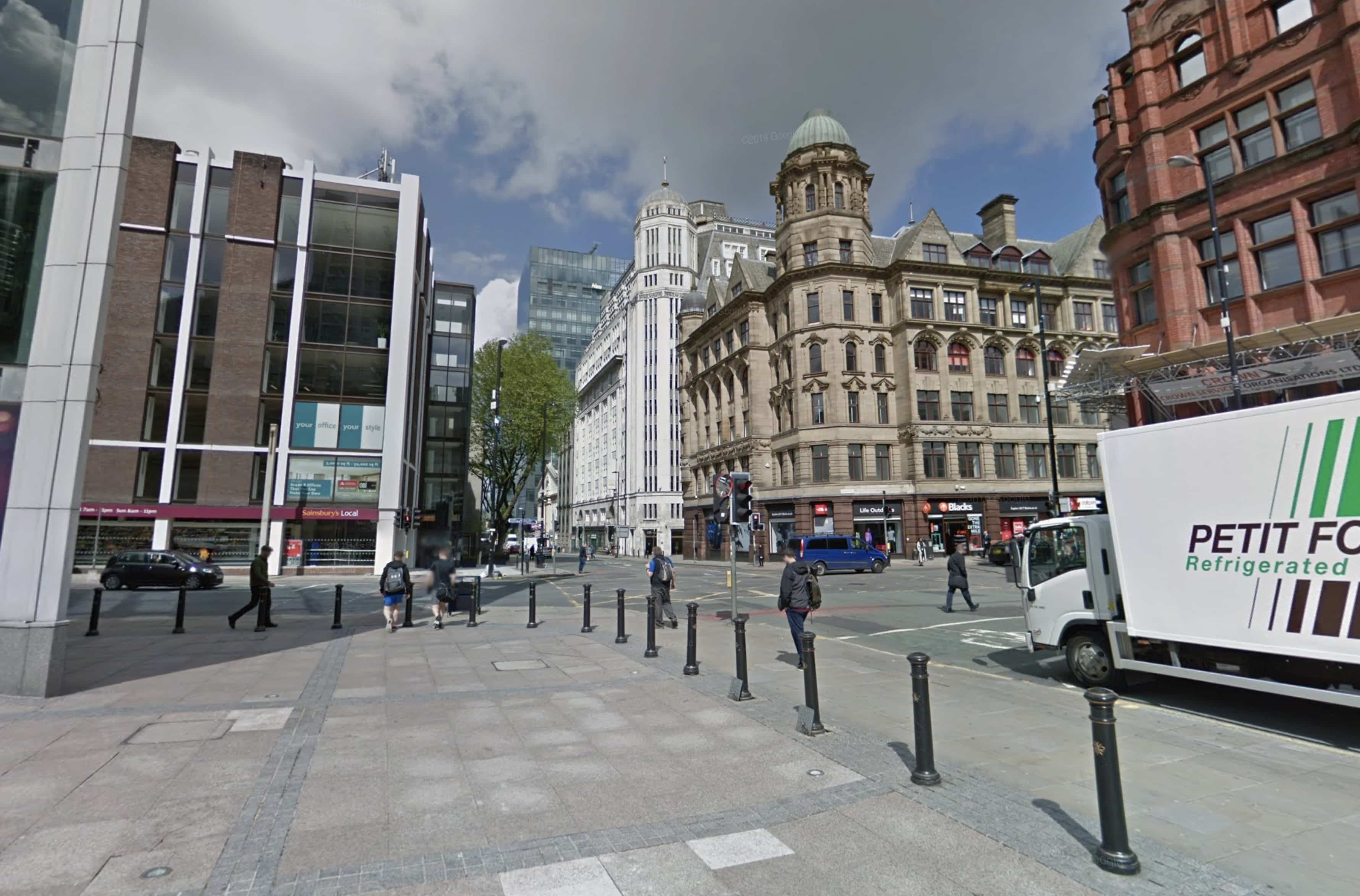
With plenty of separation between cars and pedestrians, streets can be wider and traffic can move faster. Faster vehicle traffic leads to less foot traffic, and less business for nearby shops. The streetscape is a transitory one, meant for moving from place to place.
Compare this to another English streetscape, at London’s Oxford Circus.
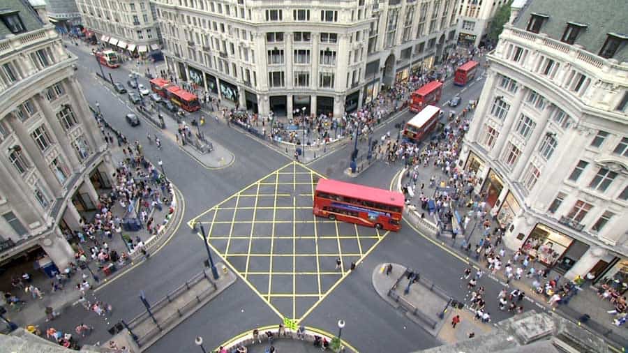
The crossing of these four major streets is similar to the Manchester one: bollards protected the sidewalks, giving vehicles as much room as possible. Pedestrians were kept out of the intersection altogether, pushed out to make crossing high-speed traffic safer. But in 2009, the intersection was redesigned to prioritize pedestrian traffic.
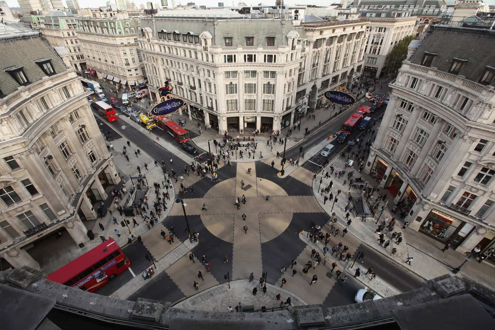
In the year after the redesign, 90 million people crossed the intersection. What was once a forgettable crossing is now a destination and landmark. And the benefits go beyond aesthetics: annual sales in the shopping district around the intersection increased by 7%.7
Post-industrial design goes beyond the material and asks important questions about the nature of human interactions with the built and natural environment. The modern bollard is no bollard at all.
Conclusion
The design of durable goods began as an expression of quality and artisanship. Wealthy patrons used design to reinforce myths about social status and politics. As mass manufacturing made goods more accessible, and as hand-made goods were supplanted by assembly line products, critics began to question the value and purpose of ornamentation. Consumers voted with their dollar, leading to the evolution of design past mere decoration and towards self-expression. Over time, the scope of that self-expression grew exponentially: today, individual consumer decisions can have a direct impact on geopolitics, the global economy, and the course of human-caused climate change.
Design has evolved to meet the challenge of the new relationship between people and the material goods they need. Today, designers — artisans, manufacturers, engineers, architects — think far beyond the way things look. Comparing pre-industrial design to post-industrial design with a picture is absurd. Critiquing a modern object based on its appearance is ignoring the thousands of decisions that go into its creation. Each and every one of those decisions has tradeoffs, ranging in impact from saving fractions of pennies in material cost to causing billions of dollars of long-term ecological harm.
Today, beautiful things have beautiful supply chains. They enable beautiful systems, connect beautiful communities, and redouble the beauty of nature. Their beauty is much, much more than skin deep.
Join the mailing list
I'll send new posts to your inbox, along with links to related content and a song recommendation or two.
Ironically, the bollard in this picture is a modern recreation, available brand new from UK-based Broxap for £146.00. ↩︎
Boulting, Nikolaus (1976). “The law’s delays: conservationist legislation in the British Isles.” In Fawcett, Jane (ed.). The Future of the Past: attitudes to conservation, 1174–1974. London: Thames & Hudson. p. 13. ISBN 978-0-8230-7184-5. ↩︎
Purbrick, Louise (ed.). The Great Exhibition of 1851: New Interdisciplinary Essays.. Manchester, U.K.: Manchester Univ. Press. 2001. 232 pp. ISBN 978-0-7190-5592-8. ↩︎
Ruskin, John. The Opening of the Crystal Palace: Considered in Some of Its Relations to the Prospects of Art. 1854. ↩︎
Edward Bernays, called “the father of public relations,” was behind the earliest cigarette ad campaigns targeted at women. Bernays was Sigmund Freud’s nephew and organized the US publication of Freud’s Introductory Lectures on Psychoanalysis in 1920. ↩︎
Denominazione di Origine Protetta, Appellation d’origine contrôlée, and Protected Designation of Origin, respectively. ↩︎
“Oxford Circus ‘X-crossing’ used by 90 million people.” BBC. November 2, 2010. https://www.bbc.com/news/uk-england-london-11672984 ↩︎