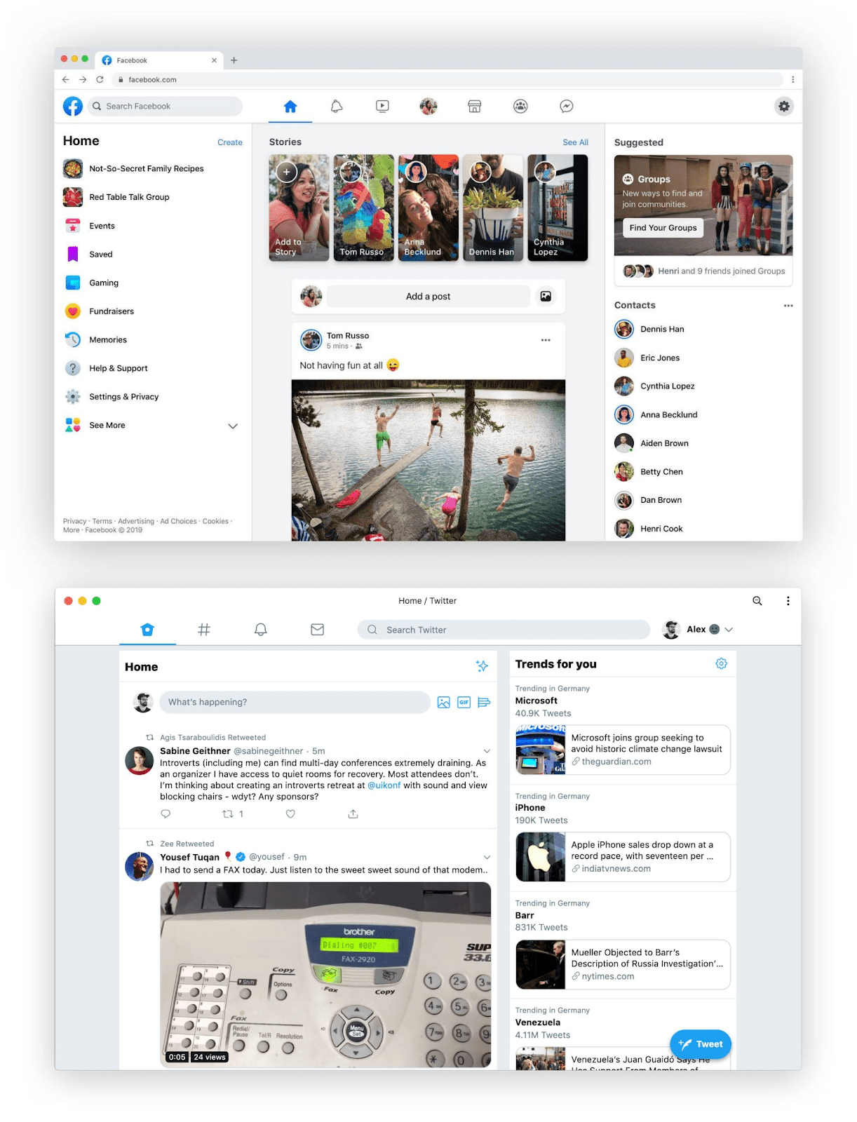
Last month, Facebook revealed a major redesign of all its apps across web and mobile. Reactions from design twitter were mixed, but there was one thing everyone agreed on: it looked familiar.

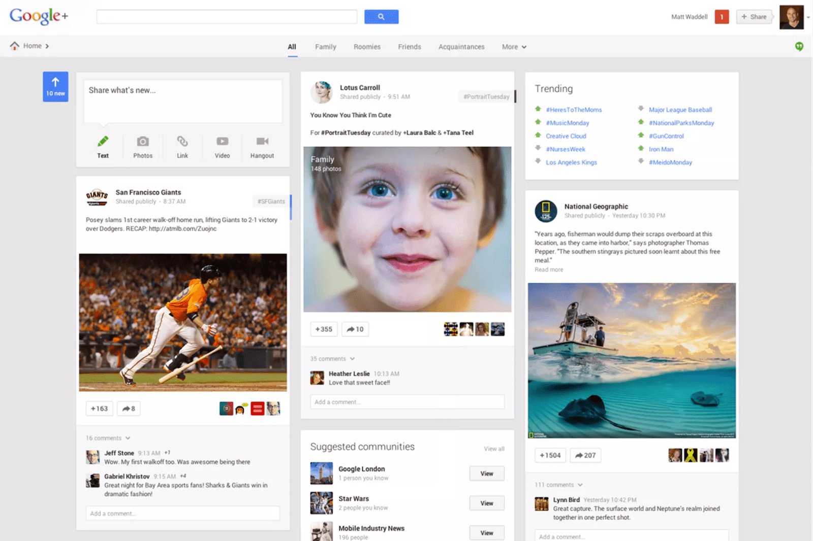
A few folks correctly noted that even Twitter’s most recent redesign looked eerily similar to Google Plus circa 2013:

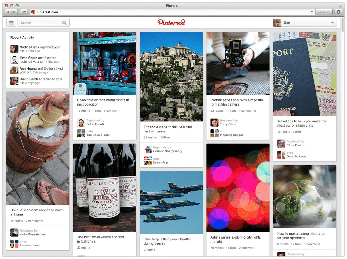
Going deeper, Google’s 2013 redesign of Google Plus took a lot of cues from Pinterest’s design at the time:

What’s going on here? Why do all websites look the same?
The question gets debated in the design discourse every few years. Here are some plausible answers:
- Designers are lazy. In late 2018, Boris Müller wrote Why Do All Websites Look the Same? “In the age of mobile-first, generic, framework-driven development, nobody seems to bother with the visual and contextual integrity of a web page.”
- Websites are a commodity. In 2015, Travis Gertz wrote one of my favorite essays in this genre, Design Machines. “Squarespace doesn’t care about content. Its entire business model relies on the fact that you can paste any ’ol passage of slop into their system and it will look acceptable.”
- Violating learned patterns hurts user experience. A 2017 article by Aurora Harley, Variations on Practiced Patterns Cause Mistakes, states: “Past experiences and repeated practice inform user expectations. Deviations from a learned routine lead to user errors.”
I agree with all of these arguments. But I’d like to offer another explanation for the same-ification of the internet, one that speaks to a fundamental truth about the way we make design decisions.
The principle of minimum differentiation
In 1929, the economist Harold Hotelling published a paper in The Economic Journal titled “Stability in Competition.” The paper describes a strange phenomenon: “an undue tendency for competitors to imitate each other in quality of goods, in location, and in other essential ways.”
90 years later, it’s easy to see: compare McDonalds and Burger King, Pepsi and Coke, or CVS and Walgreens. But it was noticeable even in 1929, when stores opened across the street from one another selling nearly identical goods at a nearly identical price point.
Hotelling’s paper shows that the convergence of competition to nearly-identical products is not just a coincidence: it is inevitable. It seems irrational, but the math is sound. This is an emergent phenomenon: it’s not written into the rules. Businesses don’t need to coordinate with each other. Over time, as each business pursues its own success according to the same rules, clusters form.
For a deeper explanation, check out this 4-minute video:
Minimum differentiation in software
Ice cream stands on the beach are one thing. Applications — especially ones as large and multifaceted as Facebook and Twitter — don’t fit perfectly into Hotelling’s simplified model of the world. But minimum differentiation factors into all the explanations for same-ness:
- Designers aren’t lazy, just productive. Lazy is the wrong word. When stakeholders set overly ambitious targets and fill backlogs with competing priorities, it’s understandable that designers do the minimum required effort to succeed.1
- Websites aren’t a commodity, but the technology that powers them is. With the rapid proliferation of SaaS tools for customer support, user experience, analytics, and eCommerce, anyone can (and does) build a digital product. Product owners tend to make the minimum investment for functionality, meaning minimum risk.
- Relying on established patterns doesn’t equal stagnation. Jakob’s law says that your users spend most of their time on other sites. Following this, you can improve your site’s usability by making it look like other websites. Minimizing pattern variation increases task success rate.
These behaviors come from many product makers making perfectly rational decisions. Some even set out to differentiate themselves, only to find their end of the beach getting more crowded. Take Snapchat, for instance: the app launched its “stories” feature in 2013. At the time, Snapchat was new and different (whether or not the UI and UX is good or bad is still hotly debated2). In 2016, Instagram launched its own version of stories.
Instagram CEO Kevin Systrom put it in no uncertain terms: “[Snapchat] deserves all the credit.” Other platforms followed. In 2019, Instagram, Facebook, and WhatsApp each count more than 500 million people posting or viewing stories every day.3
Conclusion

Convergence is not the sign of a broken system, or a symptom of a more insidious disease. It is an emergent phenomenon that arises from a few simple rules.
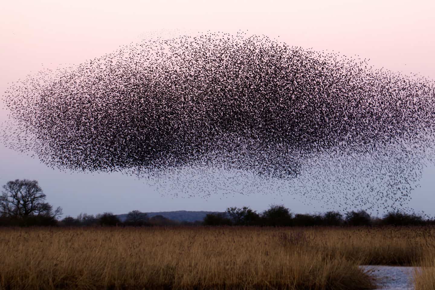
It’s similar to another emergent phenomenon: a murmuration of starlings. Each bird follows three rules:
- Separation: Don’t crowd other birds.
- Cohesion: Move towards the center of nearby groups of birds.
- Alignment: Try to match the direction and speed of nearby birds.
The birds don’t communicate directly with each other, but they still form a cohesive and ever-evolving flock. Seen from afar, it’s almost as if they are a single organism.4
If Hotelling is right, even if they try to differentiate themselves, all websites will eventually flock together.
Special thanks to Josh Petersel and James Ayres for contributing to early drafts of this essay.
Join the mailing list
I'll send new posts to your inbox, along with links to related content and a song recommendation or two.
Oddly, this mindset is seen as a positive one for developers to have. ↩︎
https://techcrunch.com/2019/04/24/facebook-stories-500-million/ ↩︎
The study of murmurations intersects with computer science in some really neat ways. ↩︎